Download
1 / 14
230 likes | 741 Vues
SO441 Synoptic Meteorology. Manual analysis: surface, upper-air charts & identifying features. Objectives. First: why daily weather discussions? Grow very comfortable interpreting and discussing commonly-used charts: 500 mb , surface, WV satellite, soundings Manual analysis objectives:

E N D
SO441 Synoptic Meteorology Manual analysis: surface, upper-air charts & identifying features
Objectives • First: why daily weather discussions? • Grow very comfortable interpreting and discussing commonly-used charts: 500 mb, surface, WV satellite, soundings • Manual analysis objectives: • Learn the value of taking the time for manual analysis • Understand various methods of manual analysis • Difference between surface and upper-level analyses • Learn to decode surface station model plot
Why manual analysis? • Tremendous amount of weather data available today when compared to 1950s (1950s are considered the start of modern meteorology) • Automated techniques are pretty good at plotting isolines of anything • Temperature, pressure, dew point, precipitation, height, etc. • But … to understand & synthesize the data in the charts requires the meteorologist to examine the actual observations (and it requires patience) • A manual analysis requires a meteorologist to look at every data point! • Time consuming, yes. So is it valuable? • Tremendous benefit in being forced to think about observational data and interpret weather observations
Manual surface analysis • Isopleth: a line along which the value of a quantity is constant, with readings on one side lower and on another side higher • Pressure: • Discontinuities in the pressure field do not existin the atmosphere • Isobars are smooth lines roughly parallel to one another • Regions of light wind should have large spacing between isobars, and regions of strong wind should have small spacing • Temperature: • Tend to be noisier than pressure b/c of elevation and local effects (proximity to water, urban areas, etc.) • Purpose is to analyze synoptic scale variability • Thus a clear outlier in temperature (i.e., maybe a station on top of a mountain) need not be explicitly contoured
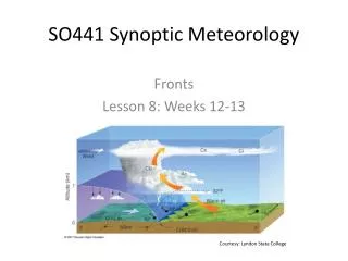
Manual analysis: fronts • What is a front? • Boundary between air masses of different densities • Warm, cold, and stationary fronts found at the edge of strong temperature differences • They mark the boundary of air masses, and often are accompanied by a pronounced wind shift • Fronts are often also associated with a pressure trough • That is, a bending (or “kinking”) of the isobars often aligns along the front • Fronts should be analyzed using more than one variable. • I.e., do not rely only on temperature to locate a front, but instead use temperature, pressure, and wind • Description of fronts from HPC: http://www.hpc.ncep.noaa.gov/html/fntcodes2.shtml http://www.hpc.ncep.noaa.gov/html/sfc2.shtml
Surface station plotand current weather Commonly reported current weather Sample station plot (in degrees F) Available at: http://www.hpc.ncep.noaa.gov/html/stationplot.shtml
More surface analyses: blend of automation and human • NOAA Ocean Prediction Center “Unified Analysis”: http://www.opc.ncep.noaa.gov/index.shtml • Chilean Weather Service: http://www.meteochile.gob.cl/carta_sinoptica.html
Rules of Isoplething • Never violate a valid data point. Only in extreme and defendable circumstances should data be omitted. Analyze for all given data. • Interpolate as much as possible. Allow for extreme packing of isolines if that is defendable. • Smooth isolines and, whenever possible, keep pacing consistent. • Do not analyze for what does not exist. Do not assume data. • There should be no features smaller than the distance between data points. • Isolines cannot intersect nor can they suddenly stop. Just as data is continuous, so are isolines. The exception to this is naturally at the end of a page. • Label all closed isolines with appropriate markings (i.e. "H" or "L") in bold and large letters. Label the maximum and minimum values with a small underline. • Label the ends of the lines neatly and consistently. Make sure that any abbreviations are understandable. Title the map and include time. • Analyze in even multiples of the interval of analysis. • Remember that each line must represent all areas with the specified value. On one side of the line, values will be lower than the value on the line and on the other side, values will be higher. • Use a good pencil and initially sketch lines lightly. If needed, make them smooth by darkening the lines after you know where they should be placed. • Have a good eraser handy. • Start with a line that gives you a good understanding of what is happening. This may be in the middle or near the extremes. Use this line as a guide to draw the rest of the isolines. • When the lines become tricky to draw, consider all the alternatives. There may be a better way to draw the analysis. • Remember that the data is only a reflection of the actual atmosphere! Adapted from College of DuPage http://weather.cod.edu/labs/isoplething/isoplething.rules.html
Surface temperature • Contour the “10s” (0°F, 10°F, 20°F, etc…) • Contour every 10 degrees F • You could contour every 5° F if you wish more detail, or are focusing on a regional analysis
Surface pressure • Contour the “4s” (1000 mb, 1004 mb, 996 mb, etc.) • And thus contour every 4 mb • Remember the station model: if pressure is listed as “002”, that usually means 1000.2 mb. Pressure of “994” means 999.4 mb.
Dew point temperature • Convention not as established. • Should try to include the 10s (50°F, 60°F, etc.) • Depending on interest, can contour every 10°F, every 5°F, or even every 2°F • Every 2°F would only be on a regional analysis • Also depending on focus (i.e., severe thunderstorms? Winter precip? Drought?) can omit low or high values • Example: start at 45°F and contour every 5°F to 75°F, if focusing on identifying the dryline and thunderstorm possibilities • Example: start at 20°F and contour every 5°F to 50°F, if interested in wintry precip
Manual analysis: upper-air • Important to also examine weather observations above the surface of the earth • Typically examine constant-pressure charts • 250 mb, 500 mb, 700 mb, and 850 mb • Height contours almost always parallel to winds (i.e., geostrophic balance) • Temperature gradients tend to not be as sharp above 700 mb • Example: at the surface in winter, Florida can have temps near 30C (mid-80s F) and New York near -10C (mid-10s F), while at 500 mb, temps near -10C over FL may only decrease to -20C over NY.
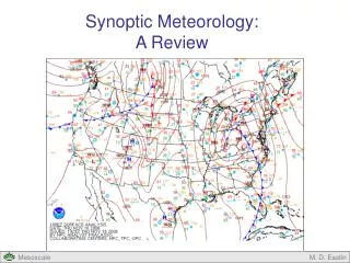
Basics: upper-level analysis • Identifying troughs and ridges • Today’s 500 mb chart: • Where are troughs and ridges?
Upper-air analysis • 250 mb: Contour every 60 m • Be sure to include 10800 m – so 10860, 10920, 10740, etc. • 500 mb: Also contour every 60 m • Be sure to include 5400 m – so 5460, 5520, 5340, etc. • 700 mb: Contour every 30 m • Be sure to include 3000 m – so 3030, 3060, 2970, etc. • 850 mb: Also contour every 30 m • Be sure to include 1500 m – so 1530, 1560, 1470, etc.