Masthead-
In what ways does your media product use, develop or challenge forms and conventions of real media products? media product use, develop or challenge . Masthead-

Masthead-
E N D
Presentation Transcript
In what ways does your media product use, develop or challenge forms and conventions of real media products? media product use, develop or challenge
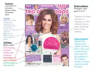
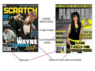
Masthead- The masthead is in a large blue and black font. This is so that it’s the most eye catching to the reader. Its is clear and simple and easy to read. Eyebrow The eyebrow that goes against the top of the magazine is in red text. This is a very conventional feature in a magazine and is always placed at the top row of the page. Key Image- The key image that I decided to use was of Professor Green. The reason that I chose to you use him was because he is appropriate to the target audience of my genre. He is standing with arm behind his back, looking directly at the camera allowing personal contact with the reader. Strapline- I decided to go against the normal convention of a magazine by not having a strapline. This is due the amount of writing in my tittle and the fact it speaks for itself. I chose the background colour to be blue as this co Barcode- The barcode is a very typical convention. I made own barcode so it is unique to my magazine. Anchor text- This anchor text draws in the reader as in bold writing so that it shows this is one of the main articles in the magazine.
CONTENTS PAGE ANALYSIS I copied the typical convention that VIBE use which is the splitting of the word ‘contents’. This convention is done in order to not copy the norm of having a straight word at the top of the page. Whilst analysis VIBE contents page, I realised that In all of their issues they have a big letter V in the background. This V represent the V in VIBE. I also duplicated this convention and used a big R to show the R in ‘Rhythm n’ Blues’. This is in the background with the writing and images placed on to of it. I used a model that would fit In with my demographic of males and females aged 16-24. She is standing in a rebellious and an unconventional way which also shows how my magazine is breaking all the conventions. At the bottom of the page I put a little paragraph which proves that the work is all taken by me and shows I'm the photographer and editor. The text that used was used so that it would specifically attract my readers. I talked about upcoming artist which is a inspirational to the readers of a music magazine. I created two segments, fashion and features. The features column talks about miscellaneous topics such as award shows + my chosen artists. This is so that the reader has a variety of choices to read from, however all target at them.
There’s a contrast between the italics and the size 30 font of my artist name to show the difference in importance. I placed a large image of my artist on the left hand side of my double page spread. This is a convention used in VIBE magazine that i was using as inspiration. Also in this image I done photo manipulation by adding tattoos to his arm and neck. This is shown by Professor Green and I done this to make him look authentic. This a quotation in big font which is also found in the main text, to attract audiences that are skimming the article. I placed a footer in both corners of the double page spread that shows the page number and corresponds to the numbers in the contents page. These spaces between texts are called gutters, these are in place to show equal spacing.
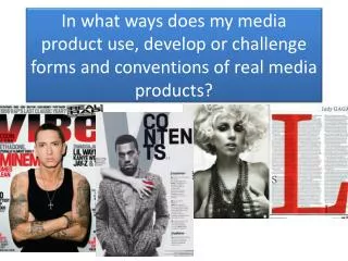
Conforming to conventions • Another way in which my magazine follows the conventions of a typical magazine is by the eyebrow. An eyebrow is the writing that goes along the top of the page to show exclusive texts. • My product follows the normal conventions of VIBE magazine as it keeps in line with the same format. The word contents being written like this shows how VIBE is trying to be unconventional compared to other magazines. It is in clear black font that is placed close together for effect. Both my cover page and VIBE’s cover page contain an exclusive text in the article. This is both in clear font so the reader can read them.