Download

1 / 2
20 likes | 129 Vues
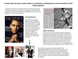
This analysis explores the strengths and weaknesses of a magazine's masthead. It highlights the conformance to conventional magazine layouts, the boldness and prominence of the text, and its neutral color choice. Additionally, the analysis notes the masthead's school-like font, which resonates with a specific audience. However, a noted weakness is the lack of color differentiation from the main image, which detracts from its vibrancy. Overall, the masthead's design choices convey both a sense of progressiveness and a need for visual enhancement.

E N D
A strength is that the masthead conforms to the conventions as it is at the top of the page. • A strength is that the masthead is in bold and a stark contrast to the background of the image • A strength is that the masthead is large and bold. • A strength is that the masthead is located at the top of the magazine so it conforms to magazine convections. • The strengths of the name is that it that the font looks like a school font commonly used in American schools. • A weaknesses of the masthead is that that it isn’t a different colour to the main image making less vibrant. • A strength is that the black masthead shows that the magazine is gender neutral as the colour is non-gender specific • A strength is that “ESSENCE” suggests that it is the invariable source of all that is deemed to be both ‘cool’ and necessary for progression to further steps.