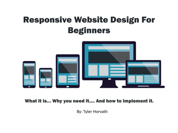
Dynamic Serving or Responsive Design?
Web Choice details about what you should go after to Dynamic Serving or Responsive Design? For further details, Email: info@webchoiceuk.com.<br>

Dynamic Serving or Responsive Design?
E N D
Presentation Transcript
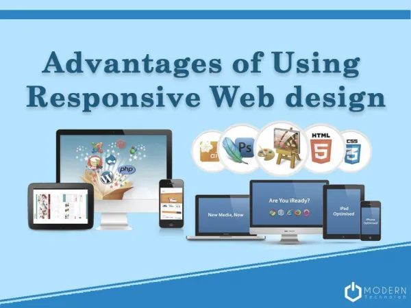
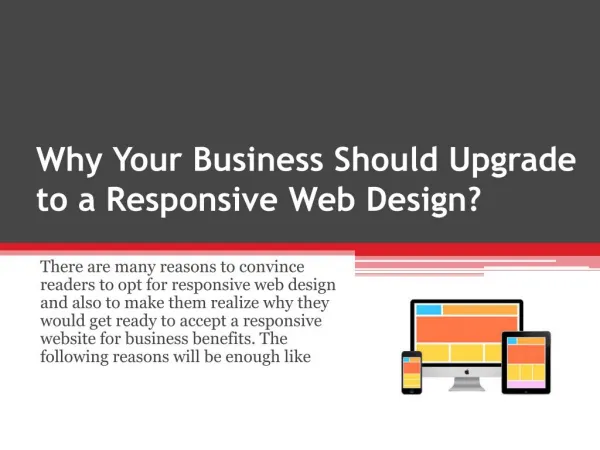
Dynamic Serving or Responsive Design? We’ve already explored responsive design in some depth on the Web Choice site. It has been an exciting and productive development for the design world (not to mention the business world), but even as we head into 2020 it still doesn’t represent a catch-all solution. In the quest to adapt sites for the increasing users of mobiles, smart phones or tablets, there remain two dramatically different technical approaches. Neither is innately superior; they both offer benefits and drawbacks. Ultimately, the nature of your project and business objectives will guide your choice. The recent hype has been centred squarely on responsive design, kicking dynamic serving well into the background; nevertheless, the latter approach is a useful technique in some contexts. Even the best web designer can be swayed by the trends of the moment, when they’re not always relevant. We would argue that dynamic serving can continue to play a valuable role in modern design and, most importantly, it won’t hurt your business from an indexing or SEO perspective (this is an issue that business owners will obviously be concerned about). Under this approach, the server scans for the User Agent value in the HTTP header to figure out whether it’s
catering for a desktop, tablet or smart phone. The server then gives different HTML, CSS and JS code and media files (images, video and more) according to this User Agent value. Mobile and desktop users therefore receive different content from the same URL, unlike today’s popular responsive web design approach. Under dynamic serving, the mobile version of a site isn’t just an adaptation of the full-blown website, since the dynamic serving variety will only dish out the appropriate code and optimised media files. Accordingly, the user’s device doesn’t receive megabytes of unnecessary HTML-CSS code. Performance optimisation (meaning weight and speed) is simple and highly efficient this way. That’s the main pull of this approach – and a decisive one for many business owners, particularly in the e-commerce space where reactivity is a critical part of the customer conversion process. Additionally, responsive design can mean making some undesirable sacrifices. A site designed for mobiles viewed on a 5K screen will show an obvious step down in graphics and ergonomics terms. On the other hand, so many websites are poorly adapted for mobile devices that even the best web designer out there would have to agree that the performance of the original desktop version is preferable by contrast. With dynamic serving, you don’t have to make any annoying or self-sabotaging compromises. This fact ensures that even a considerable time after the rise of responsive design, the more effective techniques of yesteryear can have impressive staying power and relevance in the design world. Anyway, if you’re unsure where you stand or you’re toying with the idea of going with the old-fashioned dynamic serving approach, get in touch with the team at Web Choice today and we’ll explore the possibilities in more depth with you. Author Bio: We are a full-service web design agency with a dedicated focus on creating websites that are Responsive, Secure and Results Driven. We utilise the latest technology which in turn guarantees fantastic results for the clients we help and support.