
Exploring User Interface Models: Enhancing User Experience Through Structure and Design
This document outlines various user interface (UI) models to improve user interaction, detailing structures like Multiple Windows, One-Window Paging, and Tiled Panes. It highlights the advantages and challenges of each approach, such as cognitive load reduction in Two-Panel Selectors and the visual arrangement in Canvas plus Palette designs. Additionally, it discusses techniques like Wizards for guiding users through complex tasks and emphasizes maintaining context with strategies for navigating between screens. Understanding these models can lead to more effective UI design.

Exploring User Interface Models: Enhancing User Experience Through Structure and Design
E N D
Presentation Transcript
ORGANIZING THE CONTENTPhysical Structure September 14th, 2009
General Models • Multiple Windows • Good for complex data or parallel viewing • Can be confusing or annoying • One-Window Paging • Very Common Model (e.g. Web pages), conserves space, straight forward design • May not be suitable for complex applications • Tiled Panes • Good method to show a lot of data at once. Becoming more and more popular. • Required user to understand where their focus of attention should be
Patterns • Two-Panel Selector • Canvas Plus Palette • One-Window Drilldown • Alternative Views • Wizard • Extras on Demand • Intriguing Branches • Multi-Level Help
Two-Panel Selector • Side by side panels. One displays list of objects. The second displays the content of the selected item in the first. • Typically used when presenting a list of objects (Mailbox, Music Library, Image Library, Database records) • Typically some type of detail in the list pane, full detail exists in the display pane. • The display needs to be large enough to accommodate two panels at once
Two-Panel Selector – Why • It is a learned paradigm, but it is very common and powerful • With two panels visible the user can shift focus back and forth efficiently • Advantages over other models: • Reduces physical effort – less eye movement and mouse clicks • Reduces visual cognitive load • Reduces the users memory burden
Two-Panel Selector Presentation • The selectable list panel should be on the top or left (Reverse for right to left languages) • The second panel should display content immediately on item selection – via mouse click or keyboard • The selected item should be visually obvious • List Organization • Linear, Tables • Hierarchies (by Category or Parent/Child) • Spatial Organizations
Canvas plus Palette • Iconic palette next to a blank canvas. The user uses the palette buttons to create items on the canvas • Used for graphical editors. Allows objects to create items and arrange them visually on the canvas (virtual space). • Why? • One of the most common UIs. Consider Paint. • Common set of graphics, metaphors and gestures, even across similar applications
Canvas plus Palette Presentation • Large Blank area as the canvas • Overall UI can still make use of title panels, etc. • Palette should always be side by side with the canvas • The Palette is typically a grid of iconic buttons • If the icons are complex or cryptic, short labels may be valuable by the icons • The Palette should be the top or left of the canvas. • The Palette can be divided into groups (Card Stack) with tabs or expander panels • Most Palette buttons should create and object
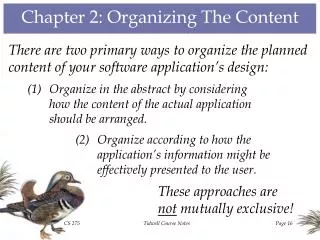
One Window Drilldown • Each screen in the application is shown in a single window. When the user selects and action or object, the entire window contents are replaced with a new page • Typically used when: • Space constraints exist • The application complexity surpasses the skill set of the target user
One Window Drilldown Presentation • Organize each screen to fit into logical panels or lists • Design obvious and consistent paths for the user to navigate through the windows • Consider how the user will go back up the chain • Forward/Back Buttons • Breadcrumbs • Sequence Maps
Alternative Views • All the user to choose from structurally different views of the user interface • Typically used when due to the nature of the application or data content, a single presentation model will not handle all usage scenarios • You may also use this when different target users will use different technologies
Alternative Views Presentation • Information may be added or taken away, but the primary content should remain largely unchanged • The switch for the view should be accessible from the main screen but doesn’t always need to prominent • Applications often remember the last used view, so it is the default when using it in the future
Wizard • Leads the user through a step by step view of the interface that requires a specific order of operations • Typically used when: • Designing UI for a task that is long or complicated. This may include branching. • Designing UI for an infrequent but meaningful operation • You are certain the UI Designer will know more than the user about how to get this task done • Don’t use when expert users will find annoying or rigid, especially if the content supports a creative process
Wizard Presentation • Break up the task into logical chunks or groups of operations. • The UI may be dynamic based on options and decisions the user has available (e.g. it may skip steps or take a different branch) • Steps in a single window with Back/Next buttons are the most common implementation • A two-Panel Selector may be more suitable to provide context • Single Window Patterns • Title Sections • Responsive Enabling • Responsive Disclosure
Extras on Demand • Show the most important content initially, let user access more detail on demand • Typically used when there is too much to show on one page and some of it is too detailed, advanced or unimportant • Often very good for usability and to reduce initial cognitive load. Users will find the interface more “friendly”.
Extras on Demand Presentation • Prune down the UI to it’s most commonly used and/or important items • Allow the users to access the remaining information through a button or link • More Options • Advanced Options • >> • … • Allow the user to re-hide this information
Intriguing Branches • Place links to interesting content in unexpected places and label such that a curious user would be attracted • Commonly used in as inline links in webpages or application text • When used in applications consider using more descriptive language in these links. For example, a user may be drawn to “Learn more…” more often than a generic “help” label.


