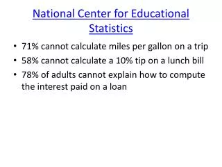
Educational Statistics
Educational Statistics. GURU K MOORTHY. Outline. Introduction Frequency Distribution Measures of Central Tendency Measures of Dispersion. Outline-Continued. Other Measures Concept of a Population and Sample The Normal Curve Tests for Normality. Learning Objectives.

Educational Statistics
E N D
Presentation Transcript
Educational Statistics GURU K MOORTHY
Outline Introduction Frequency Distribution Measures of Central Tendency Measures of Dispersion
Outline-Continued Other Measures Concept of a Population and Sample The Normal Curve Tests for Normality
Learning Objectives When you have completed this chapter you should be able to: Know the difference between a variable and an attribute. Perform mathematical calculations to the correct number of significant figures. Construct histograms for simple and complex data.
Learning Objectives-cont’d. When you have completed this chapter you should be able to: Calculate and effectively use the different measures of central tendency, dispersion, and interrelationship. Understand the concept of a universe and a sample. Understand the concept of a normal curve and the relationship to the mean and standard deviation.
Learning Objectives-cont’d. When you have completed this chapter you should be able to: Calculate the percent of items below a value, above a value, or between two values for data that are normally distributed. Calculate the process center given the percent of items below a value Perform the different tests of normality Construct a scatter diagram and perform the necessary related calculations.
Introduction Definition of Statistics: • A collection of quantitative data pertaining to a subject or group. Examples are blood pressure statistics etc. • The science that deals with the collection, tabulation, analysis, interpretation, and presentation of quantitative data
Introduction Two phases of statistics: • Descriptive Statistics: • Describes the characteristics of a product or process using information collected on it. • Inferential Statistics (Inductive): • Draws conclusions on unknown process parameters based on information contained in a sample. • Uses probability
Collection of Data Types of Data: Attribute: Discrete data. Data values can only be integers. Counted data or attribute data. Examples include: • How many of the products are defective? • How often are the machines repaired? • How many people are absent each day?
Collection of Data – Cont’d. Types of Data: Attribute: Discrete data. Data values can only be integers. Counted data or attribute data. Examples include: • How many days did it rain last month? • What kind of performance was achieved? • Number of defects, defectives
Collection of Data Types of Data: Variable: Continuous data. Data values can be any real number. Measured data. Examples include: • How long is each item? • How long did it take to complete the task? • What is the weight of the product? • Length, volume, time
Collection of Data • Significant Figures • Rounding
Significant Figures • Significant Figures = Measured numbers • When you measure something there is always room for a little bit of error • How tall are you 5 ft 9 inches or 5 ft 9.1 inches? • Counted numbers and defined numbers ( 12 ins. = 1 ft, there are 6 people in my family)
Significant Figures • Significant figures are used to indicate the amount of variation which is allowed in a number. • It is believed to be closer to the actual value than any other digit. • Significant figures: • 3.69 – 3 significant digits. • 36.900 – 5 significant digits.
Significant Figures – Cont’d. • Use Scientific Notation • 3x10^2 (1 significant digit) • 3.0x10^2 (2 significant digits)
Significant Figures • Rules for Multiplying and Dividing • Number of sig. = the same as the number with the least number of significant digits. • 6.59 x 2.3 = 15 • 32.65/24 = 1.4 (where 24 is not a counting number) • 32.64/24=1.360(24 is a counting number i.e. 24.00)
Significant Figures Rules for Adding and Subtracting • Result can have no more sig. fig. after the decimal point than the number with the fewest sig. fig. after the decimal point. • 38.26 – 6 = 32 (6 is not a counting number) • 38.2 -6 = 32.2 (6 is a counting number) • 38.26 – 6.1 = 32.2 (rounded from 32.16) • If the last digit >=5 then round up, else round down
Precision and Accuracy Precision The precision of a measurement is determined by how reproducible that measurement value is. For example if a sample is weighed by a student to be 42.58 g, and then measured by another student five different times with the resulting data: 42.09 g, 42.15 g, 42.1 g, 42.16 g, 42.12 g Then the original measurement is not very precise since it cannot be reproduced.
Precision and Accuracy Accuracy • The accuracy of a measurement is determined by how close a measured value is to its “true” value. • For example, if a sample is known to weigh 3.182 g, then weighed five different times by a student with the resulting data: 3.200 g, 3.180 g, 3.152 g, 3.168 g, 3.189 g • The most accurate measurement would be 3.180 g, because it is closest to the true “weight” of the sample.
Precision and Accuracy Figure 4-1 Difference between accuracy and precision
DescribingData • Frequency Distribution • Measures of Central Tendency • Measures of Dispersion
Frequency Distribution • Ungrouped Data • Grouped Data
Frequency Distribution 2-7 There are three types of frequency distributions • Categorical frequency distributions • Ungrouped frequency distributions • Grouped frequency distributions
Categorical 2-7 Categorical frequency distributions • Can be used for data that can be placed in specific categories, such as nominal- or ordinal-level data. • Examples - political affiliation, religious affiliation, blood type etc.
Categorical Example :Blood Type Frequency Distribution 2-8
Ungrouped 2-9 Ungrouped frequency distributions • Ungrouped frequency distributions - can be used for data that can be enumerated and when the range of values in the data set is not large. • Examples - number of miles your instructors have to travel from home to campus, number of girls in a 4-child family etc.
Ungrouped Example :Number of Miles Traveled 2-10
Grouped 2-11 • Grouped frequency distributions • Can be used when the range of values in the data set is very large. The data must be grouped into classes that are more than one unit in width. • Examples - the life of boat batteries in hours.
Grouped Example: Lifetimes of Boat Batteries 2-12 Class Class Frequency Cumulative limits Boundaries frequency 24 - 30 23.5 - 37.5 4 4 38 - 51 37.5 - 51.5 14 18 52 - 65 51.5 - 65.5 7 25
Frequency Distributions Table 4-3 Different Frequency Distributions of Data Given in Table 4-1
The Histogram The histogram is the most important graphical tool for exploring the shape of data distributions. Check: http://quarknet.fnal.gov/toolkits/ati/histograms.html for the construction ,analysis and understanding of histograms
Constructing a Histogram The Fast Way Step 1: Find range of distribution, largest - smallest values Step 2: Choose number of classes, 5 to 20 Step 3: Determine width of classes, one decimal place more than the data, class width = range/number of classes Step 4: Determine class boundaries Step 5: Draw frequency histogram
Constructing a Histogram Number of groups or cells • If no. of observations < 100 – 5 to 9 cells • Between 100-500 – 8 to 17 cells • Greater than 500 – 15 to 20 cells
Constructing a Histogram For a more accurate way of drawing a histogram see the section on grouped data in your textbook
Other Types of Frequency Distribution Graphs • Bar Graph • Polygon of Data • Cumulative Frequency Distribution or Ogive
Characteristics of FrequencyDistribution Graphs Figure 4-6 Characteristics of frequency distributions
Analysis of Histograms Figure 4-7 Differences due to location, spread, and shape
Analysis of Histograms Figure 4-8 Histogram of Wash Concentration
Measures of Central Tendency The three measures in common use are the: • Average • Median • Mode
Average There are three different techniques available for calculating the average three measures in common use are the: • Ungrouped data • Grouped data • Weighted average
Average-Grouped Data h = number of cells fi=frequency Xi=midpoint
Average-Weighted Average Used when a number of averages are combined with different frequencies
Median-Grouped Data Lm=lower boundary of the cell with the median N=total number of observations Cfm=cumulative frequency of all cells below m Fm=frequency of median cell i=cell interval
Example Problem Table 4-7 Frequency Distribution of the Life of 320 tires in 1000 km