Download
1 / 8
80 likes | 217 Vues
Explore the essential principles of effective design, focusing on the interplay of elements such as purpose, audience, content, and distribution. Learn how to create a strong focus point and a fluid flow that guides the reader’s eye across your design. Understand the concepts of symmetry, asymmetry, and the rule of thirds to achieve visual harmony. Craft designs that communicate your message effectively while maintaining balance and aesthetic appeal, ensuring your audience engages with your content as intended.

E N D
Plan Your Design • What is the purpose ? • Design elements should match the message you want to communicate • Who is the audience ? • How much do they need to know about the topic • What will be the form ? • Print media, presentation media, audio/visual media • What content will be included ? • Text, graphic images (charts, graphs, maps, images) • How will it be distributed ? • Displayed, mailed, presented The answer to each question will affect your design decisions
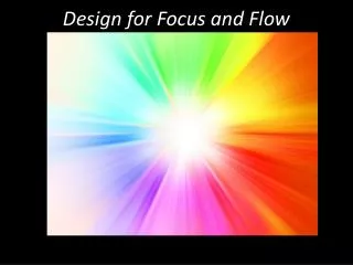
Focus and Flow • Focus Point—the element the reader sees first • Create the focus point with: • Graphic images • Font style and size • White space—the “blank” area between elements and in the outside page margins • Gives the reader a “breather” and causes other elements to have greater impact • When choosing a focus point, remember the eye tends to see: • Graphics before text • Larger text before smaller • Text in bright colors before text in black .
Focus and Flow • Flow—a visual path for the reader to follow • Enables the reader’s eye to move easily from the focus point through the rest of the page in the order you intended the document to be read • Z Pattern—a commonly used visual path • Starts at the top left of the page, moves to the top right, down to the bottom left, then to the bottom right. • Placement of graphics, white space, or large text can change the reader’s starting place .
Symmetry • Symmetry—requires that an element on one part of the page be balanced with another element • Symmetry is used to create an attractive page • Design elements that create balance (Symmetry): • Graphics • Text • White space • Asymmetry—elements that are not balanced against one another Consider two different versions of the Pepsi-Cola logo. Prior to 2008, the logo was symmetrical, with the red, white and blue swirls being horizontally and vertically balanced. The redesign, however, is the perfect example of asymmetry, with the red space considerably more dominant than the blue. .
Rule of Thirds • It is more pleasing to view a page divided into thirds rather than halves • Pages do not have to be divided evenly to be attractive • The division can be horizontal, vertical, or both “Following the rule of thirds philosophy, images that fall into “thirds” regions are the most pleasing and are associated with balance and harmony. “ “Where the focus of an image falls in the imaginary grid can create associations as well. “ “For example, the placement of an object in one third of the photo can imply motion, such as with the bird in the image on the right. (You can almost sense that he has just flown in from the left and landed on the branch.)” 2 .
Works Cited Standards • 38.2.2 Apply the principles and elements of design and their relationship to each other • 38.3.1 Apply elements of design (e.g., line, shape, color) • 38.3.2 Apply principles of design (e.g., proportion, balance, harmony, rhythm, unity) • 38.3.6 Create symmetric and asymmetric designs Lake, Susan. Desktop Publishing. South-Western Educational Publishing, 2000 http://tympanus.net/codrops/2012/05/23/ understanding-the-rule-of-thirds-in-web-design/