
SlideServe
Menu
Préférences
© SlideServe · v2026

Friday, September 23 rd

xia avatar
19 diapositives · 350 Views · Jul 27, 2014

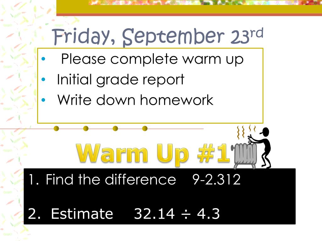
Friday, September 23 rd. Warm Up #1 . Please complete warm up Initial grade report Write down homework. Find the difference 9-2.312 Estimate 32.14 ÷ 4.3. Joke of the Day. What country did candy come from? “Sweeten”. Week Schedule .
Friday, September 23 rd - slide 1
01 / 19Friday, September 23 rd
1 / 17

Télécharger la présentation

Friday, September 23 rd
Une image / un lien ci-dessous est fourni (tel quel) pour télécharger la présentation

Politique de téléchargement : le contenu du site vous est fourni TEL QUEL pour votre information et votre usage personnel ; il ne peut être vendu, concédé sous licence ni partagé sur d’autres sites sans l’accord de son auteur.Le contenu vous est fourni TEL QUEL, pour votre information et votre usage personnel uniquement. Téléchargez la présentation en cliquant sur ce lien. Lors du téléchargement, si vous ne parvenez pas à télécharger une présentation, l’éditeur a peut-être supprimé le fichier de son serveur.Pendant le téléchargement, si vous ne parvenez pas à obtenir une présentation, le fichier a peut-être été supprimé par l’éditeur.

F I N

Plus de contenu associé

Transcription de la présentation
  1. Friday, September 23rd Warm Up #1 Please complete warm up Initial grade report Write down homework Find the difference 9-2.312 Estimate 32.14 ÷ 4.3

  2. Joke of the Day What country did candy come from? “Sweeten”

  3. Week Schedule • Today: Stone Mountain slip due. Weekly Review DUE, Line Plots and Frequency tables Saturday: Stone Mountain

  4. Data Analysis

  5. Let’s fill in our Concept Map! Match the graph and definition

  6. First

  7. 2nd ***You must choose intervals that separate the data into EQUAL groups. Each interval will be the same size, but might not contain the same frequency of data as every other interval.

  8. Last

  9. Let’s See how we would put one together!

  10. Step 1: Survey students. Record the results.

  11. Step 2Frequency Table • Make a frequency table of the data. Be sure to use equal intervals

  12. Step 3Make histogram • Choose an appropriate scale and interval for the vertical axis. The greatest value on the scale should be at least as great as the greatest frequency.

  13. Step 4 • Draw a bar for each interval. The height of the bar is the frequency for that interval. Bars must touch but not overlap. • Label the axes and give the graph title

  14. Final Product!

  15. Question of the Day? What is the difference between a histogram and a bar graph?

  16. Histogram Bar Graph

  17. Let’s Try some together Open up to page 316 Complete 2- 8

  18. You Try! • Complete • “How do you repair a broken tuba”