Download
1 / 20
200 likes | 307 Vues
This comprehensive guide explores the vital components of poster design, focusing on composition, layout, text, and color. It covers the importance of type/font style in conveying your message effectively and offers insights into creating compelling graphs, charts, and photographs. With emphasis on layout structures such as three-column and asymmetrical designs, readers will learn how to draw attention from the top left to bottom right. Practical strategies to enhance contrast and hierarchy will also be discussed, ensuring your poster captures and retains the audience's interest.

E N D
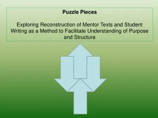
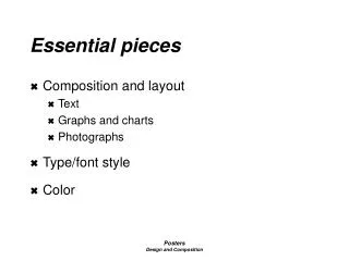
Essential pieces • Composition and layout • Text • Graphs and charts • Photographs • Type/font style • Color Posters Design and Composition
Abstract Top Left to Right 36” Bottom Conclusion 48” Composition and layout Posters Design and Composition
1 2 3 Title Big Idea Subtitle specifics provided Abstract Introduction Methods Results 48” Conclusion 36” 3 Column layout Posters Design and Composition
4 5 1 2 3 Abstract 36” Conclusion 48” 5 column layout Showing A Cyclical Process Posters Design and Composition
Title Big Idea Subtitle specifics provided Introduction Abstract 48” Methods Results Conclusion 36” Asymmetrical layout Posters Design and Composition
Type • Your choice of type, and the way you use it, plays a major role in the success of your presentation. • Your choice of type, and the way you use it, plays a major role in the success of your presentation. • Your choice of type, and the way you use it, plays a major role in the success of your presentation. Posters Design and Composition
Maximize foreground background contrast t o Type • Avoid clichés: typeface establishes tone of poster • Weight contrast: light, medium,bold • Capitalization: MAY BE DIFFICULT TO READ • Contrast: Posters Design and Composition
Develop a Type Hierarchy Title to be largest/boldest Text to be simple, easy to read Labels for table, charts and photos to be smallest Chart 4: Comparison of Seasonal Growth Patterns in Rubus Posters Design and Composition
Color • Hue: another name for color • Chroma: the brightness or dullness of a color • Value: the lightness or darkness of a color Posters Design and Composition
Primary colors Posters Design and Composition
Secondary Colors • Two primary colors mixed together Posters Design and Composition
Color • Tint: color + white • Tone: color + gray • Shade: color + black Posters Design and Composition
Warm Colors • Exciting, advancing Posters Design and Composition
Cool Colors • Calming, receding Posters Design and Composition
Complementary Colors • Opposite on the color wheel • Highest, striking contrast Posters Design and Composition
Color • Tint, tone, or shade “it down” • Reduce harshness • Reduce eye strain Posters Design and Composition
Color • Mono-chromatic colors: using any shade, tint or tone of one color Posters Design and Composition
Color schemes Showing A Cyclical Process Abstract Conclusion Posters Design and Composition
Abstract Conclusion Color schemes Showing A Cyclical Process Posters Design and Composition
Color Website addresses: • Interactive color wheel: www.sherwin-williams.com/DIY/interior/colorselect/confidence/dwc4.asp • How the eye works to perceive color and the 3 properties of color: www.thetech.org/exhibits_events/online/color/eye • General color information: http://www.busybrushes.com/Classroom/harmonyintro.html Posters Design and Composition