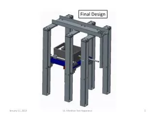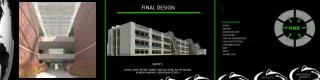
Final design
Create a magazine cover using Photoshop with a striking image of Morocco from dsphotographic.com and barcode from dalesman.co.uk. Incorporate red and white text for a professional look.

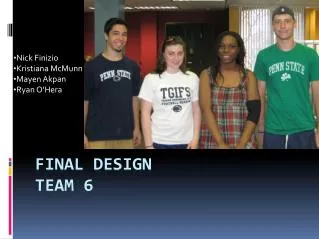
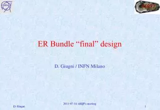
Final design
E N D
Presentation Transcript
Font used: Calibri (Body) Colour of text: Red and White Size of text: 11 for the text on the cover excluding the title which will be size 20 so it stands out more. I am going to take the barcode from the website: http://www.dalesman.co.uk/press/2013_calendar_barcodes.htm and I am going to take the background from: http://dsphotographic.com/photos/morocco-part-2/ Place image on photoshop and add the barcode image as another layer and add into the first layer so that both images are on the same page. Then merge the barcode with the double dooredimage and resize to fit the bottom right hand corner of the image. This will make it look like a legitimate magazine cover. Afterwards add a text box across the top of the image to form the title ‘Discover…Morocco’. Now add another text box to be able to add text to cover the majority of the magaizne cover to make it look like a real one
Why I chose graphic b • I have chosen this graphic as it is the most symbolic of Morocco as identified by the majority of respondents to my questionnaire. The colours of the background contrast with the white text on top and the red titled text and this allows the image to stand out as well as show the image underneath. I didn’t choose the other two as I saw them as too simple and the background deferred the readers attention from the actual text on the magazine cover and just focused on the background. Furthermore especially with design C as there were many images on the cover and so there was a lot going on in the background to allow the reader to read the text.