Download
1 / 50
500 likes | 515 Vues
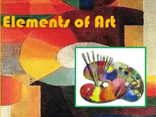
Learn the seven key elements of art (Line, Shape, Form, Space, Color, Value, Texture) and understand how artists use them to create stunning works of art. Dive deep into the principles of composition (Center of Interest, Directional Movement, Value Pattern, Balance, Rhythm/Harmony, Contrast) and unlock the secrets to producing captivating compositions. This comprehensive guide will help you enhance your artistic skills and elevate your creative output to new heights.

E N D
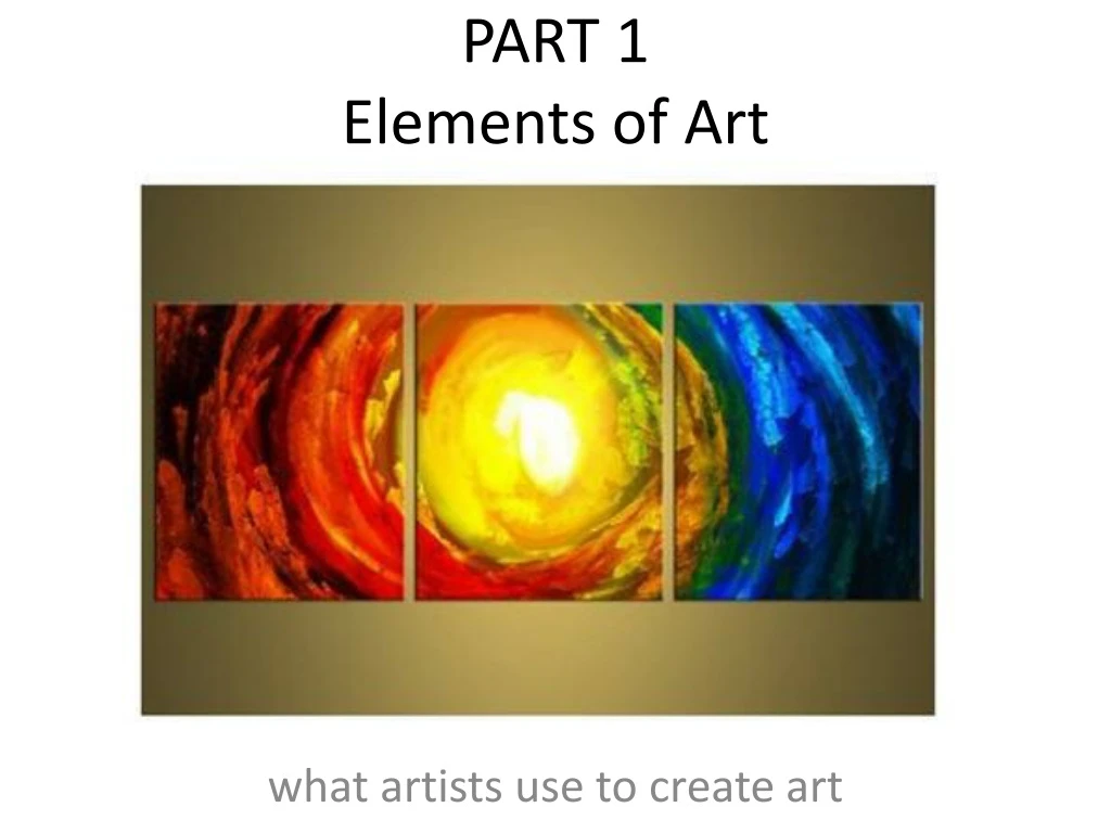
PART 1Elements of Art what artists use to create art
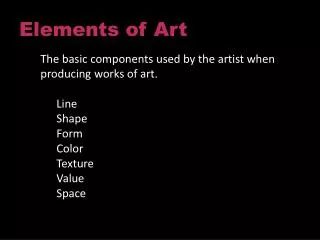
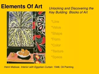
7 Elements • Idea‐ There are seven elements of art that artists use. It is important to know them to beable to use them when creating art. • Any combination of these elements can be used in a work of art.
THEY ARE: • 1. Line • 2. Shape • 3. Form • 4. Space • 5. Color • 6. Value • 7. Texture
ELEMENT 1 - LINE • Line: A line can be straight or curved, geometric or organic and can describe the outside edge of a shape.
An actual line can be made with many different media, can be thick or thin and show direction.
ELEMENT 2: SHAPE • Shape: A shape is flat and 2 dimensional. Shapes can be geometric as in a square, circle, triangle and rectangle.
ELEMENT 3: FORM • Form: A form is solid and has 3 dimensions. Forms are found in all the objects around us.
The basic forms are Cube, Sphere, Cone, Pyramid, Cylinder and Prism.
The forms can be shaded to show depth using the principles of proper shading.
ELEMENT 4 - SPACE • Space: There are two kinds of space, positive (white) and negative (black).
Figure Ground creates two separate images depend on which space you focus on.
Positive (white )space is the area taken up by objects and Negative (black) space is the area in and around objects.
Perspective shows how objects appear to get smaller in space as they move away from us.
ELEMENT 5 - COLOR • Color has three properties: • a. Chroma • b. Intensity • c. Value
a. The color or chromatic scale as in a color wheel, this is made with three colors called the primary colors, Red, Yellow and Blue. The secondary colors are mixed using the primaries, Orange, Green and Violet. The tertiary colors are mixed with a primary and secondary colors such as, Blue‐Green, Yellow‐Green, Red‐Orange, Yellow‐Orange, Blue‐Violet, and Red‐Violet.
b. Intensity refers to brightness and dullness. Colors opposite each other on the color wheel are called complementary pairs. These colors reduce the brightness or intensity of the color and it becomes neutral (brown). Intensity changes when you add a colors compliment to it.
c. Value in color theory, is the addition of white and black (not colors) in order to lighten and darken a color. You can mix gray (tones) with black and white then add it to a color to produce a monochromatic scale. • When adding white, it is a tint. When adding black it is a shade. A mono‐chromatic scale with blue showing tints and shades. White to Black with incremental gradiations.
ELEMENT 6: VALUE • Value:Value refers to dark and light. Everything has a certain value of lightness or darkness. • Black and white are the extremes and grays (tones) are in between. • Shows form and depth, and it is the primary element that will show realism of a subject. • A gradation is a gradual change in value from dark to light.
ELEMENT 7: TEXTURE • Texture: This refers to rough and smooth surfaces. Texture can be real as in a relief or implied with lines and values to appear like something has a rough or smooth surface.
PART 2Principles of Composition what an artwork should have
Idea‐ There are six principles of composition that use the elements of art to produce a work of art, forming a composition. • Not all the elements of art or principles of composition are used in every work of art. • These principles are the guidelines for success in the arrangement of the elements to produce a good composition.
The Six Principles • 1. Center of Interest • 2. Directional Movement • 3. Value Pattern • 4. Balance • 5. Rhythm / Harmony • 6. Contrast
Principle 1 – CENTER OF INTEREST • Center of Interest : (area of emphasis and focal point) An area that is special or more interesting than the other areas. • Sometimes, you can use the division of thirds to find the aesthetic center as opposed to the mathematical center. • It makes one part of an artwork dominant over the other parts. • It makes an element or object in a work stand out. • To use an area of emphasis in an artwork is to attract the viewer's eyes to a place of special importance in an artwork.
This is the division of thirds and the numbers show the four aesthetic centers
PRINCIPLE 2: DIRECTIONAL MOVEMENT • Directional Movement: Leads the viewer’s eye or attention in and through the work. • It uses rhythm and the unity of objects to move through a piece of work and keep you within the format. • This can be done with a value pattern, an arrangement of light and dark areas that produce a directional movement.
The fish create a directional movement! • A triangular movement within a format.
PRINCIPLE 3: VALUE PATTERN • Value pattern: A value pattern is a dark light design that travels through a composition.
It can be either dark values through a light background or light values through a dark background.
The value pattern is a bridging design that touches and visually connects as it moves vertically and horizontally.
PRINCIPLE 4: BALANCE • Balance: This is the arranging of elements so that no one part of a work overpowers, or seems heavier than any other part. • Two different kinds of balance are symmetrical and asymmetrical. • Symmetrical (or formal) balance is when both sides of an artwork, if split down the middle, appear to be the same.
PRINCIPLE 5: RHYTHM / HARMONY • Rhythm/ Harmony: It uses elements or things that are similar. • It also indicates movement by using the repetition of these elements. • Rhythm/Harmony can make an artwork seem active and helps in creating the complete composition.
Similar shapes and direction are examples of rhythm/patterning
PRINCIPLE 6: CONTRAST • Contrast: This can show a difference and diversity in an artwork by combining different elements to create interest. • Contrast provides variety in an artwork with things that are in opposition. • Variety and contrast can help to show an area of emphasis, as well as a difference in all the elements of art. • All the elements of art can be used to create contrast in a work of art.
Contrast can be achieved through the elements…see the positive/negative space, color usage, varying textures, etc?