Classic Design Theory Shape and Colour
140 likes | 283 Vues
Explore the fundamental concepts of shape and color as key elements in design. This resource explains how shapes are identified as positive spaces, while the surrounding areas represent negative spaces. Emphasizing the importance of both, it illustrates how artists like M.C. Escher blurred these distinctions. Additionally, the principles of color, including hue, value, and intensity, are discussed, along with various color schemes such as complementary, triadic, and discordant. A practical activity invites you to create a design using these concepts.

Classic Design Theory Shape and Colour
E N D
Presentation Transcript
Classic Design TheoryShape and Colour Taken and adapted from Bonnie Skaalid http://www.usask.ca/education/coursework/skaalid/theory/cgdt/
Shape • Two dimension objects have shape, not volume and mass like a three dimensional object. • In a picture, the shapes are considered the positive spaces. • The spaces around the shapes are the negative spaces. • It is just as important to consider the negative space in a picture as the positive shapes. • Sometimes artists create pieces that have no distinction between positive and negative spaces. M. C. Escher was a master at creating drawings where there was no distinction between positive and negative space.
M. C. Escher print: Study of the Regular Division of the Plane with Horsemen
Colour • Color occurs when light in different wavelengths strikes our eyes. Objects have no color of their own, only the ability to reflect a certain wavelength of light back to our eyes. • Colors appear different depending on whether you view them under incandescent, florescent or natural sunlight. • Colors also change according to their surroundings.
The reddish outline box is the same color in all the examples.
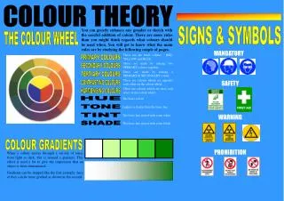
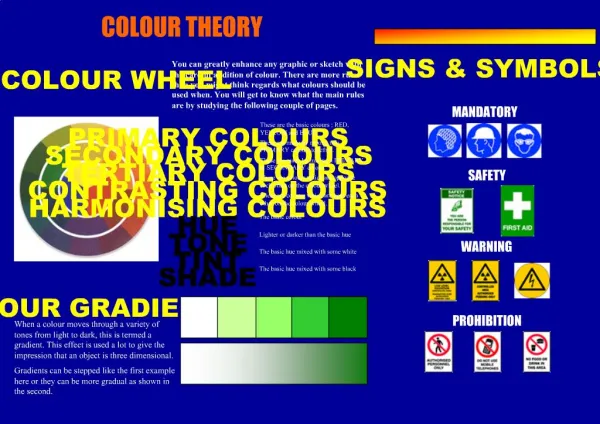
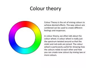
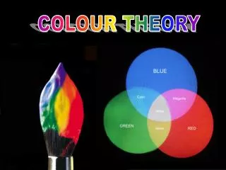
Hue • Hue refers to the color itself. Each different hue is a different reflected wavelength of light. White light broken in a prism has seven hues: red, orange, yellow, green, blue, indigo and violet. • White light occurs when all the wavelengths are reflected back to your eye, and black light occurs when no light is reflected to your eye. This is the physics of light.
Colour value • Color value refers to the lightness or darkness of the hue. • Adding white to a hue produces a high-value color, often called a tint. • Adding black to a hue produces a low-value color, often called a shade
Intensity • Intensity, also called chroma or saturation, refers to the brightness of a color. • A color is at full intensity when not mixed with black or white - a pure hue. • You can change the intensity of a color, making it duller or more neutral by adding gray to the color. You can also change the intensity of a color by adding its complement (this is the color found directly opposite on the traditional color wheel). When changing colors this way, the color produced is called a tone. • When you mix complementary colors together, you produce a dull tone. However, when you put complementary colors side by side, you increase their intensity. This effect is called simultaneous contrast - each color simultaneously intensifies the visual brightness of the other color.
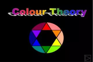
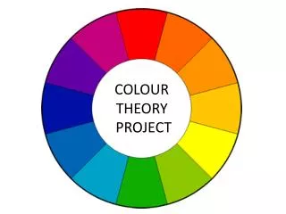
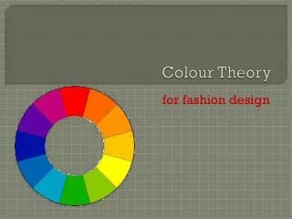
Color Schemes • Complementary • This color scheme involves the use of colors that are located opposite on the color wheel such as red and green, yellow and purple, or orange and blue. Complementary colors produce a very exciting, dynamic pattern.
Triadic • This color scheme involves the use of colors that are equally spaced on the color wheel. The primary colors of yellow, red and green could be used together in a color scheme to produce a lively result.
Color Discord • While monochromatic, analogous, complementary or triadic color schemes are considered to be harmonious, there are some color schemes considered dissonant. • Discordant colors are visually disturbing - we say they clash. Colors that are widely separated on the color wheel (but not complementary or triadic) are considered to be discordant. Discordant colors can be eye-catching and are often used for attention-getting devices in advertising
Shape and Colour Activity • Based on the lesson on design shape and colour, create a basic shape pattern which has no distinction between positive and negative space. Use a complementary colour scheme to represent each of the shapes. • Save you project in your H:\CommTech\Photoshop folder as ShapeAndColour.psd
