Enhancing Library Engagement Through Effective Branding and Campaign Design
This campaign aims to promote awareness of the library by implementing a visually striking and transmutable design identity. By exploring the importance of branding in mass communication, particularly how visual identity influences perceptions, the campaign seeks to counter the misconception that Google replaces librarians. Emphasizing the interaction between patrons and librarians, the initiative underscores the values of inquiry, integrity, and insight. The design, featuring dynamic letterforms, serves as an engaging invitation for library users to connect with resources and services uniquely.

Enhancing Library Engagement Through Effective Branding and Campaign Design
E N D
Presentation Transcript
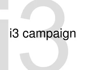
i3 i3 campaign
i3 intro
Advertising campaign. Promote awareness of the library. Convey a message about the library. Visually arresting, transmutable design. Multiple permutations. intro
i3 identity
What role does branding play in mass communication? What importance does visual identity have to an institution or company? How can a visual campaign change people’s perceptions and/or alter behavior? identity
This font Capitalis Pirata, is made entirely of parts of readily identified trademarks. It was developed by Plazm and distributed for free online, to generate discussion of the nature of visual consumer culture and the power of font design. identity
Harmless enough? McDonald’s didn't think so and, threatened legal action against Plazm unless it removed McDonald’s arches from the font set, claiming that its inclusion “diluted the authority of the brand.” identity
What does this illustrate? Did McDonald’s over-react to Plazm’s avante-art provocations? Have other companies under-reacted to Plazm’s possible “dilution of the authority of the brands?” What does it matter? identity
Companies strive to develop a relationship with consumers. Brand campaigns are instrumental in the development of this relationship. Consumer attention is a limited resource. Cradle to grave. identity
i3 idea
Counter the increasingly popular notion that Google is a surrogate for librarians. • What is the essence of patron/librarian interaction? • inquiry Research begins with a question. • integrityLibrarians bring professionalism and legitimacy to patron service. • insight= Inquiry + integrity • Inquiry, integrity, and insight are a process, not a product. idea
i3 implementing
With the idea or concept in mind, we began an “i” letterform study. In short, letters are treated as shapes and arranged in patterns. In understanding how we arrived at the design, it is helpful to think of visual elements as having a language of their own. A simple visual question. Which is friendlier, a circle or square? A more complex visual question is how to represent inquiry, integrity, and insight graphically. implementing
Its overall shape suggests a triangle, the geometric object with the fewest straight lines. Visually, it signifies parsimony, strength, stability.
It is multidimensional. The i’s are pointing along different axes, with its center providing a sense of orientation in space.
It is dynamic. Letterforms force the eye to move about the design.
It is monochromatic, the antithesis of Google. It is arresting. It is modular. You andpatronare “i”. Italicizedi’s are smooth and have a human quality.
i3 instances
Posters in academic departments and the Union. Posters to include library users with the i3 branding. Newspaper advertisements in the MaineCampus. Highlighters, mouse pads, bookmarks, etc. UMaine Today magazine. UMaine web site: Current student resources http://www.umaine.edu/current/ Online postcards using FirstClass sent to students. instances
Banners at our entrances or lobbies. Oakes room posters or table tents. Orientation materials. Incorporate into broadsheet for bookstore and others. Faculty brochure. Postcards to faculty. Liaisons to departments. Promotional materials. instances
i3 inquiry