Ad Layout Design
Ad Layout Design. A rough draft that show the general arrangement and appearance of a finished ad. Developing Print Layouts. Use color More appealing Color can increase reading by 80% Increase cost by 35% Selecting Typeface and Size Headline are large and bold Check Ad Proof

Ad Layout Design
E N D
Presentation Transcript
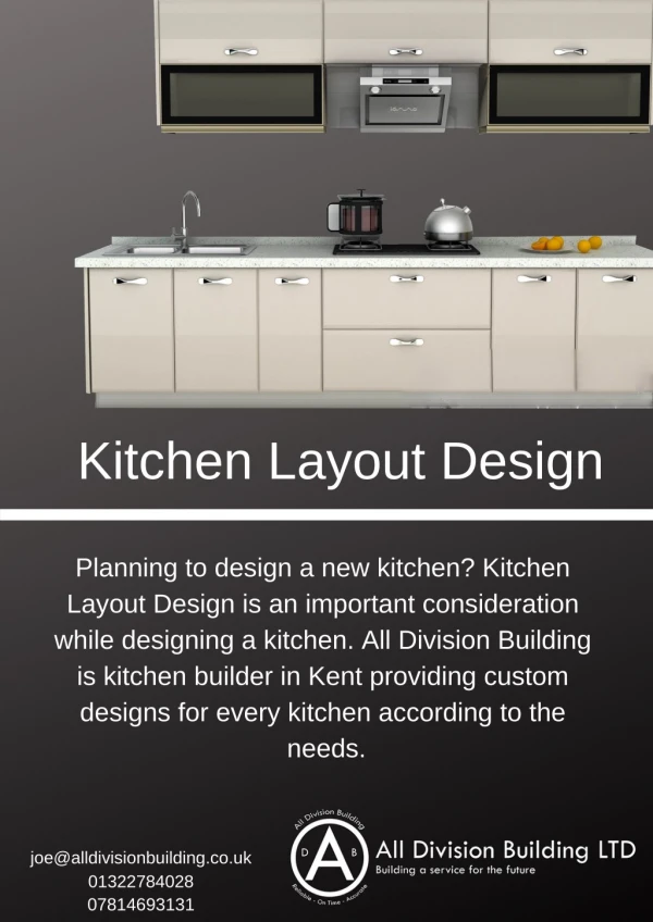
Ad Layout Design A rough draft that show the general arrangement and appearance of a finished ad
Developing Print Layouts Use color • More appealing • Color can increase reading by 80% • Increase cost by 35% Selecting Typeface and Size • Headline are large and bold Check Ad Proof • Shows how ad will appear
Evaluating Proof • Ad should be bold enough to stand out • Overall layout should look clean an uncluttered • Should be easy to read • Signature should be apparent and distinctive • Message and image projected should match target audience
Types of Layout • Standard – combination of copy and illustration • Editorial – based on words w/ little illustrations • Poster – dominated by illustration • Picture clusters – groups of pictures • Comic – drawn illustrations
Layout Guidlines • Illustrations make up 50%+ of ad • Headlines 10-15% of ad • Logos usually at bottom center or right • No more than 3 font types • Optical Center • Control eye movement
Ad Essentials • Make ad memorable • Use a dominate element to grab attention • Use white space • Make copy complete • Call to action
