Effective Website Design: A Balancing Act of Functionality and Aesthetics
Explore the key elements that make a good website, including functionality, layout design, and site navigation. Learn from examples of bad websites and understand why websites load slowly to create an engaging online experience for visitors. Discover the impact of colors on user behavior and mood to enhance website design success.

Effective Website Design: A Balancing Act of Functionality and Aesthetics
E N D
Presentation Transcript
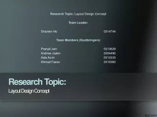
Research Topic: Layout Design Concept Team Leader: Shareen Ho 0314744 Team Members (Dustbringers) Pranjal Jain 0313629 Andrew Jaden 0304490 Aida Azrin0313333 Ahmad Faeez 0315360 LayoutDesign Concept ResearchTopic:
A good website should:(Don’t bore your visitors) • Be not too simple or confusing. • Some designs are equal to ‘small’ companies. • Be functional.
Be not too simple or confusing Balance between both aesthetics and functionality (featured photos and easy navigation) (http://www.steamcommunity.com)
Design equals to a ‘small’ company (Association Fallacy) To constitute a given company as being ‘small’ (http://www.fifa.com)
Be functional It has to load quickly, readable and straightforward (http://www.zonalmarking.net)
Examples of Bad Websites: (http://www.mimarch.net) • Nothing happens when graphics are clicked because home page has 225 files and eats up 25Mb of bandwidth 25 megabytes. • Uncontrollable scrolling mechanisms.
Examples of Bad Websites: (http://www.spectrumpowderworks.com/) • Contrast is bad. • Navigation button and the “About Us” below is hard to read because of colour. • Bland and not attention-grabbing.
Examples of Bad Websites: (http://www.wrdaonline.org//) • Too many colours. • Colours become painful towards eyes. • Colour scheme doesn’t have an aim (to whom, for what)
Why Websites Load Slowly:(Don’t make them wait) Amount of content A page with a lot of pictures or flash animations takes longer to load) Too many plugins Extensions that power animations and videos can also cause a site to load slowly. Bloated Javascript & CSS Redundant line breaks and extra space in the coding will also cause a site's performance to drop.
Website Navigation3 major questions on navigation: Where am I? • Not all visitors will be directed to the home page (but to an article instead) from Wikipedia. • The CNN logo acts as a home button to direct visitors to the homepage. • The highlighted button acts as a section title (Middle East)
Website Navigation3 major questions on navigation: Where can I go from here? • Links should be in context for visitors to plan their next move to reduce effect while navigating a website • Different types of products are organized into sections, with drop down menus further separating them into categories and brands, making it more ambiguous for the customer to find what they want.
(http://www.zalora.com.my) DROPDOWN MENU
Website Navigation3 major questions on navigation: Where was I already? • To avoid confusion, default, non-visited links are usually blue and visited links will turn purple • This reminder can be seen on the online encyclopedia, Wikipedia, where there is no need for tiring, wild guessing which will lead to a loss of interest and time
Visited vs. Unvisited Link Unvisited link Blue Visited link Purple
Bad Navigation Sites: (http://www.dsrny.com/) Mystery Meat Navigation (destination of the link is not visible until the user points their cursor at it) causes a lack of user-centred design, focusing on aesthetic appearance, white space and the concealment of significant information over basic practicality and functionality
Bad Navigation Sites: (http://cavs.mit.edu/) The calendar stops at February 2011, and the calendar archives are missing 2010 entirely. The home page mentions 2008. Plus the design in the middle is slightly off. Hence, bad navigation to land on a different page.
Bad Navigation Sites: (http://sundaymorning.ekwc.nl/) The arrows on the illustration above show the menu items on the “job opportunities” page (located under “us”). If window isn’t wide enough, the links disappear and isn’t accessible. Mystery Meat: “Here”, “Others”, “Now” and “Seek” do not adequately explain the content within.
The Relation of Colors on Visitors • According to KISSmetrics, colors have influence over attitudes, emotions, moods and resulting behavior • 90% visitors evaluations are related to color • It is advised to stay within the 216-color pallet since not all web browsers share the same 256-color pallet • Contrasting pixels of two colors to create an extra illusion of color • Avoid dithering (makes texts hard to read)
Women like blue, green and purple, whereas they dislike gray, brown and orange. • Woman’s Day uses all of the women’s favorite color as it has a female customer base. (http:www.womansday.com/)
Men like blue, green and black, whereas they dislike brown, orange and purple. • AskMen.com uses two of men’s favorite colors, inviting their target customers. (http://www.askmen.com/)
Blue relates to trust. Hence, if you want viewers to trust you, use blue. • Facebook, the world’s most popular social network, mainly uses blue. (http:www.facebook.com/)
Yellow relates to warnings, or simply just a heightened state of emotion and response. The Chicago Tribune also reported that “Yellow activates the anxiety center of the brain”. (http://www.roome.co.uk/)
Most warning signs use yellow to call for attention and heighten emotion or response.
Green relates to the environment or outdoor products. • Sproutlet.io an environmental group, uses a green background as the organization is very ‘green’ oriented, and has a very environmental-friendly purpose. (http://www.sproutlet.io) (http://www.roome.co.uk/)
Orange relates to impulse or a sense of haste. • As you can see here, Sunkist uses the orange background to highlight something impulsive like their own products. (http://www.sunkist.com/) (http://www.roome.co.uk/)
Black relates to luxury and value. • Oakley, one of the most luxurious and famous sunglasses brand, has a website using a lot of black. (http://www.oakley.com/) (http://www.roome.co.uk/)
White relates to a sense of spaciousness, breathability and freedom. • The color white represents the professionalism of one’s company like The Sum which specializes on clean design and white spaces. (http://thesum.ca/) (http://www.roome.co.uk/)
Loading The author of the article states that to attract visitors to a site, one should not add in too much content to it - which is to say, it should not be bogged down with too much that it takes time to load, which may cause the visitor to lose interest. The author then goes on to say that one way to figure out whether your site has too much content is to do a ‘breath test’ of sorts; with a reliable Internet connection, hold your breath and then load the website, and should you need to breathe before it’s fully loaded, it means that it’s failed the test. Alternatively, the author also suggests that optimally, one’s page should be no bigger than 50K.
Finally, the author then goes on to conclude that if an image is there for the sole purpose of making one’s page ‘look nice’ rather than to ‘sell’, it’s best to pull it off, as ultimately aesthetics matter less than sheer convenience. An example of a site that follows this rule is Lazada - it loads quickly without losing anything major looks-wise: (http://www.lazada.com.my/)
In contrast, another page that fails to follow the rules mentioned above is Buzzfeed. Their main page lists a long line of articles, all of which have images of their own, and this causes it to be somewhat bloated: (http://www.buzzfeed.com/)
References • Anon., n.d.Web Style Guide: Dithering. [Online] Available at: http://webstyleguide.com/wsg2/graphics/dither.html[Accessed 3 October 2014]. • Pate, N. & Puri, R., n.d.QuickSprout: The Complete Guide to Understanding Consumer Psychology. [Online] Available at: http://www.quicksprout.com/the-complete-guide-to-understand-customer-psychology-chapter-4/[Accessed 3 October 2014]. • Smith, J., n.d.KISSmetrics: How to Use the Psychology of Color to Increase Website Conversions. [Online] Available at: https://blog.kissmetrics.com/psychology-of-color-and-conversions/[Accessed 3 October 2014]. • Staff, H., n.d.HTMLGoodies: Consistent Colors For Your Site - All You Need To Know About Web Safe Colors. [Online] Available at: http://www.htmlgoodies.com/tutorials/web_graphics/consistent-colors-for-your-site-all-you-need-to-know-about-web-safe-colors.html[Accessed 3 October 2014]. • Water, A. V. d., 1992. Chicago Tribune: Avoid The Color Yellow Unless You Like Hearing Babies Cry. [Online] Available at: http://articles.chicagotribune.com/1992-03-15/news/9201240411_1_pale-blues-carlton-wagner-color-research[Accessed 3 October 2014].
References • Edition.cnn.com, 2014. CNN.com International - Breaking, World, Business, Sports, Entertainment and Video News. [online] Available at: <http://edition.cnn.com> [Accessed 3 October 2014]. • Zalora.com.my, 2014. ONLINE SHOPPING MALAYSIA | ZALORA Malaysia & Brunei. [online] Available at: <http://www.zalora.com.my> [Accessed 3 October 2014]. • Wikipedia, 2014. Main Page. [online] Available at: <http://www.http://en.wikipedia.org/wiki/Main_Page> [Accessed 3 October 2014]. • FédérationInternationale de Football Association, 2014. FIFA.com. [online] Available at <http://www.fifa.com/index.html> [Accessed 2 October 2014]. • Steam, 2014. Welcome to Steam. [online] Available at: <http://store.steampowered.com/> [Accessed 2 October 2014]. • Zonal Marking, 2014. Zonal Marking. [online] Available at: <http://zonalmarking.net/> [Accessed 2 October 2014].