Proximity
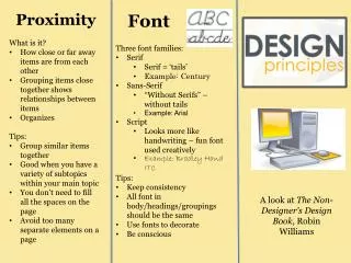
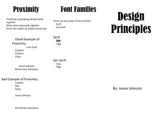
Proximity. Font Families. Design Principles. Items related to each other should be grouped together By using proximity you create more appealing white space If there are more than 3-5 items on the page try to group more things together

Proximity
E N D
Presentation Transcript
Proximity Font Families Design Principles • Items related to each other should be grouped together • By using proximity you create more appealing white space • If there are more than 3-5 items on the page try to group more things together • Try using the space before and after feature on word instead of putting in hard or soft returns. • Don’t use! • Soft returns Shift + Enter • Hard returns Enter • These are the two font families: • San Serif-Without feet at the bottom of letters • Example: Calibri • Serif-Font has feet at the end of the letters • Example: Bookman Old Style • You can only use 2 types of font styles in one project. For example I am using a Serif font for my headings and the body is a san serif font. Using more than two fonts in one project makes the project look sloppy and hard to follow. Ali Machlica February 22, 2014
Contrast Repetition Alignment • Contrast has two principles: • Create an interest on the page • More interesting the more likely it will be read • Organization • Should be logical flow from one item to another • Our eyes like contrast therefore it should aid in our understanding of the paper at hand not confuse the reader • Purpose of repetition: • Unify • Add visual interest • Must be consistent • Don’t repeat too much so the document isn’t so overwheleming • Very critical to use in multi-page documents but can also be used to tie every thing together in one-page documents. • Basic purpose: • Unify • Organize • Be conscious of where you place elements. • Strong alignment creates a sophisticated, formal, and fun look. It helps bring everything together just like repetition.