Download
1 / 23
340 likes | 624 Vues
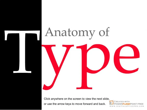
Anatomy of Type. Anne Metcalf. Objective. Students will be able to recognize the characteristics that distinguishes one typeface from another: Baseline Cap height x-height Ascender Descender Utah Desktop Publishing Core, Grades 8-12, Standard 04, Objective 0402. Anticipatory Set.

E N D
Anatomy of Type Anne Metcalf
Objective • Students will be able to recognize the characteristics that distinguishes one typeface from another: • Baseline • Cap height • x-height • Ascender • Descender • Utah Desktop Publishing Core, Grades 8-12, Standard 04, Objective 0402
Anticipatory Set • We are surrounded by typefaces: in magazines, newspapers, books, and billboards. • How are typefaces similar and how are they different?
Teaching—Baseline • Baseline is the invisible line upon which type sits.
Teaching—Cap Height • Cap height is the height of the capital letters.
Teaching—x-height • The x-height is the distance between the baseline of a line of type and tops of the main body of lower case letters (i.e. excluding ascenders and descenders).
Teaching—x-height continued • Typefaces of the same point size may have different x-height. • These are the same point size.
Teaching—Ascender • Ascenders are the strokes that rise above the x-height.
Teaching—Descender • Descenders are the strokes that dip below the baseline.
What is this? • the baseline • the cap height • the x-height • ascenders • descenders
What is this? • the baseline • the cap height • the x-height • ascenders • descenders
What is this? • the baseline • the cap height • the x-height • ascenders • descenders
What is this? • the baseline • the cap height • the x-height • ascenders • descenders
What is this? • the baseline • the cap height • the x-height • ascenders • descenders
Draw the baseline Draw a line showing the cap height Shade in the area of the x-height Label any ascenders and descenders “I think and think for months and years. Ninety-nine times, the conclusion is false. The hundredth time I am right.” Albert Einstein Guided Practice *Students will mark their own handout.
Closure • You have learned how to recognize the characteristics that distinguishes one typeface from another: • Baseline • Cap height • x-height • Ascender • Descender
Independent Practice • Find a typeface for each of the following descriptions: • A typeface that does not follow a straight baseline. • A typeface that has a high cap height in relationship to its x-height. • A typeface that has a large x-height in relationship to its cap height. • A typeface that has simple, straight ascenders. • A typeface that has elaborate, curved descenders.
Good Job! The arrow is pointing to the baseline.
Good Job! The arrows are pointing to the cap height of the “G” and the “B.”
Good Job! The blue area is the x-height
Good Job! The arrows are points to the ascending strokes on the “t” and the “h.”
Good Job! The arrows are pointing to the descending strokes on the “y” and the “p.”