Download
1 / 17
170 likes | 307 Vues
Chapter 5: Describing Distributions Numerically. Finding the Center. When we think of a typical value, we usually think of the center of the distribution. If a distribution is unimodal and symmetric, it’s easy to find the center – It’s just the center of symmetry. Measures of Center.

E N D
Chapter 5: Describing Distributions Numerically
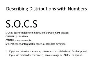
Finding the Center • When we think of a typical value, we usually think of the center of the distribution. • If a distribution is unimodal and symmetric, it’s easy to find the center – • It’s just the center of symmetry
Measures of Center Midrange (average of minimum and maximum values) • Usually not a good choice because it is very sensitive to skewed distributions and outliers
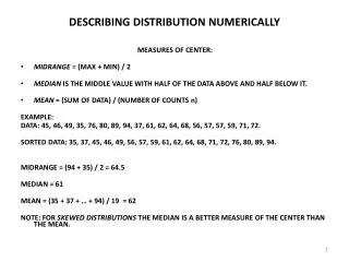
Measures of Center Median (the value with exactly half the data values above it and half below it) It is the middle data value (once the data values have been ordered) that divides the histogram into two equal areas. It has the same units as the data
Measures of Spread • Always report a measure of spread along with a measure of center when describing a distribution numerically. • The range of the data is the difference between the maximum and minimum values: • Range = max – min • A disadvantage of the range is that a single extreme value can make it very large and, thus, not representative of the data overall.
Spread: The Interquartile Range • The interquartile range (IQR) lets us ignore extreme data values and concentrate on the middle of the data. • To find the IQR, we first need to know what quartiles are…
Quartiles divide the data into four equal sections. • The lower quartile is the median of the half of the data below the median. • The upper quartile is the median of the half of the data above the median. • The difference between the quartiles is the IQR, so • IQR = upper quartile – lower quartile If n is odd, exclude the median when finding the quartiles!
The lower and upper quartiles are the 25th and 75thpercentiles of the data, so… • The IQR contains the middle 50% of the values of the distribution, as shown in Figure 5.3 from the text: The pth percentile of a distribution is the value with p percent of the observations less than it. When looking at the histogram to the right, think in terms of area. The center section, representing the middle 50%, accounts for 50% of the total area of all the bars combined.
The Five-Number Summary • The five-number summary of a distribution reports its median, quartiles, and extremes (maximum and minimum). A boxplot is a graphical display of the five-number summary.
Why use boxplots? ease of construction convenient handling of outliers construction is not subjective (like histograms) Used with medium or large size data sets (n > 10) useful for comparative displays
Disadvantage of boxplots does not retain the individual observations should not be used with small data sets (n < 10)
Constructing Boxplots • Draw a single vertical (or horizontal) axis spanning the range of the data. • Draw short horizontal lines at the lower and upper quartiles and at the median. • Then connect them with vertical lines to form a box.
Erect “fences” around the main part of the data. • The upper fence is 1.5 IQRs above the upper quartile. • The lower fence is 1.5 IQRs below the lower quartile. • Note: the fences only help with constructing the boxplot and should not appear in the final display.
Use the fences to grow “whiskers.” • Draw lines from the ends of the box up and down to the most extreme data values found INSIDE the fences. • If a data value falls outside one of the fences, we do not connect it with a whisker.
Add the outliers by displaying any data values beyond the fences with special symbols. • We often use a different symbol for “far outliers” that are farther than 3 IQRs from the quartiles.
A report from the U.S. Department of Justice gave the following percent increase in federal prison populations in 20 northeastern & mid-western states in 1999. 5.9 1.3 5.0 5.9 4.5 5.6 4.1 6.3 4.8 6.9 4.5 3.5 7.2 6.4 5.5 5.3 8.0 4.4 7.2 3.2 Create a modified boxplot. Describe the distribution.
Homework Chapter 5 Exercises (p. 73) # 4 (show work by hand) # 6 (write your answer in context in complete sentences) # 11