Download
1 / 24
240 likes | 376 Vues
Evaluation. By Karen Dodd. In what ways does your media product use, develop or challenge forms and conventions of real media products?. LINK TO MUSIC VIDEO NARRATION ANALYSIS. LINK TO VIDEO OF CD COVER NARRATION ANALYSIS . LINK TO VIDEO OF WEBSITE NARRATION ANALYSIS . CONCLUSION.

E N D
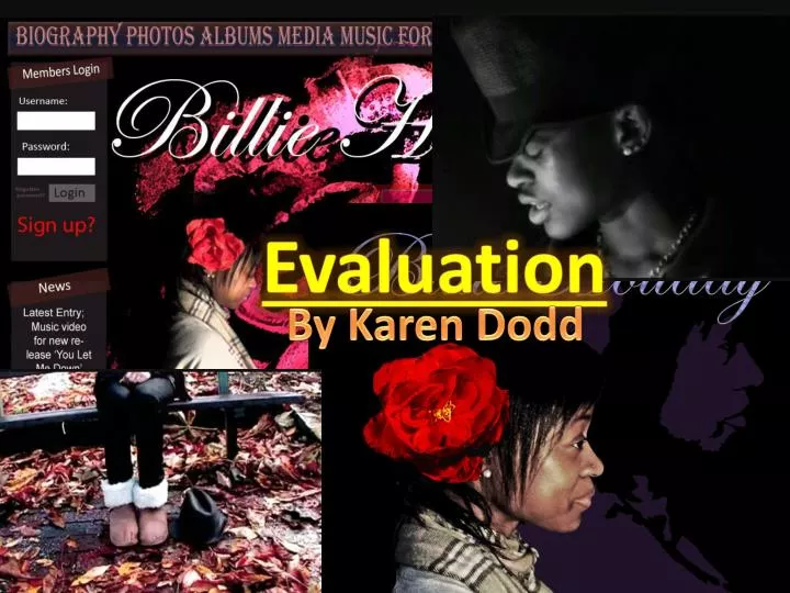
Evaluation By Karen Dodd
In what ways does your media product use, develop or challenge forms and conventions of real media products?
LINK TO MUSIC VIDEO NARRATION ANALYSIS LINK TO VIDEO OF CD COVER NARRATION ANALYSIS LINK TO VIDEO OF WEBSITE NARRATION ANALYSIS
CONCLUSION All my products I have formed to be close in conventions to my exemplar artists whom all are modern but with influences in jazz music. The unconventional decisions made were all as a result of Research and Planning-stage gathered feedback from my target audience usually, thus are more likely to appeal to this target audience. Overall, however I would say that my products are fairly conventional and compare well to real products.
How effective is the combination of your main product (music video) and ancillary texts (the website & CD cover)?
The hat is in the music video and on the CD cover’s back but not on the website. Having the hat not on website was not a deliberate decision and one I feel ruins the cohesiveness of the three products somewhat. Same font used (obviously not in the music video though seen as this medium is picture based rather than wording). This is a common thing to do amongst artists so that their name is recognisable by appearance of the font type also so increases recognition. Red flower appeared in all. This was one of the most significant correlations between them as it is likely to be best recognised due to its vivid colour. White flowers were the brand of Billie Holiday. This Brand we wanted to re-invent because white has connotations of innocence which we felt wouldn’t appeal as much as the colour red which has connotations of love and passion. White flowers; the brand of Billie Holiday and jazz artists featured in 2 out of 3 products. Not having it in the CD cover isn’t too cohesive-destroying however because the CD cover does feature the more impacting red flower. Same clothing in all products. This is a good characteristic of cohesiveness because it makes the person on them more recognisable which is important, especially for artists wanting to be introduced to the public, or, as in this case, introduced to the youth.
Feedback on cohesiveness from target audience Those who I emailed with the set questions about my products I asked to comment on how well they thought my products linked together cohesively to help me with this question of the evaluation. Here’s my results from this... My target audience do believe they all three go cohesively together as a package. This shows members of the public should be able to easily connect all three as the same cause and artist.
CONCLUSION I have been able to identify many cohesive structure between my three creations and feedback from the target audience confirms they are both noticeable and obvious. There are some areas the cohesion could be improved however such as having the hat featured in the website design alongside the others, although overall the cohesion is successful. This means a brand has been identified for our artist and thus when trying to get her popular amongst young people it will be an easier job to make her recognisable.
CLICK TO VIEW VIDEO OF FACEBOOK-GATHERED FEEDBACK Needing more feedback I emailed some people with these set questions and shall now relate to the replies I got in my analysis
MUSIC VIDEO The video having a narrative was very popular as many found it ‘interesting’ as they felt not many videos included much of a narrative. Furthermore they felt it suited the song . One area clearly popular were the scenes in which the flowers and ripped up letters appears to fly into the actress’ hands by the use of reversing the footage. This means our aim to have some creative oddity within the video, like Adele’s was at the right amount of odd and thus was well received. The reasons they gave for this included they felt it was and Another of the areas praised in the music video were the bits filmed in a studio and altered during the editing stages to be black and white
Some feedback even noted the convention of having a range of different scenes and praised this. GENRE? The only problem with this was that we received one comment that stated they felt it seemed a feature of a different genre of music to the one we wanted to demonstrate. Because of the black and white sections Although, this comparison may have been made because young people aren’t generally exposed to the genre of jazz and therefore would compare the video to something they were more familiar with, like R & B, as in this case. Besides, for the most part, people were easily able to identify the genre from all three of my products from things such as use of black and white footage and the hat present in the music video and CD cover. Additionally, they realised that although they were jazz the design was made so as to appear more “mainstream” so as to suit a younger target audience.
POSITIVES FOR ALL The colour schemes which I used for the products of having girl-specific tones such as pink and purple were well received in all three products. And the usage of the same font for “Billie Holiday” as on her website for the CD cover and Website was praised because people found it an appealing font. A certain feature of the website tended to be pointed out as a good idea too. This feature being the “members” section to the page. People commented how they thought it was quite a rare yet excellent feature. Other areas praised was on the CD cover the purple silhouette behind the actress as they felt it added more colour, and on the website the layout which they felt was encouraging of easy navigation
TARGET AUDIENCE? One key question was whether those who gave feedback could identify who the target audience probably was for all the products. I was pleased to observe they all reported it to be our target demographic; 16-25 females. They attributed the age to elements such as bright colours and the age of the model/actress.. For gender they attributed it to use of colour, the flower, the font (for Billie Holiday) and the artist being female. There was only one issue, one person felt, and that was with the video which they deemed to be perhaps to be a little too slow cut for that age group.
negatives Music Video Problems with the music video included that some of skill in shot type needed working on. One scene in particular was identified as the main example; the scene in which the actress put the flower in her hair. The shot type admittedly was a bit too tight and framed badly. CD cover With the CD cover criticisms included those of the clothing of the model thinking they did not suit the style at all. The other criticism which I agree very much on looking back over it is that the back of the CD cover’s silhouette image is red whilst the silhouette on the front is purple. This makes the cover therefore look quite inconsistent as a result.
Website With the website there was no clear pattern of criticism being formed unlike the other two. The comments here included a criticism of the overuse of the colour pink. Other comments however had liked the colour usage. Someone else felt that the picture of the artist should have been bigger. This seems reasonable as on most websites it is the photo of the artist which is central to attention. The last criticism was that the theme of using a flower was overused within the website.
CONCLUSION For the most part, despite a few criticisms, my products were effective and successful in their aims of displaying an old-fasioned artist in a way that would appeal to a young audience. This worked so well in some cases that people said they liked the remix song and even in one case someone has said: Which shows the aim definatelywas a success on at least one person!
How did you use media technologies in the construction and research, planning and evaluation stages?
Planning and research stage LINK TO WEBSITES USED IN PROJECT ANALYSIS Used a DICTAPHONE to interview our target audience on specific questions. This was much easier than getting written responses especially as people are more likely to answer genuinely due to having less time to articulate their answers. This information was vital as it set the guidelines of how I was to go about the creation of the products. HTML: To manage my Wordpress blog and in preperation of the website I would later create I looked up various HTML codes such as how to embed videos, change font colours, make bullet points etc MICROSOFT WORD AND EXCEL I used to form charts out of my feedback data that I received. This allowed exploration of various forms of presenting my findings.
Construction stage We successfully learnt how to use and set up a tripod. We even tried filming without one to see how much better the picture is being kept still. The dolly we didn’t really use but learnt how to set that up too anyway. When filming we were equipped with a CAMCORDER, TRIPOD and DOLLY. We all learnt more about filming through this and also technical things such as how to set up the camera and load batteries, tapes etc We reordered footage onto TAPES. We then learnt how to transfer our footage onto a MAC computer and how to “Log and Capture” it on Final Cut Pro. We used a LAMP in order to control lighting and learnt how good an effect it has on the video. Footage took aided by this light was complimented greatly. For creating the music video I used a MAC COMPUTER for the first time. Through this I learnt how to use this kind of computer. Our plug-in HARDRIVE is where we kept all our music video footage files. This included the raw footage and final edits. MEMORY STICKS we used to transfer our files from home computer to college computers and share files amongst ourselves. During the making of the CD cover we had a little TV SCREEN on which to watch our music video’s formation to check it looked alright.
FINAL CUT PRO we used to edit our music video. It was tricky to use at first but I am now fairly confident in creating videos with it. Creation of the CD cover and website appearance was performed with PHOTOSHOP and PHOTOSHOP ELEMENTS. I found Elements easier to use of the two but developed my skills and understanding of both versions of the program so that I am now confident using it. Used a KEYBOARD DESIGNED FOR FINAL CUT PRO which made editing easier once we got used to it.
ALL 3 STAGES MY BELOVED CAM CORDER: Throughout the construction stages I would enjoy the irony of filming us filming. As well as us editing. This footage all then was put into our ‘behind the scenes’ which comes as use to document our progress and provide evidence we actually made the finished video! The other use of my camera was this very evaluation stage. I don’t have a mic to record narration so therefore I would film the audio on my camera and convert this into an audio file with. This audio then was edited on Windows Movie Maker. From this I gained vast more audio editing experience alongside general filming experience. • WINDOWS MOVIE MAKER: Throughout I have used this software to from videos to communicate findings and evaluate. Things created through it include; • Vox pops final edit • Behind the scene video • Evaluations of my finished products • Analysis of my Facebook feedback to my finished products • Analysis of the website I used • My editing using this program and skills were therefore enhanced greatly through so much practise, which came to use when editing the music video. • MICROSOFT POWERPOINT: • This program has enabled me to analyse and communicate in more dynamic and interesting style. • I used it for; • My textual analysis in Research & Planning • To present my storyboard easilly • When looking at other music video in P & R • This very evaluation. • I now find I am able to create Powerpoints much faster due to such practise had in the project. • MICROSOFT POWERPOINT: • This program has enabled me to analyse and communicate in more dynamic and interesting style. • I used it for; • My textual analysis in Research & Planning • To present my storyboard easilly • When looking at other music video in P & R • This very evaluation. • I now find I am able to create Powerpoints much faster due to such practise had in the project. PAINT: The quickest, easier place to paste captured SCREEN SHOT photos and save them. This has been useful to show my work develop as it goes along and
CONCLUSION From Planning & Research to Construction to the Evaluation media technology has been a very important part of it all. I was introduced to technologies completely new to me such as a MAC computer and Final Cut Pro and with these and in all the items and software I used I was able to harness and improve my skill in them to find myself confident in the usage of all.
THE END (at last!!)