Download
1 / 10
100 likes | 110 Vues
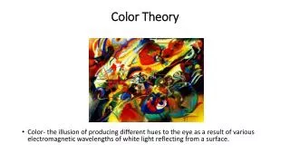
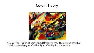
Utilizing color theory is a highly impactful approach for creating designs that are both meaningful and unforgettable. Colors possess the ability to evoke emotions, communicate messages, and shape the overall perception of a design. By comprehending the principles of color theory, one can effectively tap into the power of colors to develop designs that deeply connect with their intended audience.

E N D
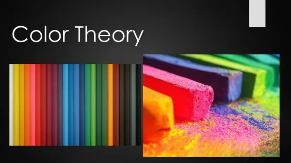
Using Color Theory To Create Meaningful And Memorable Designs
Utilizing color theory is a highly impactful approach for creating designs that are both meaningful and unforgettable. Colors possess the ability to evoke emotions, communicate messages, and shape the overall perception of a design. By comprehending the principles of color theory, one can effectively tap into the power of colors to develop designs that deeply connect with their intended audience. Let us see some of the fundamental concepts to keep in mind.
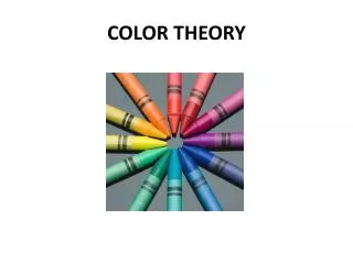
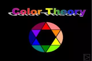
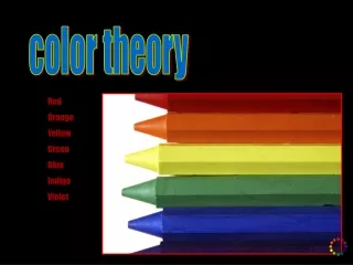
Color Wheel The color wheel is an essential resource for comprehending and using colors. It takes the form of a circular diagram that arranges colors according to their connections, providing valuable guidance for developing harmonious color schemes. The color wheel consists of primary, secondary, and tertiary colours, each plays a significant role in color theory.
Colour Symbolism Colors carry symbolic meanings that are tied to them. For instance, red can symbolize passion or danger, while blue often represents calmness or trust. When selecting colors, it’s crucial to consider the emotions and messages you wish to evoke. However, it’s important to remember that the symbolic associations of colors can differ based on cultural and personal factors. Therefore, it’s vital to take into account the preferences and interpretations of your specific audience.
Colour Contrast To make designs visually striking and easily readable, contrast plays a vital role. Contrast can be achieved by incorporating differences in hue, value (lightness/darkness), and saturation (intensity) of colors. For instance, using a dark color on a light background enhances legibility. Skillful utilization of contrast can also help direct attention to specific elements or establish focal points within a design.
Color Psychology The choice of colors can impact people’s moods and behaviors on a psychological level. Warm colors like red, orange, and yellow are often associated with energy and excitement, while cool colors such as blue, green, and purple tend to evoke feelings of calmness and relaxation. By comprehending the psychological effects of colors, you can align your design with the intended emotional response you wish to evoke.
Cultural Considerations The meanings of colors can vary across different cultures. For instance, in Western cultures, white is commonly associated with purity, while in certain Eastern cultures, it symbolizes mourning. If your design targets a global audience, it is essential to conduct research on color symbolism in various cultures. This ensures that your color choices are appropriate and well-received, considering the cultural perspectives and preferences of your audience.
Color Accessibility When designing digitally, it is crucial to prioritize accessibility guidelines, particularly concerning color choices. Pay attention to contrast ratios between text and background colors to ensure readability for individuals with visual impairments. Additionally, it is important to provide alternative methods for conveying information, such as utilizing patterns or labels, to accommodate individuals with color blindness. By considering these factors, you can create designs that are inclusive and accessible to a wider range of users.
Colour Harmony Color harmony means choosing colors that look good together in a design. There are different ways to achieve color harmony, like using colors that are opposites on the color wheel, colors that are next to each other, or three colors that are evenly spaced. When colors harmonize, they create balance and make the design look unified and pleasing to the eye. You can also approach a best Graphic design Company in Coimbatore or in your nearby places to get the finest output for your project.
Conclusion In conclusion, color theory holds immense potential in shaping the significance and impact of designs. Designers who grasp and apply the principles of color theory can craft harmonious color palettes, evoke specific emotions and messages, and establish visual contrast to guide viewers attention. It is essential to consider the cultural associations and individual interpretations of colors to ensure effective communication with the intended audience. We Trioticz is the Best Graphic design Company Chennai & Coimbatore. We offer the best results to our clients and also, we are known as the finest Branding Agency in Coimbatore. Feel free to contact us anytime we are always available to provide assistance.