Web Design -- Continuing Studies CS 21
The Process of Web Design - slides 6-9. Pre-design Work - slides 10-11 ... Web users want control over the online material -- they want to seamlessly obtain the ...

Web Design -- Continuing Studies CS 21
E N D
Presentation Transcript
- 1
Slide 1:Web Design -- Continuing Studies CS 21
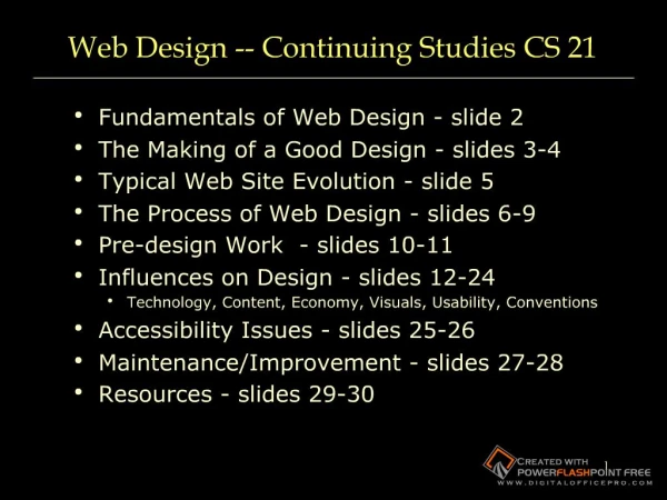
Fundamentals of Web Design - slide 2 The Making of a Good Design - slides 3-4 Typical Web Site Evolution - slide 5 The Process of Web Design - slides 6-9 Pre-design Work - slides 10-11 Influences on Design - slides 12-24 Technology, Content, Economy, Visuals, Usability, Conventions Accessibility Issues - slides 25-26 Maintenance/Improvement - slides 27-28 Resources - slides 29-30 After discussing what we�ll be talking about today, on 2 screens, show examples of both good design and bad design. Bad design=show webpagesthatsuck.com, http://www.webpagesthatsuck.com/wpts1/, http://www.ty.com, http://www.cuttingedgebankcard.com/, http://www.daltonmailingservice.com/ Good design = show coolhomepages.com, kinkos, gap, disney, https://itss.stanford.edu/organization/clientsupport/dtl/training/who.html http://coursework.stanford.eduAfter discussing what we�ll be talking about today, on 2 screens, show examples of both good design and bad design. Bad design=show webpagesthatsuck.com, http://www.webpagesthatsuck.com/wpts1/, http://www.ty.com, http://www.cuttingedgebankcard.com/, http://www.daltonmailingservice.com/ Good design = show coolhomepages.com, kinkos, gap, disney, https://itss.stanford.edu/organization/clientsupport/dtl/training/who.html http://coursework.stanford.edu
2Slide 2:Fundamentals of Web Design
Purpose of Web Design Inform/Educate Persuade Influences on Web Design Technology Used by Both Target Audience and Designer Nature of the Content Economy (Budget, Time, and Scale of the Project) Amount and Type of Visuals Included Meeting Usability Objectives
3Slide 3:The Making of a Good Design
Content is important, but content alone will not make your site work. Biggest mistake in web design is to build a site for the designer, not the user. Users expect sites to be flawless. Looks matter. Site should be pleasing to the eye. Site should evoke trust and value.Biggest mistake in web design is to build a site for the designer, not the user. Users expect sites to be flawless. Looks matter. Site should be pleasing to the eye. Site should evoke trust and value.
4Slide 4:The Making of a Good Design
Content is important, but content alone will not make your site work. Good Design is: Understandable Interesting Easy to use Uniform in look and feel Done from a visitor�s point of view: WYSIWYW (What You See Is What You WANT) Biggest mistake in web design is to build a site for the designer, not the user. Users expect sites to be flawless. Looks matter. Site should be pleasing to the eye. Site should evoke trust and value.Biggest mistake in web design is to build a site for the designer, not the user. Users expect sites to be flawless. Looks matter. Site should be pleasing to the eye. Site should evoke trust and value.
5Slide 5:Good Design Maxims
�Rules� are only guidelines -- no single model fits every situation, and there is no such thing as the �right� way to create a web site. Remember WYSIWYW Web users want control over the online material -- they want to seamlessly obtain the information they need. Don�t force visitors down a specific path -- give them control.
6Slide 6:Typical Website Evolution
Generation 1 -- replaces paper information Generation 2 -- has flashy elements Generation 3 -- is bleeding edge, causing content to suffer Generation 4 -- content and technology are integrated Ideally, try to skip the problems of Generations 1-3 by planning your web site carefully.
7Slide 7:General Methods for Design
�Ad-hoc� Process (�seat of the pants�) Hastily put together Created on the fly �We need a web site TODAY� A methodical, well-thought process includes: Planning Quality-assurance testing
8Slide 8:Pitfalls of Ad-hoc Process
Many �under construction� banners Old content Dated design and techniques Errors (broken links, broken scripts) Convoluted logic results in a confusing site �Spaghetti code� in the CSS that only the original designer understands Difficult to update and maintain
9Slide 9:Benefits of Ad-hoc Process
Sometimes �quick and dirty� is not only good enough, it�s the best way. It�s useable for: Sites that will have a short lifespan Very small web sites Sites designed for a very specific purpose (a single survey, a single class, a specific event, etc.)
10Slide 10:Why take the time to design and test before launching?
Although it takes a lot more time up front, a well-thought-out web site: Has fewer problems Is more effective Is more understandable Is easier to navigate and may end up taking less time overall to create and maintain.
11Slide 11:Pre-design Work
Consider your organization�s mission Define the target audience Set goals for the web site Immediate Long-term Gather content Organize and establish hierarchy of content �Chunk� content into logical information units Start by looking at the big picture, then work down to the specifics. 1) define the problem/goal for the site 2) analyze the requirements 3) design a prototype; implement and test the site 4) show to clients; get feedback 5) develop new prototype 6) release and maintain the site Forces developers to plan everything up front Start by looking at the big picture, then work down to the specifics. 1) define the problem/goal for the site 2) analyze the requirements 3) design a prototype; implement and test the site 4) show to clients; get feedback 5) develop new prototype 6) release and maintain the site Forces developers to plan everything up front
12Slide 12:More Pre-design Work
Create an outline or plan for content Create your web site on paper first Use a flowchart to depict how visitors will go from one page to another Think about the actual HTML, PDF, graphic, sound, and other files you will need in the site Where will they be placed? How will visitors access them? Organize the files logically, so that the development team can understand the hierarchy of the web pages. Site plan: Goal statement Audience assessment Content requirements Technical requirements Visual requirements Delivery requirements Site structure diagram Staffing requirements Timeline for project Budget estimateSite plan: Goal statement Audience assessment Content requirements Technical requirements Visual requirements Delivery requirements Site structure diagram Staffing requirements Timeline for project Budget estimate
13Slide 13:Influences of Technology on Design
Browsers Internet Explorer is the dominant browser <http://www.w3schools.com/browsers/browsers_stats.asp> <http://www.e-janco.com/browser.htm> Operating systems Windows XP is the most popular operating system Connection speeds 75% access the Internet using broadband (DSL/T1/T3) 25% access it using narrowband (modem) <http://www.websiteoptimization.com/bw/0609/> User screen sizes 80% of users are using a display with 1024x768 pixels or more and a color depth of at least 65000 colors <http://www.w3schools.com/browsers/browsers_stats.asp>
14Slide 14:Influences of Content on Design
The content drives how the web site looks Sites designed for students look different than sites designed for staff, which look different from sites designed for potential faculty Sites designed for current employees look different than sites designed for potential clients Sites designed to get people to purchase items look different than sites designed to provide information Use quality content from subject matter experts Have site reviewed PERIODICALLY by key members (CEOs, Department Heads, Supervisors, etc.) of the group the site supports Have non-affiliated people review content for clarity Have others proofread for grammar Fresh eyes often see things you miss! Make sketches on paper or screen to begin with - allows for creativity without limitations of HTML - think about how it�ll look in a web browser Create template web pages instead of real content during design phase - reduce mockup time - easier to make changes quicklyMake sketches on paper or screen to begin with - allows for creativity without limitations of HTML - think about how it�ll look in a web browser Create template web pages instead of real content during design phase - reduce mockup time - easier to make changes quickly
15Slide 15:Economic Considerations
Budget concerns Staff time for creation Staff time for maintenance In-house vs. outsourcing
16Slide 16:Usability
Browsers don�t use web sites -- people do. Don�t design a site for a particular browser -- design a site for the user. There are no generic people. Try to envision a real person accessing your site. Most users absorb data visually. Most users will not expend effort to remember things about how your site works. Remember, most users will not have really fast machines with lots of memory and disk space. Most users will not have as good a machine as a developer! Don�t develop web pages for you � develop them for your users!Remember, most users will not have really fast machines with lots of memory and disk space. Most users will not have as good a machine as a developer! Don�t develop web pages for you � develop them for your users!
Slide 17:Visual items
Compare: 17
Slide 18:Visual items
Compare: 18
19Slide 19:Usability -- Making It Easy To Read
Factors that affect readability Poor eyesight of users Smaller, older computer monitors as displays Poor color perception of users �Cocktail-party� effect -- lots of information on a single web page Design fixes: Use high contrast between text and background Use lots of white space Use larger fonts Put key navigation buttons in the upper left Don�t rely on color alone to distinguish between elements on a web page Avoid busy graphics Limit page noise -- ensure page elements don�t compete for a visitor�s attention Upwards of 20% of all men are color blind. Always use something other than color to distinguish elements on a web page.Upwards of 20% of all men are color blind. Always use something other than color to distinguish elements on a web page.
20Slide 20:Usability -- User�s Memory
Don�t force visitors to remember how to navigate/use the site Provide redundant, easily recognizable features Generally, have visited and unvisited links be different colors to make it easy for users to remember where they�ve been Limit the number of items in a group of choices
21Slide 21:Usability -- Response Times
The amount of time a user will wait is proportional to the payoff. If they know there is something they want to see, they will wait for it. Otherwise� 1 second: no major potential for interrupt 10 seconds: users become bored More than 10 seconds: user may leave Without a progress bar or other browser feedback, users generally will go about other business -- look at sites in other windows, talk on the phone, etc. Designers must provide some sort of indication as to how much longer the download will take, if the wait will be more than 10 seconds.
22Slide 22:Using Cutting-Edge Tools
Poor reasons: To look cool To prove you can Good reasons: To look cool! To draw attention To maintain attention To enhance information To inform or educate
23Slide 23:Accessibility Issues
Section 508 of the 1986 Federal Rehabilitation Act requires that entities doing business with the federal government must include solutions for employees with disabilities when awarding contract proposals. The 1992 American with Disabilities Act states that firms with 15 or more employees must provide reasonable accommodation for employees with disabilities. (see next slide for accessibility examples and fixes) activities and resources located in physical spaces are now becoming more online. accessible webpages are more compatible with emerging technologies (PDAs, etc.) physically accessible - user can get info functionally accessible - user can make use of the info for intended purpose good design: coursework.stanford.edu use opera to show various views (emulate text browser)activities and resources located in physical spaces are now becoming more online. accessible webpages are more compatible with emerging technologies (PDAs, etc.) physically accessible - user can get info functionally accessible - user can make use of the info for intended purpose good design: coursework.stanford.edu use opera to show various views (emulate text browser)
24Slide 24:Accessibility in Web Design
Make the navigation clear and simple Use a clean visual layout with ample white space Use descriptive link texts (avoid using �click here� without more information) Provide text equivalents for non-text elements Don�t rely solely on color to indicate links Don�t make the screen flicker Use plain, understandable English Don�t rely completely on high-tech solutions Use markup and style sheets -- HTML for structure and CSS for presentation. Don�t use visual markup (for example, to make text bold, use strong instead of b; to italicize, use em instead of i) Don�t use header tags for visual formatting Add "skip to" links to main navigation and page content If PDF files are used, provide alternate formats for the information Best practices: 1) navigation is clear and consistent 2) clean visual layout & use of white space 3) CSS for visual formatting 4) Alt attributes for images 5) Header tags in their proper hierarchy (not for visual formatting) 6) flexible screen & font sizes 7) descriptive link text (not click here) 8) structural, not visual markup (strong not bold; em not i) 9) summary sentence at the top of each page 10) "skip to" links to main navigation and page content 11) PDFs - provide alternate formats 12) Audio/video - provide link to transcript Best practices: 1) navigation is clear and consistent 2) clean visual layout & use of white space 3) CSS for visual formatting 4) Alt attributes for images 5) Header tags in their proper hierarchy (not for visual formatting) 6) flexible screen & font sizes 7) descriptive link text (not click here) 8) structural, not visual markup (strong not bold; em not i) 9) summary sentence at the top of each page 10) "skip to" links to main navigation and page content 11) PDFs - provide alternate formats 12) Audio/video - provide link to transcript
25Slide 25:Approvals/Proofing (again!)
Get feedback on the entire web design from: Other web designers (for design) Subject matter experts (for content) All represented parties, including department heads, managers, deans, etc. (for final approval) Non-affiliated people (for clarity) Proofread for grammar -- fresh eyes may catch things you miss! Validate for accessibility and compliance with W3C guidelines http://wave.webaim.org/ http://validator.w3.org/ http://cynthiasays.com/
26Slide 26:Maintenance/Improvement
Set a maintenance schedule for the site. Who will do the maintenance? What to do if emergency problems occur? Where will backup copies of the site be located? Schedule a quarterly review of the site. Does the content need updating? Is the design still working? Are there newer, cutting-edge tools we should be using?
27Slide 27:Resources - Web Sites
Web Style Guide A thorough and accessible guide to Web design http://www.webstyleguide.com/ Jacob Nielsen�s Use It A web site devoted to accessibility issues http://www.useit.com/ Cool HomePages.com A listing of the �coolest� home pages http://www.coolhomepages.com/ Vincent Flander�s Web Pages That Suck Learn good design by looking at poorly designed web sites http://www.webpagesthatsuck.com/ disABILITY Information and Resources A listing of web sites to help make web pages more accessible http://www.makoa.org/ Web Site Optimization Analyzer Analyze time it takes for web site to load http://www.websiteoptimization.com/services/analyze/ Web Browser Statistics http://www.w3schools.com/browsers/browserstats.asp Lynx Viewer Emulations of lynx (text web browser) http://www.delorie.com/web/lynxview.html http://www.yellowpipe.com/yis/tools/lynx/lynx_viewer.php WebTV Viewer An emulation of the WebTV browser http://developer.msntv.com/Tools/WebTVVwr.asp HTML Validator Validates HTML code http://validator.w3.org/ Bobby Accessibility Validator Validates web sites for accessibility issues http://bobby.watchfire.com/ August 2005 Connection Speed Statistics: http://www.websiteoptimization.com/bw/0508/ World Wide Web Consortium The organization responsible for creating official web standards http://www.w3c.org/ W3Schools Online web tutorials (also contains web statistics) http://www.w3schools.com/
28Slide 28:Resources - Books
HTML & XHTML: The Complete Reference Author: Thomas Powell ISBN: 0-07-222942-X Web Design: The Complete Reference Author: Thomas Powell ISBN: 0-07-222442-8 Designing With Web Standards Author: Jeffrey Zeldman ISBN: 0-73-571201-8 HTML for the World Wide Web Author: Elizabeth Castro ISBN: 0-32-113007-3 Integrated Web Design Author: Molly Holzschlag ISBN: 0-73-571233-6