
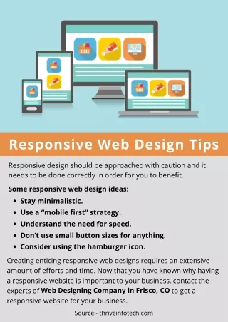
Tips to Build Responsive Web Design
List of Top 10 points needs to consider the easy way to build the responsive web design. Â

Tips to Build Responsive Web Design
E N D
Presentation Transcript
Guidelines to Develop Responsive Website Design SLA Academy https://goo.gl/NKDKN8
What is Responsive Web Designing Responsive web design is defined as using HTML and CSS to perform actions over contents of a website such as hiding, shrinking, resizing, moving etc., so that there is no biased view in multiple devices of varying screen sizes. SLA Academy https://goo.gl/NKDKN8
Responsive design for big screen solutions This is a myth that responsive web design is only for small screen solutions. But it is not so. It can be applied to even large screens and an efficient responsive web design should offer satisfied user experiences. Responsive web designs are usually aimed for mobile devices though not restricted. Today mobile devices too come with varied screen sizes. Hence, an effective web desigs should support all screen size displays of mobile devices, tablets including desktops. SLA Academy https://goo.gl/NKDKN8
Context Never miss out contexts i.e. required information for a particular website while concentrating on the layout to fit in various screen sizes. SLA Academy https://goo.gl/NKDKN8
Meaningful discard During responsive screen design, it is a good practice to retain the important information, analyse the remaining information and if required discard the unwanted data without any second thoughts. SLA Academy https://goo.gl/NKDKN8
Content prioritization The contents in the website should be prioritized for display pertaining to the varied instances and situations or context during an effective responsive web design. SLA Academy https://goo.gl/NKDKN8
Navigation scalability and consistency When you design a responsive web design, you should ensure consistent navigation when users browse in different screen sizes. Most particularly, labelling for buttons, links etc., should be consistent for varied screen sizes. SLA Academy https://goo.gl/NKDKN8
Quality images and download rate Concentrate on page performance and visuals which are the important features that attract visitors to website especially home page carousels. As discussed above, if you feel some visuals are unwanted never hesitate to eliminate them. Image optimization too plays a key role. It is a standard and good practice to give utmost importance to this as well. SLA Academy https://goo.gl/NKDKN8
Replace texts with icons “A picture is worth thousand words”- This is a maxim. Yes, try to use icons to the maximum, to denote and convey information instead of texts. Nevertheless, icons occupy less space convenient for small screen sizes. Hence, it is a vital aspect of responsive web design. Scalable Vector Graphics (SVG) file format serves this purpose making resizing and animation easier. SLA Academy https://goo.gl/NKDKN8
Font sizes Be keen on font sizes by choosing appropriate typeface and type design that automatically adjusts with the layout. Contrast and background colour also should be noted for an effective clear responsive web design. SLA Academy https://goo.gl/NKDKN8
Input methods This varies with different devices such as desktop uses mouse, and other mobile devices use touch screen devices. So, design your website with buttons and clicks that resizes and adapts to the screen size SLA Academy https://goo.gl/NKDKN8
Dry run Trial run your responsive web design in real time on various devices with test data to understand how the desired results are delivered. If there is any deviation it can be worked out for perfection with unbiased usage in all devices. SLA Academy https://goo.gl/NKDKN8
Conclusion So folks, you may use PHP, a handy scripting language for effective and efficient responsive web design. To learn PHP, undergo PHP Training in Chennai by choosing the leaders in web designing in Chennai SLA Academy https://goo.gl/NKDKN8
THANK YOU SLA Academy www.slajobs.com +9186087 00340 SLA Academy https://goo.gl/NKDKN8


