Lettering Guidelines
This is used in making lettering accurate.


Lettering Guidelines
E N D
Presentation Transcript
CLASSIFICATION OF LETTERS ACCORDING TO: Prepared by: Leonard B. delos Reyes, LPT
Classification of letters according to: SIZE a. UPPERCASE- Letters that big in size . There are also called as “MAJUSCULES” or commonly called as capital letters
SIZE b. letters that are small in size. These are also called as “minuscule” or commonly called as small letters.
B. POSITION a. VERTICAL- Letters that stand in upright position and forming ninety degrees(90O) with the horizontal guidelines.
B. POSITION b. INCLINED LETTERS- Letters that form angle between 65 to 75 degrees with the horizontal guidelines. The best slope for inclined letters is 67.5O.
Lower case letter are group into 4 Loop letters Straight line letters Ellipse letters Hook letters
Straight line letters Are letters composed of stems made of straight line. The dots i. and j and the cross of t are on the “i.” or “t” line half way between the cap and waist line.
Loop letters Are letters made with ellipse whose long axis is inclining at about 45 degrees in combination with a straight line.
Hook letters Letters made with shape from that of a hook.
Ellipse letters Are based on an ellipse with the shape of the capital letters, but no inclined as much as the loop letters.C
C. THICKNESS OF STEM BOLDFACE LETTERS- Letters having thick stems. BOLD 2. Lightface letters- letters having thin or light stems. LIGHT
D. SPACING Mechanical Spacing- distance between the letters are measured Optical Spacing- letters are spaced by making the area clearance between them approximately equal.
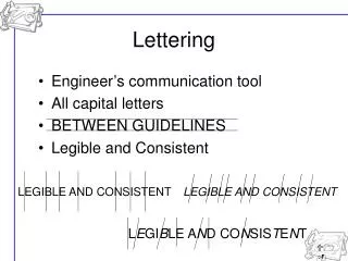
GUIDELINES Are fine, light and curve lines help make lettering straight and uniform.