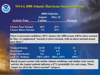
Due to the hurricane season, the site was shut down from late August 2008 until the first week of October 2008.
Due to the hurricane season, the site was shut down from late August 2008 until the first week of October 2008. Graphs in the previous file covered the period up to August 2008. Graphs in this file will cover the period from October 2008 through March 15, 2009

Due to the hurricane season, the site was shut down from late August 2008 until the first week of October 2008.
E N D
Presentation Transcript
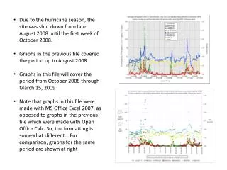
Due to the hurricane season, the site was shut down from late August 2008 until the first week of October 2008. • Graphs in the previous file covered the period up to August 2008. • Graphs in this file will cover the period from October 2008 through March 15, 2009 • Note that graphs in this file were made with MS Office Excel 2007, as opposed to graphs in the previous file which were made with Open Office Calc. So, the formatting is somewhat different… For comparison, graphs for the same period are shown at right
Also note that the SO2 concentrations have not been “multiplied by 5”for display on the graphs. • This is because for most of the data during this period, the SO2 peaks and the RGM / FPM peaks are the same order of magnitude, and if the SO2 concentrations were multiplied by 5, it would be difficult to “see” the RGM / FPM peaks on the same graph… • For comparison, graphs for the same period with SO2 * 5 (top) and SO2 (bottom) are shown at right
Experimented a bit on this graph of the same data as the previous slide, trying to add “lines” to RGM data… it turns out that this does not appear to be practical, as must paste in format with reduced resolution (e.g., as a jpg) and overall quality of graphic is reduced significantly
Peaks in CO may represent local or regional burning of some sort
The following graphs are based on very preliminary data for 2009, up to March 15, 2009. • Based on the relative values of RGM / FPM peaks and SO2 peaks, it was decided to graph SO2 * 5 so as to better show the peaks in these two groups of pollutants.