The Ultimate Guide to Responsive Web Design - Geek Master
0 likes | 15 Vues
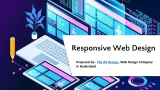
Responsive Web Design is all about creating websites that work well on all devices, whether it is a large-screen computer, tablet, or any small smartphone. It is like any wonder that knows exactly how to look perfect and be easy to use, no matter what gadgets are being used by the customers.<br><br>https://www.geekmaster.io/blogs/ultimate-guide-to-responsive-web-design-tips-and-best-practices/

The Ultimate Guide to Responsive Web Design - Geek Master
E N D
Presentation Transcript
Ultimate Guide to Responsive Web Design: Tips Ultimate Guide to Responsive Web Design: Tips and Best Practices and Best Practices We all are very well known that back to the early days of the internet, websites were primarily designed for desktops. But with the rise of smartphones and tablets, web design and development has had to adapt. Responsive web design is an approach that comes to resolve all the problems related to web design and development, by ensuring that the website appears and functions flawlessly on all types of devices. In this ultimate guide you will learn everything you need to know about responsive web design.
By reading this article you can learn more about responsive design and best practices for responsive web design and development. By the end of the article, you will get the solution on how you can give the best experience to the customers visiting your website using a variety of devices with different screen sizes by hiring a web development company. Table Of Contents What does Responsive Web Design mean? How Responsive Web Design works? Tips and Best Practices for Responsive Web Design Best Practices for Responsive Web Design Responsive Web Design and Adaptive Web Design Responsive Web Design Principles Conclusion • • • • • • • What does Responsive Web Design mean? Responsive Web Design is all about creating websites which work well on all devices, whether it is a large screen computer, tablet or any small smartphone. It is like any wonder that knows exactly how to look perfect and be easy to use, no matter what gadgets are being used by the customers. So, instead of struggling to squint at tiny text or click tiny buttons, responsive web design and development does everything for you, adjusting layout, text size and images to fit your screen perfectly. It is like a website that is built specifically for your device for giving you the best browsing experience. How Responsive Web Design works? Responsive web design is very helpful in making websites look good on whatever device the customer uses, be it a large computer screen or a small smartphone. All thanks for this wonder go to Cascading Style Sheets (CSS). It works as a set of instructions, which tells the browser how to make a website look most beautiful. Responsive web design and development helps in changing these instructions depending on the device used by your customers.
So, whether your customers are browsing on their laptop, tablet or phone, the website will adjust itself to fit perfectly and to look good. It will make a website just made just for you, no matter what device you’re using. So, by using the Responsive Web Design in your website you can give your customers the best experience, if still you have not any web development company, then for this you can hire any web development services for making your website flawless. Ultimate Guide to Responsive Web Design Tips and Best Practices for Responsive Web Design 4 Tips for Responsive Web Design To create a website that works well on all devices like phones and computers, images and videos can be difficult to handle. To make it easier, here are some tips to help you: Move from pixels and inches to grid To design a website for all devices, you should forget about fixed sizes like pixels or inches. Instead, think about using a grid. These grids serve as flexible frames that adjust to the size of the website’s screen. It helps you easily resize and rearrange elements of your websites, making everything look great without the impact of the device’s screen size.
If your website will be made up of columns then it will help you organize all in a manner. But for smaller screens, columns will not be enough, then you will need to use media queries, so you can ensure that your website looks good even on small screens. Make the website touch responsive When you’re creating a website that works well on phones and tablets, you need to think about how people touch the screen to use it. So, make sure whatever you put on the screen is big enough for fingers to tap comfortably. Even though you might want to cram a lot of stuff onto a small screen, it’s important to keep things simple and make buttons and links easy to tap. According to some guidelines, buttons should be at least as long as your fingers to make them easier to use. When you’re designing forms or spaces where people need to type things, make sure boxes and buttons are large enough to be tapped without any hassle. It’s also a good idea to use colors and styles that make important buttons stand out. And if you’re designing a website where people buy things, make sure the payment process is easy and intuitive so they don’t give up halfway through. This way, you will get more people to buy from your site. Optimize media for mobile First of all, when you are placing images or videos on your site, use the max- width property. This helps them fit well on any screen, be it big or small. For images and videos, set max-width to 100% and height to auto. This ensures that they adjust properly based on the screen size. If you’re using a background image, set its size to Contains. This makes the image fit nicely into the background without stretching or looking awkward. Also, try using smaller image sizes and compressing them. This helps your site load faster, which is good for people visiting your site and for search engines. Trust the experts Creating a website that looks good and works well on all types of devices is not easy. It’s not just about knowing how to code; you need to understand design
well too. After you’ve designed your site, you’ll need to test it on several different devices to make sure everything is working properly. Those drag and drop website builders may seem easy to use, but they usually don’t create websites that look good or function well. And hiring someone from the Internet to build your site can be risky. It would be best to hire any website development company that is really good at creating websites that work on mobile devices like Geek Master. They know all the tricks to make sure your site looks great and functions perfectly, no matter what device the audience is using. Best Practices for Responsive Web Design Here are a few Best Practices for Responsive Web Design and development keeping in mind, you can ensure that your website looks great and functions smoothly no matter how people are viewing it. Flexibility is key When it comes to designing a website that works seamlessly across different devices, flexibility is key. Everything from layout to images and text needs to be easily adapted to different screen sizes. In other words, your website should seamlessly adjust to different screen sizes for a user-friendly experience. Modify Images It is very important to think about images when you’re creating a website that works well on both large computers and small phones. They need to change depending on the screen size. So, for example, if you have a photo that looks great on a big screen, but might be too big for a phone, you may need to shrink or resize it to fit it better. Like converting a wide image into a square image so it looks better on the phone. This helps ensure that your website looks good no matter where people are viewing it.
Use Scalar Vector Graphics (SVG) One way to achieve a good website is to use scalar vector graphics (SVG) instead of traditional raster graphics like JPEG or PNG. SVGs are special because they don’t rely on pixels for resolution. Instead, they use mathematical formulas to maintain their quality at any size. This makes them perfect for icons and logos on any website as they will look sharp and clear no matter how big or small, they appear on different screens. Therefore, consider incorporating SVG in your web design to increase its responsiveness and visual appeal across different devices. Notice the breakpoint When you’re creating a website, it’s important to make sure it looks good and works well on all types of devices. One way to do this is to pay attention to breakpoints. These are specific points where the layout of your website changes, to fit different screen sizes. Web development company suggests having at least three breakpoints for your website: one for small screens (like smartphones), one for medium screens (like tablets), and one for large screens (like desktop computers). But some consultants go even further and use five breakpoints to ensure that their websites work perfectly on many different devices. Sometimes, they may also wonder how their website looks on an iPhone compared to an Android phone. Mobile First Design Approach When it comes to designing websites that seamlessly adapt to different devices, it’s important to take a mobile-first approach. This means starting your design process by focusing on the smallest screen sizes like smartphones and then scaling up to larger screens like tablets and desktops. You can make sure everything fits nicely on the smaller screen by starting designing for smartphones first, then work your way up to larger screens, and it’s easier to add stuff for larger screens later without compromising design elements.
Prioritize and Hide Content Appropriately When designing websites to work well on both large computer screens and small phone screens, it’s important to decide what’s really important and what can be hidden on a smaller screen. For example, on the phone, you can use a special menu that hides when not in use. Sometimes, you don’t need to show everything all the time. You can hide things that aren’t super important unless the audience wants to see them. Large Clickable Area for Buttons It is very important to make the button large enough to get easily clicked while creating a website for across devices like phones and computers. Because larger buttons are easier to get hit accurately. And it would be also great to leave some space around buttons and links so that your audience doesn’t accidentally tap any wrong thing. This can be annoying for the customers. So, by leaving the space around the button and link you can make your website easier and more enjoyable for your audience to use. Research competitors and industry leaders As we all know to lead in any field, this is must to be ahead of the competitors of that field. In the same way you can also get a better website which will look good on all devices by checking out what your competitors are doing. If your business is of any watches and you are creating a website where your customers can buy it then you must take a look at big brands like Titan, FastTrack, etc. Because they spend lots of money figuring out what works best, it is a good idea to learn from them and look at what and how they are doing. Responsive Web Design and Adaptive Web Design Responsive Web Design and Adaptive Web Design both are the methods used for making the mobile-friendly websites. However, they work slightly differently. Responsive Web Design is like any liquid, which flows smoothly to fit any screen size whether it is desktop, tablet or any smartphone.
It uses special instructions called Cascading Style Sheets (CSS) media queries to change the look of the website depending on the device used by the audience. Responsive Web Design On the other hand, rather than being easily adjusted like responsive web design, adaptive web design has fixed layouts for specific screen sizes. Therefore, the web design company creates different designs for common screen widths like 320px, 480px, etc. When any one will visit your website, which is using adaptive web design then it will choose the layout which is closest to the size of the screen of that person. Some people may think that adaptive design requires more effort, but that is not always the case. Responsive design can be tricky, especially if the instructions aren’t set up correctly. If the website doesn’t know how to optimize, it can cause problems with the way it looks and works, making it less user-friendly. It would be great to contact any web development company for the service to avoid any issue or loss. Responsive Web Design Principles Responsive Web Design is the technique which lies behind all websites that seamlessly adapt to all types of devices and is based on three fundamental principles: fluid grid systems, fluid image usage, and media queries. Let’s know these principles in simpler terms:
Fluid Grid System: Designers used to have fixed measurements like pixels in the past, but in today’s era every audience has a diverse range of screens on which it does not suit well. That’s why, instead of sticking to fixed sizes, responsive design uses relative measurements. This means that elements on a webpage adjust and resize proportionally based on the screen size of the device of the audiences. Fluid Images: In responsive design, images used to easily adapt to different screen sizes. This is because of fluid images. Fluid images take the shape as per the surrounding, and make sure that they will look beautiful no matter the screen size of the devices of the audience. Any web development service uses SVG files for things like icons, because they are lightweight and can scale without losing quality. Media Queries: Media queries are like instructions to the browser about how to rearrange things based on the characteristics of the device. For example, a layout that works great on a desktop may not fit properly on a smartphone screen. With media queries, the web design company can tell the browser to switch things when needed, such as changing from a multi-column layout to a single-column layout on smaller screens. It’s all about making sure the website looks and works its best on any device. So responsive web design and development isn’t just about making things look pretty. It’s about making them work seamlessly across all types of devices. And it’s all thanks to fluid grids, fluid images and media queries which work together behind the scenes. Conclusion Creating websites that work well on all devices is extremely important for any business these days. There are so many different devices out there, like phones, tablets, and computers, and it can be difficult to make sure your website looks good on all of them. But instead of stressing over creating separate versions for
each device, you can make things easier by designing websites that automatically adjust to fit whatever screen a person is using. The ideas we’ve talked about for making websites responsive are just some of the ways you can tackle this challenge. When a website is responsive, it means it’s easy to use, no matter what device your audience is on. This is great because it means people can access your site easily whether they’re on their phone, tablet or computer. But it’s important to remember that responsive design is not a magical solution to every possible problem. By working with any web design companies that specialize in responsive web design, like Geek Master a Digital Marketing Agency, you can keep up with these changes and ensure your websites remain user-friendly. As technology improves, web development services continue to find new ways to make the web a better place for everyone. Source: - https://www.geekmaster.io/blogs/ultimate-guide-to-responsive-web-design-tips- and-best-practices/
