Presentation of data
100 likes | 114 Vues
Contains Types of Bar diagrams and Pie diagrams

Presentation of data
E N D
Presentation Transcript
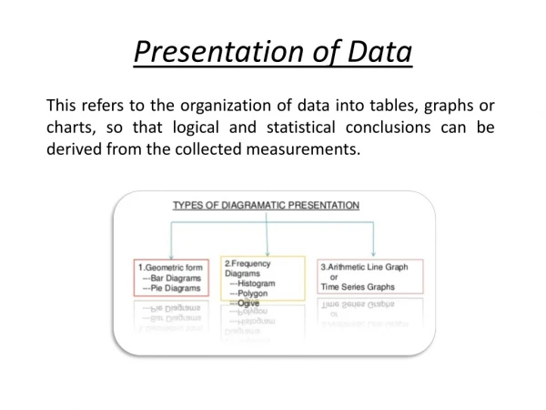
Presentation of Data This refers to the organization of data into tables, graphs or charts, so that logical and statistical conclusions can be derived from the collected measurements.
Overview This Presentation focuses on Geometric form of diagrammatic presentation. This includes- 1. Bar diagrams 2. Pie diagrams.
1. Bar Diagram Bar diagrams are those diagrams in which data are presented in the form of bars or rectangles. Bars are also called columns.
1. Simple Bar Diagram Simple bar diagram is presented below along with an example:- Years 1989 1990 1991 1992 1993 Profits 10 12 18 25 42
2. Multiple Bar Diagram Multiple bar diagram is presented below along with an example:- Years Imports Exports 1991 1930 4260 1992 8850 5225 1993 9780 6150 1994 11720 7340 1995 12150 8245
3. Sub Divided Bar Diagram Sub Divided bar diagram is presented below along with an example:- Years Wheat Barley Oats 1991 34 18 27 1992 43 14 24 1993 43 16 27 1994 45 13 34
Sub Divided Bar Diagram Solution to the already presented example. Years Wheat Barley Oats Total 1991 34 18 27 79 1992 43 14 24 81 1993 43 16 27 86 1994 45 13 34 92
4. Pie Diagram ❖Pie Diagram is a circle divided into various segments showing the percent values of a series. ❖Pie diagram has been presented below with an example Example – Imagine you survey your friends to find the kind of movie they like best.
Pie Diagram First, put your data into a table (like below), then add up all the values to get a total: Next, divide each value by the total and multiply by 100 to get a percent:
Pie Diagram A Full Circle has 360 degrees, so we do this calculation:-