Graphical Presentation of Data
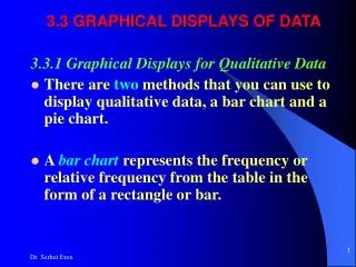
Graphical Presentation of Data. Graphical Presentation of Data. Qualitative Data. Bar Diagram. A graphical method for depicting qualitative data. Specify the labels for each of the classes on the horizontal axis.


Graphical Presentation of Data
E N D
Presentation Transcript
Graphical Presentation of Data Qualitative Data
Bar Diagram • A graphical method for depicting qualitative data. • Specify the labels for each of the classes on the horizontal axis. • Scale the vertical axis with reference to frequency, relative frequency, or percent frequency . • Draw bars of fixed width above each class with heights corresponding to the frequency. • Bars are separated to convey the information that each class is a separate category. Graphical Presentation of Data
Source: Quisumbing & Baulch, CPRC No. 143 Graphical Presentation of Data
Source: IFPRI FAND ,Working paper No 176 Graphical Presentation of Data
Pie Chart • A graphical tool to present relative frequency distributions for qualitative data. • Draw a circle; subdivide the circle into sectors to represent the relative frequency for each class. • For example, a class with a relative frequency of .25 would consume .25(360) = 90 degrees of the circle. Graphical Presentation of Data
Distribution of intergenerational transfers of husbands and wives, by type of transfer Source: Quisumbing, CPRCE Working paper No 117 Graphical Presentation of Data
Source: Quisumbing, CPRCE Working paper No 117 Graphical Presentation of Data
Source: Quisumbing, CPRCE Working paper No 117 Graphical Presentation of Data
Graphical Presentation of Data Quantitative Data
Histogram • Measure variable under review on the horizontal axis. • Draw a rectangle above each class interval with its area corresponding to the interval’s frequency, relative frequency, or percent frequency; plot frequency density if the class intervals are of unequal width. • Unlike a bar graph, a histogram does not separate between rectangles of adjacent classes. Graphical Presentation of Data
The National Sample Survey data on consumer expenditure distribution for urban all-India for 1993-94 is as follows. Draw a (relative frequency) histogram. Graphical Presentation of Data
Estimates of nutritional status of households across per capita monthly expenditure classes in 1972/73 are provided in the Table given below. Graphical Presentation of Data
8000 6000 per capita calorie intake 4000 2000 0 0 100 200 300 400 MPCE Graphical Presentation of Data
Basic data for Engel function : Urban Maharashtra (2004-05) Source: GoM (pooled state & central samples) Graphical Presentation of Data
Box Plot: Total Expenditure - Urban Maharashtra 800 700 Rs per capita per month 600 500 400 Box Whisker plot Graphical Presentation of Data
Box Plot: Food Share (%) in Total Expenditure - Urban Maharashtra 60 55 % Total expenditure share 50 45 Graphical Presentation of Data
Engel Relation for Food: Urban Maharashtra (2004-05) 60 50 Food share (%) 40 30 500 1000 1500 Total household exp (Rs) Graphical Presentation of Data
Engel Relation for Food: Urban Maharashtra (2004-05) 60 50 Food share (%) 40 30 500 1000 1500 Total household exp (Rs) % Share of Food % Share of Food Graphical Presentation of Data
Engel Relation for Food: Urban Maharashtra (2004-05) 60 50 Food share (%) 40 30 500 1000 1500 Total household exp (Rs) % Share of Food % Share of Food Graphical Presentation of Data
Engel Relation for Food: Rural Maharashtra (2004-05) 60 55 Food share (%) 50 45 400 500 600 700 800 Total household exp (Rs.) Graphical Presentation of Data
Engel Relation for Food: Rural Maharashtra (2004-05) 60 55 Food share (%) 50 45 400 500 600 700 800 Total household exp (Rs.) Graphical Presentation of Data
Engel Relation for Food: Rural Maharashtra (2004-05) 60 55 Food share (%) 50 45 400 500 600 700 800 Total household exp (Rs.) Graphical Presentation of Data
60 55 Food share in total expenditure (%) 50 45 400 500 600 700 800 Average monthly per capita consumer expenditure (Rs.) Engel relation: Rural Maharashtra Graphical Presentation of Data
Box Whisker Plot: 5 Number Summary • Five number summary : Visual representation of the box and whisker plot. • The five number summary consists of : • The median ( 2nd quartile) • The 1st quartile • The 3rd quartile • The maximum value in a data set • The minimum value in a data set Graphical Presentation of Data
Box and whisker plot: Steps • Step 1 – Estimate the median. • Median: Central value in ordered data set. 18, 27, 34, 52, 54, 59, 61, 68, 78, 82, 85, 87, 91, 93, 100 68 is the median of this data set. Graphical Presentation of Data
Constructing a box and whisker plot • Step 2 – Estimate the lower quartile. • Lower quartile: Median of the bottom half - data set to the left of 68. (18, 27, 34, 52, 54, 59, 61,) 68, 78, 82, 85, 87, 91, 93, 100 52 is the lower quartile Graphical Presentation of Data
Constructing a box and whisker plot • Step 3 – Estimate the upper quartile. • Upper quartile: Median of the top half - data set to the right of 68. 18, 27, 34, 52, 54, 59, 61, 68, (78, 82, 85, 87, 91, 93, 100) 87 is the upper quartile Graphical Presentation of Data
Constructing a box and whisker plot • Step 4 – Estimate the maximum and minimum values in the set. • The maximum is the largest value in the data set. • The minimum is the smallest value in the data set. 18, 27, 34, 52, 54, 59, 61, 68, 78, 82, 85, 87, 91, 93, 100 18 is the minimum and 100 is the maximum. Graphical Presentation of Data
Constructing a box and whisker plot • Step 5 – Estimate the inter-quartile range (IQR). • IQR: Difference between the upper and lower quartiles. • Upper Quartile = 87 • Lower Quartile = 52 • 87 – 52 = 35 • 35 = IQR Graphical Presentation of Data
The 5 Number Summary • Organize the 5 number summary • Median – 68 • Lower Quartile – 52 • Upper Quartile – 87 • Max – 100 • Min – 18 Graphical Presentation of Data
Graphing The Data • The Box includes the lower quartile, median, and upper quartile. • The Whiskers extend from the Box to the max and min. Graphical Presentation of Data
Analyzing The Graph Slide 18 • Observations inside the box represent the middle half ( 50%) of the data. • The line segment inside the box represents the median. Graphical Presentation of Data