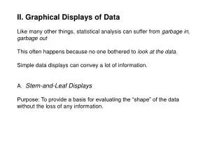
Using graphical data
Using graphical data. Dr Michelle Reid Study Adviser, University of Reading. Overview of the workshop. Why use graphical data? Tables, graphs, diagrams, pictures What to remember when using graphical data. To start you thinking…. Who writes reports? Working in pairs:

Using graphical data
E N D
Presentation Transcript
Using graphical data Dr Michelle Reid Study Adviser, University of Reading
Overview of the workshop • Why use graphical data? • Tables, graphs, diagrams, pictures • What to remember when using graphical data
To start you thinking… Who writes reports? Working in pairs: • List as many different kinds of reports as you can (e.g. Reports on lab work, reports on field work) A prize for the longest list!
Why use graphical data? Shows information in an easy to understand visual form Adds value – conveys something more than just writing can Helps the reader see trends, patterns, or complex processes more easily Is accurate, relevant, and clear – and has a purpose
Referring to graphical data If you include a figure or table, you should always refer to it and explain what it shows: e.g. “The Keeling plant's production capacity was reached in May this year. In contrast, the Hergort plant has not yet reached 75% of its production capacity (see Table 13)”. Label your figures clearly – figure 1, figure 2, etc Make it clear to your audience which one you are referring to
Main types of graphical data Tables Bar charts Line graphs Pie charts Drawings / diagrams Photographs
Tables are useful for… Presenting a quantity of numerical data in an accessible format Showing exact numbers
Using tables If you have a lot of data in tables – are they all essential? Can some be placed in an appendix? Make sure your columns and rows are clearly labeled Tables can rarely stand alone – you need to describe in words what the table shows – what are the key things the reader should look for? Graphs may be better for showing trends or patterns
Bar charts are useful for… Comparing discrete values or categories Comparing a number of different discrete values side by side (see fig.2) Internet use by Redwood School students 1995-2002 Figure 1 Figure 2 (From Statistics Canada)
Using bar charts • Bars can be vertical or horizontal (horizontal is sometimes best if there are a lot of categories) • Use of colours can help distinguish between the bars • Bar charts are not as effective as line graphs at showing continuous increasing / decreasing trends
Line graphs are useful for… Showing trends (how data changes over time) Showing relationships (how two variables interact)
Using line graphs Check that your values for the x-axis (horizontal) and the y-axis (vertical) are correct When plotting trends over time, the x axis is commonly used to represent units of time, and the y axis is used to represent quantity Use a sensible scale so that the line’s shape does not give the audience an incorrect impression of the data
Line graph scales Number of guilty crime offenders, Grishamville, 2007 Figure 1 Which scale gives the most accurate view of the trend in offender reduction? Figure 2 Graphs from Statistics Canada www.statcan.gc.ca
Pie charts are useful for… Showing the percentage or proportion of the whole that is taken by various parts percent ÷ 100 x 360 degrees = the number of degrees
Using pie charts Put the %s in as numbers alongside the segments for ease of reading The chart can become difficult to read if there are too many segments Avoid using a pie chart if you have a lot of small % which are very similar – the segments will be hard to distinguish When comparing two sets of data (e.g. figures for boys and girls) use a double bar graph, as comparing segments across two separate pie charts is difficult
Drawings / diagrams are useful for… Diagram by Eric Pierce Showing complex processes or detailed technical descriptions Showing a step-by-step cycle or process (e.g. in manufacturing)
Using drawings / diagrams Make sure all your diagrams are large enough and of sufficiently high quality Label and explain each diagram fully Reference any diagrams / figures that have been created by another person
Photographs are useful for… Illustrating what is being described As visual evidence (e.g. showing a particular site, scene or landscape) When you need “real world” visual evidence, that can’t easily be drawn Photo by K. Kiser
Using photographs It is tempting to include photos just to make your report look nice! Always think - what is the purpose of this photo and what would happen if it wasn’t there? Reference all photos taken by another person You may still have to ask permission to use your own photos if your work is likely to be published (e.g. if it is of people or a private building etc) Check the quality, especially if you are printing colour photos in black and white
Activity: What’s wrong with this picture? Working in small groups – each group has a different image / graph Assess the use of graphical data – is your figure: • Appropriate • Clearly labelled • Accurate • The right scale Why has this form of graphical data been chosen?
What to remember when using graphical data • Is this necessary, or just decorative? • Have you double checked the data for accuracy? • Is the type of figure (graph / table / diagram) appropriate for its purpose? • Is the figure labelled clearly with a title? • Does it have a key if necessary? • Is the figure of sufficient size and quality to be easily interpreted? • Do you describe what the figure shows in words too? • Have you referenced all figures created by other people?
Further resources LearnHigher report writing webpages www.learnhigher.ac.uk/learningareas/reportwriting/home.htm Guides and exercises on all aspects of reports. Analyse this! (Manchester Metropolitan) www.learnhigher.ac.uk/analysethis/ Simple and accessible guide to data analysis
Any questions? Thank you and good luck with your report writing!


