Download
1 / 25
250 likes | 352 Vues
Learn how to effectively utilize graphs, charts, and diagrams to convey data in reports. Discover the importance of tailoring content to suit different audiences and techniques for embedding visuals in the text. Explore the strategies for maintaining relevance and form in graphical communication. This resource provides insights on storytelling in corporate communication and best practices for integrating visual elements in scientific reports.

E N D
Graphical Presentation of Data in Reports Dr Peter Kappen Acting Principal Scientist – XAS
Overview • Pictures and storytelling • The Council – Examples of Story & Audience • The Council – Examples of Relevance & Form • Embedding in the text • Australian Synchrotron
Pictures tell stories “pictures” in corporate communication = graphs, charts, diagrams, photos/images graphical communication = speaking to the audience; storytelling Here: Focus on what we can do with MS Office products = content first, form later
Story & Audience • or • “WHY am I telling this story”
Story & Audience – Tailoring to suit • Scenario: • The Council organises an annual “iExercise” at the local sports ground to promote community health. • This year’s event was a big success; >450 people attended. • Report to show the geographical spread of attendees. • The Council comprises 5 wards (North, East, South, West, Centre). Each ward is divided into a few neighbourhoods.
Story & Audience – Tailoring to suit • iExercise – Attendees by Neighbourhood • Here: Audience / story = local (residents, Council).
Story & Audience – Tailoring to suit • iExercise – Attendees by Ward • Here: Audience / story = “global” (organisers, Council, State Govt.)
Tailoring to the audience • Key questions to keep asking: • Why am I reporting this? • What is the story? • Who is the audience? • Caveat: There is a difference between displaying data to tell a fact and displaying data to manipulate or twist a message.
Relevance & Form The Council – Report on the rate of customer service requests resolved This story: Improving performance.
Relevance & Form The Council – Report on the rate of customer service requests resolved This story: Consistently high number of requests received.
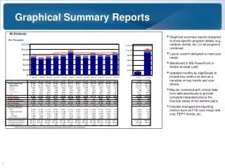
Relevance & Form The Council – Report on the rate of customer service requests resolved 88% 94% 97% 96% This story: KPI tracking and improvement + Consistently high number of requests received.
Relevance & Form What is wrong with this plot? 88% 94% 97% 96%
Relevance & Form What is wrong with this plot? 88% 94% 97% 96% Style versus relevance: What does the extra style element add ?
Relevance & Form Form: Anatomy of a plot. scaling to relevance “no-frills” formatting; relevance of style elements concise legend axis labels
Tailoring the form • Fit the form to the story • 1. Why am I reporting this? • 2. What is the story? • 3. Who is the audience? • and • 4. What style elements are required ( story)? • 5. What visual effects are required ( story; audience)? • Caveat: There is a difference between displaying data to tell a fact • and displaying data to manipulate or twist a message.
Embedding in the text • Best practices (in science): • Figures are numbered consecutively and each has a caption 88% 94% 97% 96% Figure 9: Number of service requests received and resolved since 2010. The percentage values show the fraction of requests resolved; target value (KPI) is 95%. See text for further information.
Embedding in the text • Best practices (in science): • Explicitreferencein the text • Figure supports the argument and saves words • “Figure 9highlights Council’s strong improvement in responding to customer service requests since 2010. The target (KPI) of 95% resolution rate has been met since 2012. The data also shows a continuously high community usage of Council services. […]”
Example: Australian Synchrotron Australian Synchrotron: • located in Melbourne’s SE(City of Monash) • National research facility • Interdisciplinary across many fields of research • Relevant to industry Mission Benefit to the community photo: Australian Synchrotron
National Research Organisation • Researchers by Geography
Contaminated site: Hazardous chromium mix of bad Cr + OK Cr OK Cr photo courtesy of: ERM Melbourne • use synchrotron to: • identify mix ratio • identify Cr species (compounds) in mix • develop remediation strategy bad Cr
Conclusion • The Big Why • Three key questions (content): • Why am I reporting this? • What is the story? • Who is my audience? • Style to match the story (“Content first, form later”) • Embedding in text: Captions and numbers are good practice
Thanks! • LGPro and Conference Organisers • Australian Synchrotron User Office