Make Your Website Accessible Through Smart Phone With Respon
70 likes | 295 Vues
If you don’t have a website that is compatible with a mobile device, you could be losing a great deal of business.So get your website accessible through any smart phones. To know more log on to http://www.redspotdesign.com/

Make Your Website Accessible Through Smart Phone With Respon
E N D
Presentation Transcript
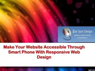
Make Your Website Accessible Through Smart Phone With Responsive Web Design
Websites that have not been designed with a smart phone in mind, are usually not compatible with a mobile device and will in all likelihood appear smaller than you anticipated, contain much larger images and be hard to read.
Difference between having a desktop website and a mobile website? When a visitor tries to access your website design on their smart phone, it has to be user-friendly with the mobile device or it’s going to look distorted. If the web design is not optimized and laid out correctly, the viewer may see the wrong content or worse they may view what appears to be a disorganized arrangement of words and design, which of course can’t be good for business.
Role of Responsive Web Design Responsive web design is a technique to build web pages that alter how they look using CSS3 media queries. That is, there is one HTML code for the page regardless of the device accessing it, but its presentation changes using CSS media queries to specify which CSS rules apply for the browser displaying the page. This is Google’s recommended configuration.
An Optimized Mobile Web Design With the number of smart phones in existence and growing daily, millions of people could potentially gain access to your website design with their mobile device, but what will they see? If you don’t have a website that is compatible with a mobile device, you could be losing a great deal of business.
Advantages of a Mobile Web Design • Generates new business • Enables easy navigation • Improves the user experience • Is interactive and easy to access • Makes surfing more fun and much easier • Improves SEO performance • Rankings rise on mobile-friendly search engines • Increases business visibility
We at Red Spot Design know precisely how to optimize a website so that it includes the right structure, layout, keywords, navigation and a properly submitted process. Contact Us Address: Red Spot Design-Dallas SEO/Web Design 3010 LBJ Freeway, Suite 1200 Dallas, TX 75234 Phone no: Dallas / Ft. Worth:214-432-1608 Toll Free:888-636-1344 Fax:214-613-1626 Website : http://www.redspotdesign.com