1 / 8

How to Build a Responsive Website A Step-by-Step Guide for Students

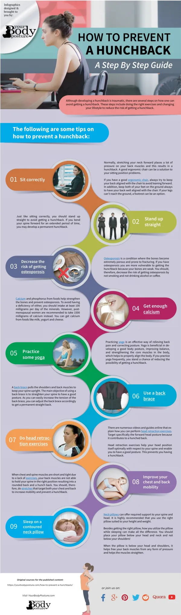
In todayu2019s digital world, building a responsive website is a must-have skill for students pursuing web development. This step-by-step guide breaks down the process of creating websites that adapt seamlessly across desktops, tablets, and smartphones. From planning your layout and writing clean HTML/CSS to using media queries and frameworks like Bootstrap, this guide walks students through every essential stage. Whether you're working on a class project or building your first portfolio site, this beginner-friendly resource will help you design user-friendly, mobile-optimized websites with confid

Lucy30
Télécharger la présentation

How to Build a Responsive Website A Step-by-Step Guide for Students

An Image/Link below is provided (as is) to download presentation Download Policy: Content on the Website is provided to you AS IS for your information and personal use and may not be sold / licensed / shared on other websites without getting consent from its author. Content is provided to you AS IS for your information and personal use only. Download presentation by click this link. While downloading, if for some reason you are not able to download a presentation, the publisher may have deleted the file from their server. During download, if you can't get a presentation, the file might be deleted by the publisher.

E N D

Presentation Transcript


  1. How to Build a Responsive Website: A Step-by-Step Guide for Students www.assignment.world

  2. Understand the Basics of Responsive Design Responsive web design ensures that websites adapt to different screen sizes and devices. Learn key principles like flexible grids, media queries, and fluid layouts to create a seamless user experience across desktops, tablets, and smartphones.

  3. www.reallygreatsite.com Use a Mobile-First Approach Designing for mobile screens first ensures that your website is optimized for smaller devices before scaling up to larger screens. Start with a simple layout, prioritize essential content, and then use CSS media queries to adjust styles for larger viewports.

  4. Implement Flexible Grid Layouts Use CSS frameworks like Bootstrap or CSS Grid to create flexible and scalable frameworks help structure web pages using a grid system that automatically adjusts based on the screen size, ensuring a well-balanced design. layouts. These

  5. Optimize Images and Media Large images can slow down your website. Use responsive images with the <picture> element or CSS properties like max-width: 100% to ensure images scale properly. Compress images using tools like TinyPNG or WebP format to improve loading speed.

  6. Utilize CSS Media Queries Media queries allow you to apply different styles based on screen size. Use breakpoints like @media (max-width: 768px) to define specific styles for smaller screens. This helps adjust font sizes, margins, and layouts dynamically.

  7. www.reallygreatsite.com Test and Optimize Across Devices After building your responsive website, test it using tools like Google’s Mobile-Friendly Test, Chrome DevTools, or online emulators. Make adjustments based on user experience feedback and performance metrics to ensure smooth navigation and readability on all devices.

  8. Contact US +61 480 020 208 help@assignment.world www.assignment.world

More Related