Digipak Analysis
Beyoncu00e9 4, the album.

Digipak Analysis
E N D
Presentation Transcript
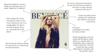
Her name is positioned centrally at the top and stretches the length of the cover. It is big, ensuring audiences will notice it. Sexual connotations as she is visibly not wearing a bra, it is erotic. Wears fur, a material Purple and yellow tinted background, establishing color pallet for this album, muted tones. She overlaps her name, showing her status in the music industry, as she is so recognizable, her face is the first thing you focus on, and what will se the album. The pose is unapologetic and makes her look confident Simple typography, only her name and the album name, which is a singular letter ‘4’. Giving the cover a neat and easy to read look. The font is feminine and curved, reflecting her sexuality, and ‘sex symbol’ status. Dark smoky eye makeup making her eyes stand out. Emphasizing her physical beauty.
Idealistic view, from the rooftops of Paris, romantic ideal, Staring off into the distance. This also presents her as dominant/authoritative as see is looking over the city. Her name is also positioned the same way as on the front in a large font, making sure you will see it. Fashionable outfit, not something your see everyday, it would be designed for her. Adds to her star persona, focus on fashion. Seen from behind in a leotard like outfit, showcasing her legs, showing her as hyperfeminine. Perhaps, dehumanizing her, as we only see her legs Track listing, informing the audience of what there're in for eg, ‘LOVE ON TOP’, and the genre of music R&B/Soul and Pop Credits to the record label and studios involved in the creation of the album. Recognizable companies that are well known to audiences The barcode, so people can purchase the CD, in the bottom right-hand corner.
The deep purple of her leotard paired with the font of her name contrasts well against the yellow tinted background, making her stand out/ ‘pop’ Follows the color theme of the other images as the visuals are all from the same photoshoot, making the digipak consistent, and result in audiences associating these images with the album. Low angle shot; we the audience are looking up to her and portraying her as powerful. Overall, I really like this digipak in comparison to other digipaks I've looked at because of its simplicity. The large bold font of her name, makes the album stand out in comparison to others. The image, presents her in a sexual way, due to her lack of clothing and feminine posting, elongating her legs and arching her back