Why Choose Responsive web design
Aarchi Infotech Solutions provides best website design services in Perth. Our website design is a responsive, SEO friendly, high speed and low cost effective.

Why Choose Responsive web design
E N D
Presentation Transcript
Responsive Web design is the approach that suggests that design and development should respond to the user’s behaviour and environment based on screen size, platform and orientation. The practice consists of a mix of flexible grids and layouts, images and an intelligent use of CSS media queries. As the user switches from their laptop to iPad, Mobile phones and tabs, the website should automatically switch to accommodate for resolution, image size and scripting abilities. In other words, the website should have the technology to automatically respond to the users preferences. This would eliminate the need for a different design and development phase for each new gadget on the market. So now you understand what responsive web design is, perhaps we should have a rundown of the benefits. Visit to : www.aarchiinfotechsolutions.com.au
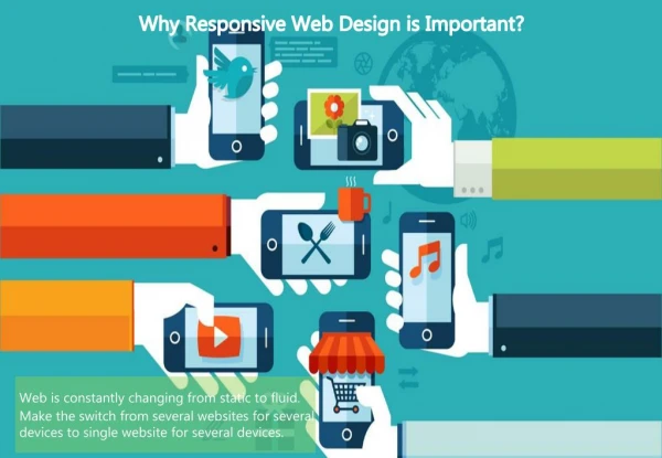
One Website, Many Devices and View One of the most appealing aspects of responsive web design is that a responsive website can provide a great user-experience across many devices and screen sizes. This is an important characteristic, since it is impossible to anticipate all the devices and screen sizes searchers will use to access your site. A site that works well regardless of these variables will provide a better and more consistent user-experience than a separate mobile site that is designed for a specific device and screen size. Let’s take the following example. Someone searches for a product on their smartphone during a lunch break at work. They find a site that has the product they’re looking for, and decide to continue researching this product on the same site when they get home. Except, when they get home, they will use their desktop instead of their Smartphone. If the site in this example is responsive, this person will have a positive user-experience when transitioning from mobile to desktop because they will view the same site on their desktop as they did on their Smartphone. On the other hand, if the site is a dedicated mobile site, this person will become frustrated with the fact that they have to locate the desktop version of the site, and find the product all over again. Future proofing. Responsive sites work well across the multitude of existing devices on the market. It’s a safe bet it will for considerable time to come. Show compares responsive website design future is secure. Visit to : www.aarchiinfotechsolutions.com.au
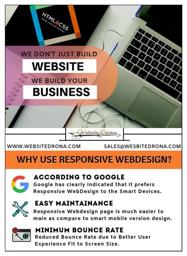
Better, faster, smarter user experience. Optimizing your site no matter what the user chooses to view it on makes their life easier. Happier customers mean a happier business. Responsive web design is user friendly. Cost Effective. Responsive sites take a little longer to put together, but they survive longer and the unified approach means management, support and upgrades only need be applied to one place. That saves time and money. Responsive website design are cost are normal to compare static design. SEO optimized. Managing SEO for separate mobile and desktop sites is hard and doesn’t produce great results. Google actually recommends a responsive approach to combat these problems and a consolidated view of your results means more focus. Google crawler is always first priority of responsive web design because Google search in all devices Aarchi Infotech Solutions provides best website design services in Perth. Our website design is a responsive, SEO friendly, high speed and low cost effective. Visit to : www.aarchiinfotechsolutions.com.au