Introduction to Excel 2007 Part 2: Bar Graphs and Histograms
Introduction to Excel 2007 Part 2: Bar Graphs and Histograms. February 5, 2008. Bar Graphs and Histograms. Although they may look similar, bar graphs and histograms differ in several important ways: 1. The types of information they convey 2. The x-axis 3. The y-axis


Introduction to Excel 2007 Part 2: Bar Graphs and Histograms
E N D
Presentation Transcript
Introduction to Excel 2007Part 2: Bar Graphs and Histograms February 5, 2008
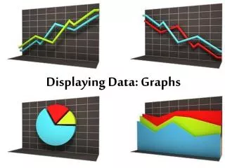
Bar Graphs and Histograms • Although they may look similar, bar graphs and histograms differ in several important ways: 1. The types of information they convey 2. The x-axis 3. The y-axis • Let’s say Instructors 1 and 2 both teach the same Psych class. You are trying to decide which instructor to take the class from (based on the grades they gave last quarter). • First, you take a look at a bar graph…
1. Types of Information • Bar graphs compare the mean scores for two or more groups (i.e., levels of a variable). We can see from the bar graph above that the average grades given by Instructors 1 and 2 last quarter are identical. We cannot compare the individual grades given by each instructor, though, to see if they differ in terms of grade distribution....
1. Types of Information • Histograms show the frequency with which a value appears in the data set (e.g., how many students received a grade of 3.0 from Instructor 1). Thus, histograms represent ALL of the values found within a given data set. Based on the histograms above, from which instructor would you choose to take Class A? Why?
2. The x-axis • The x-axis of a histogram includes the range of possible scores in the data set. In our example, students received grades ranging from 2.4 to 4.0, so the x-axis includes these values. - NOTE: Even though Instructor 2 gave no grades of 3.0, 3.3, etc., ALL consecutive values between 2.4 and 4.0 are included on the x-axis (you must do the same). - NOTE: We could have included all values from 0.0 to 4.0, but this would simply shift the bars in the Instructor 2 histogram to the right, leaving an empty space on the left side of the figure. • The x-axis of a bar graph simply identifies the levels of the independent variable (i.e., the groups you wish to compare: Instructor 1 and Instructor 2).
3. The y-axis • In 209, the y-axis of a histogram is always labeled “Frequency,” since it represents a count of how many times (how frequently) each value appears in the data set. - NOTE: The values on the y-axis of a histogram must always be consecutive whole numbers (e.g., you cannot have a value appear 2.5 times in a data set, but it can appear 0,1, 2, 3… times). • The y-axis of a bar graph always represents values of the dependent variable and must be labeled as such. Since these values are means, rather than counts, the y-axis does NOT have to contain only consecutive whole numbers.
Now we will create a bar graph and a histogram using a small data set. First, enter the following data into Excel:
Creating a Bar Graph Step 1: Calculate the means for Instructor 1 and Instructor 2. Step 2: Highlight the cells containing the two means, click on the ‘Insert’ tab at the top, and select ‘Column’ under the ‘Charts’ menu.
Step 3: Under the ‘2-D Column’ heading, select ‘Clustered Column.’
When your graph first appears, it will look kind of funny, and you will notice there are no chart or axis titles: Step 4: First remove the legend by selecting it and pressing ‘Delete.’ Step 5: While you are still under the ‘Design’ tab at the top, click on ‘Select Data.’
Step 6: In the ‘Select Data Source’ dialog box, click on ‘Edit’ under ‘Horizontal (Category) Axis Labels.’ When the ‘Axis Labels’ box appears, highlight both of your variable names on the spreadsheet and hit OK twice.
Step 7: Now you will add a chart title and y-axis title under the ‘Layout’ tab: • For ‘Chart Title’ you want the ‘Above Chart’ option. Type your title and press Enter. • For ‘Axis Titles’ add a vertical (y-axis) title by choosing the ‘Rotated Title’ option. Type your title and press Enter. • NOTE: You could add an x-axis (horizontal) title below your variable names, as well, but we won’t for this example.
Step 8: The last step is to fix the formatting of the y-axis, specifically the numbering scale. Right-click on the axis numbers, then select ‘Format Axis…’ from the drop-down menu.
Change the ‘Minimum’ value to 2.0, the ‘Maximum’ value to 4.0, and the ‘Major unit’ to 0.5 by first selecting ‘Fixed’ and then typing in your new values in the boxes. When you have finished, click ‘Close.’
That’s it! Your bar graph should now have a much more conventional (normal) appearance than when you first created it: We will now turn our attention to creating histograms.
Creating a Histogram When you create a histogram in Excel, you need to make “bins.” Bins represent the entire range of values in your data set, and entering bins creates a “slot” to show how many times each value appears within your set. This may not make sense to you right now, but hopefully you will understand it after we go through the example. First, let’s consider our variable: GPA is measured on a scale of 0.0 through 4.0, so we could potentially create bins for each grade (0.0, 0.1, 0.2….3.9, 4.0). However, the scores (i.e., grade values) for Instructor 1 only range from 2.7 through 3.3. If we included bins for 0.0-4.0, we would have a lot of empty bins (since there are no scores of 0.0, 0.1, etc., represented in the data set. Instead, we will use a bin range of 2.6 through 3.4, which includes all of the values in the Instructor 1 data set, as well as one empty bin on either end of the figure.
NOTE: Whatever bin range you choose, you MUST include ALL consecutive values between the lowest and highest score, regardless of whether that value is found in the data set. For example, even though the data set for Instructor 2 (left) does not contain any grades of 3.3 or 3.4, we must still include these consecutive values in our histogram (right). Now we will create a histogram using the Instructor 1 data set…
Step 1: Create a column for the bins for Instructor 1. In this example, our bin range will be 2.6 through 3.4 (since the lowest grade value for Instructor 1 is 2.7, and the highest value is 3.3). This will give us one empty bin on either end of the figure. NOTE: If we were creating a histogram for Instructor 2, we would need to include bins ranging from 2.4 (or 2.3) through 4.0.
Step 2: Click on the ‘Data’ tab at the top, then select ‘Data Analysis.’ When the ‘Data Analysis’ dialog box appears, choose ‘Histogram’ and click OK.
Step 3: In the ‘Histogram’ dialog box, select all of the values in the Instructor 1 column (except your calculated mean) for ‘Input Range.’ Select the values in your Bins column for ‘Bin Range.’ Make sure to check the box for ‘Chart Output.’ Click on ‘Output Range,’ and then highlight an empty cell on your sheet where you want your histogram to appear.
Step 4: To remove the unnecessary ‘More’ bin, make sure your histogram is highlighted (indicated by a purple box around the Bin column and a blue box around the Frequency column). Place your arrow over the small box where these two columns meet. Your arrow will now look like this: or Click and hold your mouse, dragging the small box from the bottom to the top of the cell.
Step 5: Remove the legend by selecting it and pressing Delete. Step 6: Change the Chart title and the x-axis title. NOTE: Excel will automatically label the y-axis as ‘Frequency,’ which is how we will label our y-axes in 209 (no need to change it). Step 7: The scale of your y-axis should NEVER include numbers with decimal places, since it is impossible for a value to appear in a data set 2.5 times or 1.7 times. Change your y-axis scale by right-clicking on the numbers and selecting ‘Format Axis…’ Change Major unit from 0.5 to 1.
Your histogram is now complete! If you have time, try creating one for the Instructor 2 data set. • A few things to note: • For the Excel Skills Test next week, all of your chart titles will include your name and student ID number (this will be part of the instructions). • We will provide a practice Skills Test for you later on in the week. • If you are trying to re-size or move your histogram, sometimes Excel will “forget” to move the axis lines and titles along with the bars. If this happens to you, simply save your file. The lines and titles should reappear in the correct location.