Analyzing your data: Variables and Graphing
Analyzing your data: Variables and Graphing. Organizing your data. In any investigation, organizing is the first step to finding answers. Once you conduct an experiment, you must organize your data.

Analyzing your data: Variables and Graphing
E N D
Presentation Transcript
Organizing your data • In any investigation, organizing is the first step to finding answers. Once you conduct an experiment, you must organize your data. • Always create a data table before your experiment starts, that way you can keep your data organized as you work. • A data table has two columns to list the two variables in your experiments.
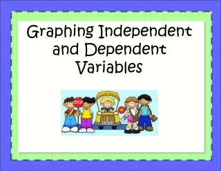
Variables independent • VARIABLES are the things that change in an experiment. • In a data table there are two types of variables: • 1. INDEPENDENT VARIABLES = The factor that the scientist changes • On the Left side in a data table and the x-axis of a graph • Examples: every week (the weeks are changing) • Distance, Amount, Time
Variables cont. dependent • DEPENDENT VARIABLE = THE FACTOR THAT CHANGES BASED ON THE INDEPENDENT VARIABLE-. • On a data table the dependent variable is on the right side. • On a graph it is on the y-axis. • Examples: • Temperature: record the temperature as it changes after set periods of time. • Mass- Mass of each object after something has affected the object.
Controlled vs. Variable Parameters • 1. VARIABLE PARAMETER (independent variable and dependent variables) – this is the things you change in the experiment. • 2. CONTROLLED PARAMETERS – these are all the other factors in the experiment that stay the same.
Examples: figure out which is the independent and dependent variable: • A scientist checks how much his puppy grows each day for 20 days. • A science student adds salt to 3 fish tanks at different rates to see how fast algae will grow in each tank. • A student records how fast the cars go on the freeway at 5 different times during the day. • A scientist takes the temperature of a beaker of cooling chemicals every 2 minutes.
Graphing • Data tables help you organize data, Graphs help you understand and use the data. • Graphs make it easy to identify trends and make predictions. • TREND = The relationship between the independent and dependent variable (THE LINE)
Steps for Making a Graph • 1. Draw the Axes: use the data table to determine the graph’s axes. The Independent variable goes on the x-axis, the Dependent variable goes on the y-axis. • 2. Label the axes: title each axis with the appropriate info. Dependent: Population Independent: Years
Steps Cont. • 3. Determine the Range and the Scale: to find the RANGE subtract the smallest value of a single variable from the largest value For our Data: 500-150 = 350, so the x-axis must cover at least 350 grams. 10-0 = 10 so the y-axis must cover at least 10 cm. The SCALE is the size that is used for each box on the graph. There can be a separate scale for each axis. The scale should be chosen such that the graph spreads out to fill most of the available space. The scale must go in equal increments
Scale SCALE SCALE
Steps cont. • 4. Plot the data points: put a dot on the graph for each pair of data in the data table (x, y). • What are the data points for this data table? • Sometimes a LINE OF BEST FIT is needed. This shows the general relationship between two variables in the graph. • 5. Label the Graph – give your graph a title that fits the information: How Temperature Affects Fainting.
What it Looks Like 2. Label the Axis 1. Draw the Axes. 5. Label the Graph Population 4. Plot the Data Points 3. Range and Scale Years 2. Label the Axis
3 Main Types of Graphs • Line Graph 3. Pie Chart 2. Bar Graph
To Make A Bar Graph • Follow the same 5 steps. • EXCEPT: For the x-axis there will be no scale. The titles on the data table are the titles of each bar.
Make a scale for each data table: • X- axis: 2. X-axis: Y axis: Y-axis:
Don’t forget about variables… Dependent Independent • INDEPENDENT VARIABLE = THE VARIABLE THE SCIENTIST CHANGES. • Is always on the left side of the data table • Is always on the x-axis on the graph (horizontal) • DEPENDENT VARIABLE = THE VARIABLE THAT CHANGES BECAUSE THE INDEPENDENT VARIABLE CHANGES • Is always on the right side of the data table • Is always on the y-axis of the graph (vertical) Distance Time