School Magazine Front Cover.
90 likes | 299 Vues
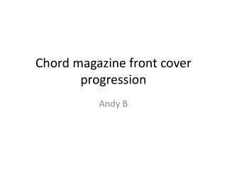
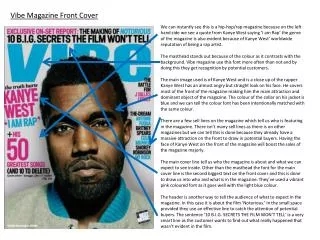
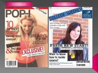
School Magazine Front Cover. Ben Wodecki. The original photo. The Syntagem : (finished product). What I did to edit the photo:. I changed the Hue and specific colour Saturation in order to make certain colours e.g. the blue, green yellow stand out to catch the readers eyes,

School Magazine Front Cover.
E N D
Presentation Transcript
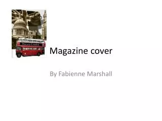
School Magazine Front Cover. Ben Wodecki
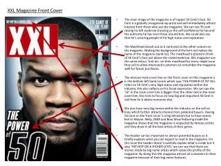
What I did to edit the photo: • I changed the Hue and specific colour Saturation in order to make certain colours e.g. the blue, green yellow stand out to catch the readers eyes, • I then used the vibrancy tool to tone down every colour (despite having certain colours very bright the colour still goes down) to show that the world around the person on the cover is bright his depression or wellbeing is making the world seem darker. The blue on the left was the original photo. The one on the right was after Increased the Hue and specific colour saturation.
What else did I do to edit the photo? • I changed the colour of the shirt from red to a Hue and specific colour edited red to grab the readers attention. The shirt on the left is a mundane pink whereas the shirt on right was photo shopped to increase the vibrancy of the colour to attract the reader’s attention.
Colour scheme • I chose Purple boxes with white writing. I did this because purple is a bright colour that stands out and white for a font is perfect due to the fact it makes the text easy to read and allows the reader upon this combination to be instantly drawn to it,
The top layer • I added this in so those who are given this magazine (as one cannot buy this magazine in the shops) can have a clear understanding of what the magazine would contain. • Addition of the year will to inform newsstands when an unsold magazine can be removed from the stands and returned to the publisher or be destroyed (in this case, the cover date is also the pull date).
The title • I chose the purple and white colour scheme again for the title as they both work well together (in the sense of the colours don’t clash) and they stand out to the reader so it attracts them not to buy this product as its not available to purchase but to attract them to read it when given it.