Magazine cover
Magazine cover. By F abienne Marshall. Brief. The aim of this project was to create an image to advertise the local area which, in my case, was London. We were allowed to use photoshop to morph images to make our local area seem more appealing. The specific brief was:

Magazine cover
E N D
Presentation Transcript
Magazine cover By Fabienne Marshall
Brief • The aim of this project was to create an image to advertise the local area which, in my case, was London. We were allowed to use photoshop to morph images to make our local area seem more appealing. The specific brief was: • A local photographic company called Progress Media is holding a competition for students, to promote the local area. The competition is called ‘The Camera Never Lies (or Does It?)’. We could us scanners, cameras, film, the internet and other methods in order to create our image.
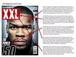
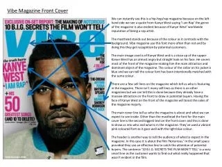
Research • I examined magazine covers and managed to identify features that I would like to carry it across to my main piece. For example, from the feedback I got from the time magazine cover, I decided to have an image in the foreground that was the central point of all attention. The colour red was also found to be really attention seeking which makes it perfect for a magazine cover.
Mood board • As my local area is London, I decided to use famous landmarks from London as they are easily recognisable and would attract people to my design. The underlying colours were red, blue and white as they are the colours of the British flag and therefore added to the overall authenticity of my image.
Initial planning • I decided on having the London bus in the foreground and then writing ‘discover London’ on it. The bus I chose because it is an iconic British image. I then was deliberating over having a black and white background so that it had a vintage appeal or keeping the vibrant colours.
Final planning • Font- The font will be a rich red to fit with the theme of British colours. The font I have chosen is Baskerville old as it seems to be an antique font which will highlight the vintage elements as this is the focus of my photoshop but at the same time is bold an eye-catching. . It will be size 32 as this will make it stand out and draw people’s attention to it as it is the key piece of information. • The central image will be the iconic London bus. This will be cropped so that you cannot see the background of the bus. This will be the only colour in the graphic. All the other images will be in black and white and merged over one another in the background. The space on which adverts are displayed on the bus will be filled with a blank white text book with ‘Discover London’ placed in the centre of it. • I chose this graphic as the response from people was that it was the most striking. The contrast between the bright red and surrounding is intriguing and the pictures were a good representation of London.
Final piece Cropping using the quick selection tool- I only wanted the union jack flapping in the wind and I didn’t want the clouds in the background so I used the flag and dragged across so that it was the correct size for the canvas and so that I could adjust it for the final piece. This was the tool I used to crop the flag.
I had to alter the canvas size so that it would be 21cm to 29.7cm which is the size of A4. I then had to adjust the image size so that it would be proportion to the canvas size. The document size shown is the canvas size.
I selected a rectangle to cover the banner of the bus so that I could write ‘discover London’ on it as I had planned in my initial plan. I stretched it to make it cover the size of the bus. I then rotated it so that it would be similar to the rotation of the bus. I then wanted the rectangle to appear black so I set the background to black. I thought, when I used white lettering, it would stand out more. #000000 was the colour code. This is what it looked like after I had finished with this:
Text I selected the horizontal tool and then placed it on the black box I had created so that the text would appear to be on the banner of the bus. This was the final alteration
Merging images To merge the layer, I dragged the layer on the right hand side over the layer I wanted to be below the bus. This made the bus appear more prominently in the forground, bring more attention to it as it is the centrepiece of the design.
Sepia effect I wanted a vintage feel to the background to highlight the historical heritage of London. I used the colour swatch to select the style I wanted it so that I could apply it to the selected layers. This was the styles that I selected my styles from this palette.
Eraser I chose the size of the eraser so that the actual column wouldn’t be erased. I selected the eraser tool and then cleared the sky background from the Nelson’s column layer so that it revealed the underlying images. I chose to erase instead of the quick selection tool because the tool was not working as the image was too intricate.
Blending I wanted to the Queen’s silhouette to appear translucent and therefore I went into the layer style to change the opacity of the head. I made it faint but still visble so that people could clearly identify it. I maintained the sepia effect as this was the them of the backgoround.