Download
1 / 5
60 likes | 170 Vues
Explore the latest music scene with bold band images & engaging content aimed at ages 16-30. Featuring exclusive interviews & band profiles in a vibrant, edgy layout.

E N D
Magazine Cover Analysis. Kelsey Hamblin.
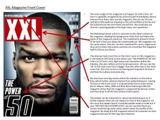
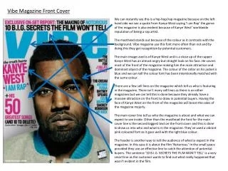
NME. This front cover has a big bold picture and title of the band its focusing on so that it would draw peoples attention to it if they liked the band due to the white standing out so much. The picture is always important and as NME have used here most magazines use big bold pictures to stand out and just to show what the magazine is about. The picture they have gone for is one of the whole band that shows attitude yet not being overly offence or to inappropriate for the target market they are going for ranging from around 16-30. This is a good age range for a magazine they would have to use appropriate photos to appeal to the whole target audience they are looking for.
Kerrang. Similar to NME kerrang have used a big bold picture of the main band they are focusing on. The title font of this magazine is like cracked glass giving the impression of the magazine being loud, crash and bang appealing to the general more ‘rock’ type people other than just anyone. As well as having a big picture of the band with quite an angry look about them which fits the magazine it also has advertisements for other bands and information on the other bands inside with a long list of bands featured in the magazine.
Kerrang. Looking at kerrang again its always in a very similar style to all their other magazines because they appeal to a certain audience and obviously have found a style that the target audience they are going for like. Still sticking with just one big bold picture of what they are focusing on in the magazine with other band advertisement around the edge of the front cover. Lots of these magazines have free give always to draw the buyer in and make the magazine more appealing as a whole.