Magazine cover analysis
Magazine cover analysis. What you would normally see on a magazine cover:. The whole cover will normally include: Main feature article Usually includes close up or medium shots Direct address.

Magazine cover analysis
E N D
Presentation Transcript
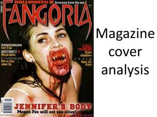
What you would normally see on a magazine cover: • The whole cover will normally include: • Main feature article • Usually includes close up or medium shots • Direct address Barcode- completely conventional to have, positioned normally in one of the corners of the magazine ‘Buzz words’- used to attract buyers as they normally say ‘free’, ‘new’, ‘exclusive’ Magazine covers normally display a ‘puff’ to imply free ‘goodies’. Colour: It is known that for horror movie posters, they either like to stick to a deep, dark colour pallet or go for something bright but powerful- either way there is no middle and they are known for making sure the colour or brightness makes a powerful effect. Strip: This is where the magazine contains a list of featuring items and will either be right at the top or the bottom of the magazine cover. It assures the audience that they have brought a magazine worth the money they have spent because it includes many stories that they would find interesting and are excited to read.
What you would normally see on a magazine cover: • Title (masthead) includes: • A unique font • Usually one or two words • Large, fills the width of the cover • Includes price or issue- along with the barcode • The date- smaller size than anything else • Includes a positioning statement – how it stands out against competitors Magazines are made up of a main cover line and normal cover lines that are lines of text naming the articles. They’re there simply to attract the eye of the audience and use ‘buzz words’ to make them interested in reading the article/magazine The main cover line is known to be the second largest section of text on the cover majority of the time (the masthead being the first). They use a minimal amount of words as possible to create the biggest effect they can, they usually compliment the main image and are in similar fonts as the other cover lines of the page.
The masthead which is conventionally at the top of every magazine as been blown up and has been set In a font which carries a theme that you can relate to the name: ‘Fangoria’. With this play on words, it allows the magazine to target a wider range of audiences because it takes on not only the genre of horror on, but it’s sub-genres too like the supernatural, thriller and even a sub genre that includes life outside of this plant- aliens. Pug The main image on the horror movie magazine has been placed directly in the middle of the poster, as a horror movie poster it has insured the main image is the main attention and with its medium close up shot it makes the audience aware of the mise-en-scene and even some of the narrative because of the candle in her had and the veil she is wearing. It’s an effective choice to make because the main image blends in well with the colour scheme along with the fonts around it relating to the image. Banner Overall layout Moving on to the colour scheme Layout
