Magazine conventions cover
50 likes | 131 Vues
Learn about the strategic placement of mastheads, dates, prices, and barcodes on magazine covers. Explore how subheadings and main images attract readers and reflect magazine branding.

Magazine conventions cover
E N D
Presentation Transcript
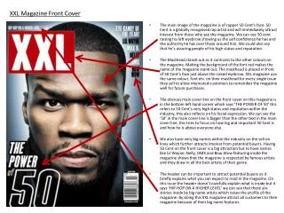
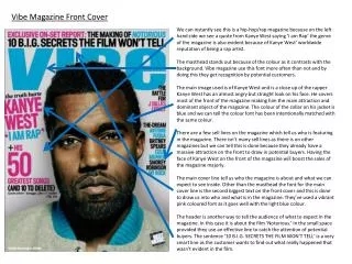
Masthead Masthead- The mast head is usually placed at the top of the magazine to show dominance over the rest of the magazine. It also is the first part of the magazine instead of the picture that you tend to see first purely because of its positioning and boldness on the cover. The masthead can also be positioned on the side of the magazine because that will also make the title noticeable and give it a unique quality. In my research I have also discovered that most of the masthead/titles are giving some sort of bolding or differentiating technique, (for example, having a different colour or making it more bold) to make them stand out from the background and be more recognisable
Date, price and barcode. The date , price and barcode are usually all kept in the same area and which tends to be bottom right or left of the cover. The reason being it is all kept in the same area and compact into a small space on the barcode, is to show relevant or important the price is in comparison to how important the rest of the cover is. By Also by putting the price next to the date and on the barcode the price will be harder to find and a customer will then not focus on the price and the actually magazine itselft. In my research I have always seen the barcode at the bottom lefte or right to fill empty space and alsmot as a tradition for magazines to have.
subheadings In most magazines there are subheadings on the side and all around the main image, in some cases on top of the image. This is used for two reasons. Firstly to fill space on the magazine, so it doesn’t look empty because that would show that the magazine would not have much to offer. The second reason is to let a customer/ reader know what information will be coming up in the magazine, these are just extra points of interest, almost like a bonus. Aswell as there being subheadings for the stories inside there are also advertisments
Main image The main image is pretty much always the first thing a customer would see when looking at a magazine front page cover. The reason for this is because an image is a main point of interest and is seen to be more intriguing then blocks of text, therefore the image takes centre stage. Its almost always place in the centre of the cover and and is always the largest part of the cover, again to bring the customers in. Most music magazines, in fact pretty much all of them use an iconic or popular musical figure for their front cover spot, this shows that the particular magazine keeps in with popular people for each certain genre. The image also helps brand the certain person or band with a type of persona they give them selves in the image which reflects heavily on the magazine.