Download
1 / 15
150 likes | 292 Vues
In crafting the cover for my music magazine "Amplified," I focused on audience preferences drawn from extensive research. By analyzing popular magazines like Kerrang and Rock Sound, I decided on a prominent top title layout and selected a bold color scheme of red, white, and black based on audience votes. The cover photo featured Liam McAuley, capturing his connection with readers. I also added a blurb about free posters and mimicked effective design elements seen in successful magazines. This comprehensive process aimed to engage and attract our target audience effectively.

E N D
Music Magazine Cover - explained By Carysnorfor
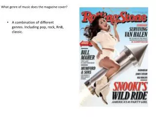
Masthead After looking at many magazines, and after my first questionnaire showed that my audience preferred Kerrang’s position of their title the most, I chose to have my title at the top. The name of the magazine was chosen after I looked at many music magazines, came up with a list of possible names, and then I asked my audience which name they liked the most, which was Amplified. I found that, Similar to magazines such as Kerrang and Rocksound, it went nicely at the head of my cover. In addition to this, my audience showed that they preferred having the title across, as opposed to in the corner (like NME or Q).
Masthead Furthermore, after looking at Kerrang’smastheads, I found that they use both White on Black (when there is a light background image) and Black on White (when there is a dark background image), in addition to this, because my audience said they liked Kerrang’s mastheads (regardless of which way around the black and white colours are), I decided to create two mock-ups of the title (and the magazine) to see which ones my audience would prefer, and they voted, pretty much unanimously, towards the white on black.
Mock-ups of the Master heads In order to get the correct colour, I made this on photoshop – so I could use the ‘eyedropper’ tool to take the exact colour of the background in my image, and show my audience what each would look like. I also showed them the two below.
Photos I chose this image because before I took my photos, I looked at lots of Music Magazines, and found (after seeing that a lot of Music Magazines only have one person on the front cover) that I would need a picture of Liam that was close up (I found that people preferred this in one of my questionnaires, also, Music Magazines tend to use them more), and he would need to be looking at the camera – therefore addressing the audience/reader, and consequently, interesting them to read the magazine, and buy it. After we took them, I chose a few that fitted the criteria for a cover photo, and asked my audience which ones they preferred. This one proved most popular. I also changed the colour of his shirt to make it blend with the colour scheme easier.
Photos Because, like most magazines, my focus was the artist – Liam McAuley, I blurred the background. I did this by duplicating the layer, then using a box blur mask to cover the background, and then I used the auto-select tool to ‘cut-out’ Liam from the background, and then I used the brush tool (using the black and white mask tool, to take out the parts I didn’t want), to take out the old background. To make this look more professional, I had to do a lot of it by eye/hand, and I had to zoom in/enlarge the image a lot to get it to the point where I was happy with it. I think the hardest part of this was doing his hair, where I had to play around with brush size and opacity of the brush, and his right index finger (right to us).
Photos Because my audience research displayed that they want posters in their magazine, and, as shown by successful magazines such as Kerrang, I chose to add another photo in of Liam, consequently, showing my audience that we have free posters, of Liam. I looked at Kerrang magazines to see how they presented posters like this, and I mimicked the design slightly, by outlining the picture in red.
Photos In addition to this, I made sure Liam was in clothing that is available to everyone – a technique I’ve seen music magazines use – to connect with the audience, for example, the covers below.
Colour scheme Because my audience voted the colours Red, White and Black as my colour scheme, and because my research showed that this colour scheme is most popular for a music magazine, it was inevitable that my colour scheme would be that. Consequently, I had to make sure, during the production, to only use white text when it has a background, because my picture has a reasonably light background, it would be bad to put white text on this background, because it would fail to stand out. Furthermore, this makes the ‘IF I WAS ON THE READING MAIN STAGE’ quote more prominent.’
Barcode From looking at various different music magazines, I saw that the majority of magazines have their barcode in the bottom left corner, with their Issue No. on, the price of the magazine, and the date of the issue. After asking my audience, I found that they preferred Monthly magazines to Weekly, so I made mine for ‘April 2013’. I also looked at the magazines for what language they used for their Issue number (Issue #1/Issue 1/Issue Number 1/Issue NO 1/Issue No. 1) and found that most magazines uses’ ‘NO 1’.
Splash (and contents) From the layout questionnaire, with my designs for my final layout, my audience showed me that they preferred having Splash on the magazine, like Kerrang does. Consequently, I made them. For the content of them, I looked at a lot of Kerrang’s Splashes, and the language in them, and saw that it’s mostly ‘name dropping’, and they use a lot of plus signs, ‘PLUS!’ arrows, capital letters, coloured text to break up the text, and separate the more vital information, and a lot of exclamation points. To decide what to put in the Splashes, I took recent events – thinking of Kerrang issues, and made some.
Splash (and contents) Because I knew that saying ‘Reading’ would interest people, I put that in, and it would be a hot topic for readers, because the last headliner did only just come out. Also, I made up a list; ‘TOP 100 ALBUMS OF 2013!’ because my questionnaires showed that the articles like that also interest people. Furthermore, I saw Kerrang magazines had reviews sometimes in their splash, and so I added in a recent album release (Bring Me The Horizon’s Sempiternal), which also fits in with my rock and sub-genres of rock genre music magazine – the same with Reading (and Leeds) Festivals.
Side headings and extras From my research for front covers, I discovered that magazines rarely use lower case on the front cover, because capitals attract more attention. I used ‘THE STROKES COMEDOWN MACHINE VERDICT’ because it fits with my genre of the magazine, it’s a new album, and, specifically, I chose the words for it after looking at many magazine covers and seeing magazines have ‘KINGS OF LEON NEW ALBUM VERDICT’, amongst other text. I chose to have ‘LIAM MCAULEY’ in the second biggest typeface on the page, because that’s what magazines always do. Rarely is the subtitle bigger than the master head.
Side headings and contents In addition to this, I chose to tilt his name slightly because I’ve seen magazines tilt their subheadings, and the audience prefered having it on a tilt, parallel with Liam’s thumbs, to having them parallel to the master head. I then have the highest-voted quote underneath, because it would incise the audience to read the magazine. Furthermore, magazines often have a quote beneath the title of the article (again, to persuade the reader to read the article).