Magazine cover analysis
70 likes | 291 Vues
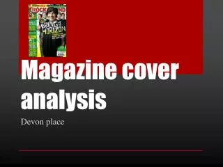
Magazine cover analysis. Devon place. ROCKSOUND. The yellow colour is contrasting and loud. ‘Paramore’ band name is a larger font to catch the eye of any fans and explain the topic of the feature. ‘Ain’t It Fun’ reference to the Paramore song. Humour intended for fans of the band.

Magazine cover analysis
E N D
Presentation Transcript
Magazine cover analysis Devon place
The yellow colour is contrasting and loud. • ‘Paramore’ band name is a larger font to catch the eye of any fans and explain the topic of the feature. • ‘Ain’t It Fun’ reference to the Paramore song. Humour intended for fans of the band. • ‘Free CD + Posters’ in a bigger font and red. More conflicting with the red to stand out- it is an incentive for the reader. • Pictures of bands/posters shows what’s inside and breaks up text- less off-putting • Alternating colour of band names splits them up and ties in with the colour theme of cover-consistent. Banner
The ‘Rocksound’ title is well known enough to be covered by Oli’s head • Bold/loud font that establishes the harsh sounding music involved in the magazine • Only ‘Sound’ is covered-not the word ‘Rock’ so the theme/content of the magazine is not hidden. • Positioning at the top of the page for display purposes? Masthead
The band’s album artwork is in the background- possibly hinting that the article could focus on this album or to add more of a gradient to the background colour. • Frontman (Oli) in foreground of image as he is main focus due to the quote. • Darker clothing for the band creates more contrasting colours that makes them stand out. It is also effective for making the text clear to read. • The picture is fairly uninterrupted. The layout is minimal which makes the band seem powerful and dramatic. • Clothing is fairly similar which makes them seem as though they should be together/makes it obvious they are a group. Main image
Organised into a column/sidebar that allows the text to be easily read without obstructing the main image. • Austin Carlile image goes with Of Mice & Men article, catches the eye of a fan immediately. The choice of image also hints at what kind of genre the band may be which could spark interest of the reader. • Dotted lines splits up different features which avoids confusion and categorises the sub headings. • Band names are larger and have contrasting colours with the ones surrounding them. This makes them more prominent and will make them more noticeable for someone who may be familiar with the bands, making them interested in the magazine. • ‘15 killer tracks…’ is highlighted and boxed off to make it obvious that it is a separate article but also makes it seem like a main feature. The text for all the band names underneath are the same which makes it evident that they are part of this feature. • Subtext for each band’s article is a different colour/highlighted/different font and is also smaller as it is not vital information that needs to be given instantly. It is additional information for someone who wants to know what the article involves. Sub headings
‘+19’ is blatant. A bigger font is used to exaggerate the fact that there is a lot in the issue. The white also makes the text pop. • Exclamation marks used to add excitement to the feature. • ‘And more!’ is in yellow to emphasise the idea of getting a lot in the issue/a lot for your money. • The circle/label keeps the text gathered together and off the image. • All colours are chosen to keep the overall cover consistent and avoids the page looking manic and off-putting.
