Kerrang! Magazine cover analysis
60 likes | 412 Vues
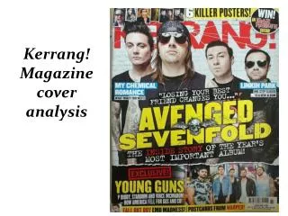
Kerrang! Magazine cover analysis. Layout. The centre of the cover features the subject of the main article in the magazine – the band ‘Avenged Sevenfold’. .

Kerrang! Magazine cover analysis
E N D
Presentation Transcript
Layout The centre of the cover features the subject of the main article in the magazine – the band ‘Avenged Sevenfold’. Other features of the magazine such as articles about Linkin Park and My Chemical Romance are placed in a symmetrical fashion around the centre to keep emphasis on the main image as well as attracting readers to other elements of the contents. The use of a striking image of a popular band will try to attract as many readers as possible in the hope that potential consumers will recognise them and peak interest.
Colour and font choice The main title ‘Kerrang’ is in bold red letters that contrasts to the surrounding black colours; this makes it stand out behind the image used. The font also has a striking white crack through the letters giving it an individual edge over other styles, this could be used to represent the magazineitself. Furthermore, the entirety of the text is not completing revealed which gives the impression that it is a well known, recognisable brand. Another striking colour used on the magazine cover is yellow. The impact of bold, block colours that contrast each other is that it allows the text to stand out and become eye-catching to the reader. The text ‘Avenged sevenfold’ is in capitals and large font which instantly tells the reader what the magazine features. The colour is also slightly distressed which again, gives the impression of individuality and style to the magazine.
Use of text In the part shown, text is used to inform the reader as well as entertain and engage them too. The pun of ‘one step closer’ is used to entertain the consumer as it also the name of a well know song by Linkin park, but goes on to show that they are potentially creating a new album; this engages the fans of the band as well as tempting them to read further to discover the possibility of new music from the band of which they are so interested. The ‘exclusive’ section at the bottom entices the consumer to continue reading the magazine in hope of discovering an unseen preview of an article exclusive to this magazine only. Here, the word ‘win’ instantly interests the reader as it suggests the notion of getting more than you pay for. It also acts as an incentive to some potential consumers to buy the magazine in a bid to win something for free.
The target audience Mainly, the target audience to this magazine would be fans of alternative and punk rock music. The bands included are all of this genre and most of the features and articles are about the band members of those shown on the front cover. The age of the target audience is most likely teenagers, as suggested by the darker colours and genre of music. It also something that teenagers would be a lot more interested in as opposed to children or adults, and this is reflected by the bands in the magazine and the target audience of the bands themselves.
Use of images In the top left hand corner there are a series of images used to show the posters that are included with the magazine. This instantly shows readers what they’re getting when they buy the magazine. This use of images is successful as it appeals to a wider range of fans and increases reason to purchase it. The use of images is what first captures the readers focus because of their size and colours. Kerrang! has used pictures of popular bands so avid fans of them will be drawn to the magazine. Images also add more colour and content to the cover making it more interesting and attractive.
