Analyzing Iconic Magazine Covers: Kerrang! vs. NME vs. MOJO
This analysis delves into the design elements of magazine covers from Kerrang!, NME, and MOJO, focusing on their mastheads and banners. The iconic Kerrang! masthead, with its broken glass aesthetic, appeals to its youthful rock audience. In contrast, NME's understated masthead supports a striking image of The Vaccines, emphasizing the band's presence. MOJO, aiming for recognition, places its masthead prominently but uses a softer font to attract casual readers. Each cover's unique features and techniques like band name-dropping are showcased to understand their market appeal.

Analyzing Iconic Magazine Covers: Kerrang! vs. NME vs. MOJO
E N D
Presentation Transcript
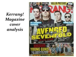
Masthead The Masthead is pushed to the background of the cover and is partially covered by Corey Taylor’s head. The masthead is iconic so it needs very little introduction. Most customers will instantly recognise the Masthead especially because of the lines running through it which represents broken glass, which itself represents the anarchy and chaos of Rock music so it appeals to it’s target audience of 13-19 year olds. The overlapping letters and stand-out font significantly distinguish Kerrang from other music magazines like NME and Q which are more neater and minimalist, this may increase passer-by intrigue and lead to more interest and sales. Banner The banner is the same colour as other aspects of the magazine so as to fit with the colour scheme. The font for the majority of the banner is the same font as the words “Corey Taylor” so it appears to be relevant. The word “Win!” is the same font as the masthead also for the sake of relevance. The word “Win!” is also slightly tilted anti-clockwise so it stands out and attracts the attention of the reader and any passers-by. Other Information The teaser for the Paramore article is designed to encourage buyers as Paramore fans are more likely to buy the magazine. This same technique is used with the Good Charlotte teaser and the 9 band names at the bottom, especially because Korn, Avenged Sevenfold, Muse and You Me At Six are VERY famous rock bands so there is a high chance fans of these bands will see the magazine. The posters for My Chemical Romance are also used to influence buyers as some of them look quite personal so it is unlikely these pictures are very well-known, increasing the exclusivity. Main Feature The huge enlarged name of Corey Taylor is used to catch the eye of any passers-by as it stands out. Any fan of Corey Taylor or Slipknot will be much more inclined to buy he magazine but it also may lead to a purchase through people not knowing who is but wanting to find out. The picture of him is a very soft and personal photo which is in stark contrast to anything Slipknot or Kerrang! would do. He is renowned for his use of scary masks, so to see him casually in a flat cap portrays to readers that he is an ordinary person as well as grabbing their attention. His use of a leather Jacket indicates he still has rock undertones. The font is very bold which gives the cover power as it stands out.
Banner The banner is the same colour and font as the word, “Vaccines” to appear relevant to the rest of the cover. The words, “NEW MUSIC 2011” are used to appeal to consumers as people may buy the article to find out about the new music of 2011. The label at the end of the banner is used to possibly influence people to purchase another copy as they may like The Vaccines cover so much they want to find out about the other cover. Masthead The masthead is very purposefully neglected in this cover as the brand that is NME is seen as iconic enough to not be at the forefront. This allows the photo of the Vaccines to be emphasised. The white colour of the letters allows the masthead to easily blend into the grey background further diminishing it and emphasising the photo. The font is very bold and striking so passers-by can still recognise it despite the magazine efforts to blend it into the background. Main Feature The enlarged name of the band is used to attract attention from passers-by, in the hope a fan of the band will see it. The different colours in their name is used to fit with the colour scheme of red, white and blue. The word “THE” is slightly tilted to draw attention to it. The quote is used to give viewers a taster of what the article is about as well hopefully influencing people to buy the magazine to see more about it. The picture used as the cover is a very angst-y and grumpy photo, this portrays the band as enigmatic and mysterious which captures the interest of passers-by as well giving off a rebellious rock vibe. Other Information The technique of name-dropping bands and artists is used to catch the eye of passers-by in the intention of influencing purchases. The font and colour of the ‘new stars’ match the rest of the cover also to show relevance.
Masthead The masthead is at the forefront of the cover (in stark contrast to the previous 2 blocked mastheads). This is used because MOJO isn’t as big a brand as Kerrang! Or NME, so it is not as recognisable to consumers, which is why the magazine is making an effort to be noticed. The white colour is used to contrast with the grey faded background, so as to appear even more noticeable. The font isn’t very bold and not serious, so as to appear laidback and to appeal to casual magazine readers. The drop shadow makes the masthead appear more interesting and is more likely to stand out. Banner The banner is the same colour as the majority of the text to appear relevant and to not deviate from the colour scheme. The font is different to the font on masthead so as to show variety. The label in the top left corner is used to appeal to passers-by as consumers are more likely to buy a magazine, if it offers free products. Main Feature The name of the artist is pushed to the side in this magazine, to make room for the picture. The colour of the name is used to also contrast with the black and white background. The white border is used to make the font appear more interesting and catch the eye of passers-by. The black and white photo of Neil Young is used to make the magazine appear retro, so as to appeal an older demographic. The fact that the artist appeals mainly to a more ‘mature’ generation which further emphasises the fact that MOJO appeals to an older demographic. Other Information The magazine names a lot of artists on the cover to appeal to fans of these artists, hoping to encourage sales. The picture in the top-right cover is also used in a similar fashion.

