Download
1 / 7
70 likes | 197 Vues
Embrace classical music's timeless elegance with a modern twist in this captivating music magazine. From Beethoven to Chopin, discover the beauty of old melodies through a contemporary lens. Dive into the world of music education with insightful articles and stunning visuals. Explore the evolution of classical tunes and how they resonate with both the young and old. Let the harmonious notes guide you on a musical journey like no other.

E N D
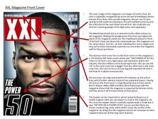
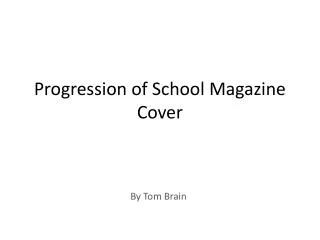
Version 1 I started of with my main image being a shot straight down the keys of a piano I like this picture because light s shining off the keys which gives it a nice effect, however, I think as there is nothing that stands out in the photo I cant really use it as my main picture. I also chose the masthead, I made it black text with a white outline, I did this to make it stand out more also if I didn’t do this the mast head would be difficult to read because its black font on a nearly black background.
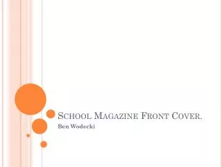
Version 2 This is the second attempt, I changed the main picture so there is something to focus on. I like this because it shows how classical music isn’t just enjoyed and played by the older generation. Also it is a modern take on very old music. I tried to change the masthead font to make it more appealing to younger people, however I don’t think it looks good and doesn’t go with the genre and the name of magazine. Also I added a few sell line down the right hand side of the picture as there is sufficient space.
Version 3 In this one I changed back to the original font for the mast head because i feel it represents the genre better. Also the main sell line is clear to see as its much larger than the other, also it coordinates with the picture. An additional sell line has been made down the right, again the main image, sell line and other sell lines are linked in together.
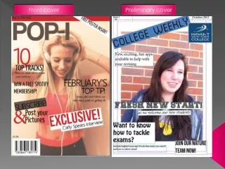
Version 4 As you can clearly see I have added a an additional sell line in a red bubble, I saw on various magazines that anything they wanted to emphasise they put in completely different colour, I chose red because it really stands out; also I put it at the top of magazine so it could be seen on the shelf of a shop. I have also added another sell line at the bottom of the page; and I've added a barcode to make it look more authentic
Version 5 I haven't really changed anything in this version apart from the sell line at the bottom of the page. As this magazine is mainly focusing on the younger generation I thought id try and make it appeal to an older audience who would be more into the classical music such as Beethoven and Chopin.
Version 6 This is the final version I have got, I have moved the barcode over to the left to make way for the 5th sell line, I have chosen ‘my journey started at school’ because the picture was taken in a school music room so the sell lines and the picture link together