Download

1 / 15
150 likes | 299 Vues
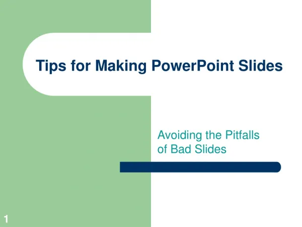
Designing PowerPoint Slides for Video. PowerPoint is a computer application used to produce support materials for delivering instruction. Design Considerations. Design rules are applied to produce instructional materials for any projected media.

E N D
PowerPointis a computer application used to produce support materials for delivering instruction.
Design Considerations • Design rules are applied to produce instructional materials for any projected media. • Special considerations are required when using computers or video monitors.
Text • Projected text should be large enough to read by all viewers. • This is 32 point, the recommended minimum size. anything smallerbecomes more (20 point) and more (16 point) difficult to read. • In most cases, less information on a slide is easier to read.
Text • Six words per line = maximum. • Six lines per slide = maximum • Although it is tempting to squeeze a few more lines on each slide, this is not advisable. It is better to find a logical break in the content and create a new slide.
Text • Use a combination of Upper Case and Lower Case letters. • This combination is easier to read THAN ALL UPPERCASE LETTERS.
Fonts • San serif fonts are preferred examples include; Helvetica, CG Omega,Universe, Arial. • Serif fonts such as; Courier, or Times New Roman may be more difficult to read.
Contrast • Use of a “drop shadow” increases the contrast for text and objects. • Without drop shadow……. and with a drop shadow • The colors of text and background should contrast for clear visibility.
The greatest difference between the monitors used to view a computer or video is… COLOR Color
Chroma Crawl • Some bright colors tend to blur and distort, making text and images difficult to view: Red is the worst color.
Color Fading • Other colors appear faded when transferred from a computer to a video monitor. • The orange color in this slide is an example:
Video Template • Download a “Safe Area”, template from the "Faculty/Staff" page. It serves as a PowerPoint slide master limiting the work area for use in video • The upper right corner is also blocked to allow for live video - use this if you might do a videoconference course.
Safe Area • Keep all text and images in the “Safe Area” - the black box around the screen. • This is located within the central 80 percent of a computer monitor. • Information closer to the edges may be cut off by the bezel of TV.
Safe Area • Once your presentation is finalized. REMOVE the safe area blocks by selecting "Master Slide " from the "View" menu and manually deleting the black blocks. • Use this template as a Master and then save your presentation with a different file name.