Continuous Outcomes Investigating Relationships
840 likes | 1.02k Vues
Continuous Outcomes Investigating Relationships. Chapter 3. Outline. Describing: Numerical summaries Graphical summaries Simple linear regression: Model Inferences Diagnostics Multiple linear regression: Linear regression ANCOVA. Continuous Outcomes. No gaps:

Continuous Outcomes Investigating Relationships
E N D
Presentation Transcript
Outline • Describing: Numerical summaries Graphical summaries • Simple linear regression: Model Inferences Diagnostics • Multiple linear regression: Linear regression ANCOVA
Continuous Outcomes • No gaps: All values are possible. Level of detail is limited only by measurement tool. • Examples: Blood pressure Weight Hemoglobin Concentrations Gene expression levels
Learning Objectives • How do I describe relationships between continuous variables? • How do I compare groups while adjusting for confounders (continuous and categorical)? • How do I investigate the association of risk factors (continuous and categorical) with the outcome? • How do I plan for a study when the research question involves two continuous variables?
Public Health Application The US EPA estimates that 76 – 85 million pounds of atrazine (6-chloro-N2-ethyl-N4-isopropyl-1,3,4-triazine-2,4-diamine),a triazineherbicide, is produced annually with approximately 76.5 million pounds applied within the United States. Atrazine’smain use is to control broadleaf and grassy weeds with the most common sites of application being corn, sugarcane, and sorghum. Once introduced into the environment, atrazine is not easily broken down and has been shown to persist for long periods. This persistence provides ample opportunity for water system contamination (Agency for Toxic Substances and Disease Registry 2003). Current research shows that atrazine exposure may pose a significant threat to human health with drinking water providing the most widespread route of water.
Data Description • Longitudinal study conducted to investigate the effects of drinking water exposed to herbicides and maternal health outcomes: 979 pregnant women with data at week 9 • 270 drank only tap-water during pregnancy. • 315 drank only bottle/filtered water during pregnancy. • 394 drank a combination of tap and bottle/filtered water. Demographic variables collected at week 9 Hemoglobin measured throughout pregnancy For those drinking tap water, the tap water consumption was measured (L).
Research Question Does exposure to herbicides in drinking water impact changes in hemoglobin?
Most Important Step in Data Analysis • Describe the data: Before making conclusions or inferences, an investigator needs to fully understand what the data looks like. • Numerical and graphical summaries cannot be skipped! Need this information to choose the most appropriate statistical method Need this information for valid statistical inferences
Describing the Data • Numerical summaries: Common measures of center and spread • Graphical summaries: Histograms Box-and-whisker plots Mean plots (with error bars) • Same as Chapter 2, but these do not describe relationships
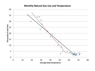
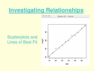
Scatterplots • Plot two-variable relationships. • A point represents a value for each variable. • Points can be described: Direction (positive or negative) Linear Strength
Scatterplots Insert Figure 3-1
Association and Correlation • Tap water consumption and hemoglobin change demonstrate a positive linear relationship. • Association: Positive Negative • Correlation quantifies the linear relationship between two variables.
Correlation Correlation ranges between 1 and 1. 1—strongest negative linear relationship +1—strongest positive linear relationship 0—no linear relationship
Correlation *p-Value < 0.05.
What is a Linear Relationship? Insert Figure 3-4
Statistical Models • Help us understand relationships in the data and how the data could have been produced. • Relate a response to an explanatory variable. • Define how changes in the response variable can be explained by the explanatory variable. • Provide a mechanism for understanding the random variation that may occur in the relationship between the response and the explanatory variables.
Statistical Model The scatter plots indicate that there might be a linear relationship between tap water consumption and hemoglobin change. This suggests that a line would do a good job of describing the relationship.
Random Variation Insert Figure 3-5 We would not expect data to line up perfectly.
Simple Linear Regression Model Response = + (explanatory variable) + • Identically and Independently distributed as normals • Mean of 0 • Constant variance
Least Squares Insert Figure 3-7 How do you choose the line? Minimize the errors.
Explaining Variability Insert Figure 3-8 R2 is the proportion of variability explained by the regression model (x).
ANOVA Table Note: The F test tests H0: 1=0. H1: 1≠0.
Inference Change = + (water) + , N~(0,2) Research hypothesis: Tap water consumption and hemoglobin change are linearly related: ≠ 0. Null hypothesis: Tap water consumption and hemoglobin change are not linearly related: = 0.
Prediction Equation The prediction equation is the estimated line. Can be used to predict responses, Note: No error term – this is not a “model;” this is an actual line.
Diagnostics • Linear regression assumptions: The mean of the errors is 0. The errors have constant variance. The errors are identically and independently distributed as normals. • Checking the assumptions: Plots Residuals Outliers and influence points
Properties of Residuals In any regression model, the set of sample residuals is
Types of Residuals • Raw residuals: The difference between actual and predicted Y • Studentized residuals (STUDENT): Raw residuals that have been “standardized” • Jackknife residuals (RSTUDENT): Raw residuals that have been “standardized” Denominator use in “standardizing” does not involve ith observation.
Residual Plots • The plot of the residuals vseach of the regressorvariables: Should be random . Scattergramsshould occur at the horizontal line 0. • Nonrandom scatter on residual plots indicates violations of model assumptions.
Residual Plots: Potential violations • Studentized residuals vs predicted can indicate an outlier. • Studentized residuals vs predicted can indicate nonconstantvariance (V-shaped plot). • Studentized residuals vsgiven predictor can indicate need for higher order terms (curvilinear plot). • Studentized residuals vs time can indicate correlation among residuals (sine curve plot). (really not an issue with cross-sectional data)
Insert Figure 3-12 Residual vsx: If all assumptions are met, your plot might look like this.
Insert Figure 3-13 A violation has occurred...how can you tell?
Insert Figure 3-14c A violation has occurred...how can you tell?
Probability (Q-Q) Plots Insert Figures 3-17a,b,c
Insert Figure 3-18b A violation has occurred...how can you tell?
Polynomial Regression • When a curve is leftover in the residuals, you might need to add a polynomial term. For example, remember the formula for a parabola quadratic regression (includes a squared term): Usually happens with variables like age
Planning R2 Number of regressors Power Significance level
Statistical Models You are already familiar with a statistical model that describes the linear relationship between X and Y. Y = + X+ ε, εN(0,2) Simple linear regression
Multiple Linear Regression • Public health involves complex research problems; so, it is not often that there is only one explanatory variable or one regressor (x). • When there are multiple regressors, we have multiple linear regression: y = + 1x1 + 2x2 + … + KxK + • For the purposes of illustration, let us start with two regressors x1 and x2.
Two-Regressor Model • The model: yi= α +1x1i + 2x2i + i, i= 1,..., n • Model assumptions: 1, 2,…, n represents a random sample of unobservable error terms from a population of residuals characterized by • Mean (i) = 0 for all the i’s • Var (i) = 2 for all the i’s(homoscedasticity) • Cov (i, j) = 0 for all the i’s ≠ j’s(another way of saying independent)
Obtaining Estimates (Two Regressors) • To obtain estimates for , 1, 2, and 2, use the same principle of least squares as you did in simple linear regression. Minimize the SSE!