Download
1 / 9
90 likes | 203 Vues
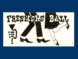
Evaluation of Media Products (Poster, Magazine Cover and Trailer). I used the names of three famous actors who I feel would fit the roles of characters in my thriller. Three names of the main actors, in a white font to stand out above the dark background.

E N D
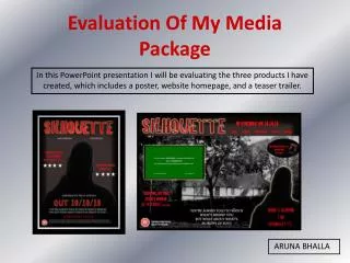
Evaluation of Media Products(Poster, Magazine Cover and Trailer)
I used the names of three famous actors who I feel would fit the roles of characters in my thriller. Three names of the main actors, in a white font to stand out above the dark background. The picture is the main focus of the picture, like with the majority of other film posters. The scratched effect gives the poster an eerie, unnerving quality – making it clear that it’s a thriller. The title of the film is obvious to the audience as it is in the large font size and the brightest colour. The tagline could be fairly difficult to read – a larger font size would’ve been more effective. Further information about the film is in a smaller font as it isn’t the most important audiences will need to know.
Evaluation Film Poster This is the poster I have made to promote my movie, using Adobe Photoshop. The poster is a vital part of film promotion as it is most likely to be the thing most seen by an audience, unlike a trailer or a magazine cover they can be seen in a wide variety of places such as; on buses, around city centres and outside cinemas. I have tried to keep to the conventions of other posters for movies of the same genre like No Country For Old Men and Seven. One of the main conventions was using dark colours and lighting. I was able to make the picture fairly dark and easy to edit in Photoshop by taking the photograph in front of a black screen. When editing the photo I added a layer of scratches to make the photo look eerie and scarier than it would’ve been if it was just the original picture. This has turned out to be quite successful however, at the top of the poster there are the names of three different actors and I have only used one photograph so it would be more conventional to include two additional photographs to correspond to the other names. As this is a poster and may not be looked at for too long by the target audience I attempted to make the title, ‘The Intervention’, bright and bold, compared to the rest of the poster, so that it stands out. The title is the most important thing for the audience to get from the poster but after looking at several other posters I discovered that the tagline is an important part of the poster. On my poster I don’t think that the tagline, ‘those who have nothing will do anything to take it all’, is bold enough and is in a dark font so it doesn’t stand out well above the background.
The date of release and the price are in a much smaller font. The use of ‘Plus!’ and ‘Inside!’ in bolder fonts give the impression that this issue has a lot to offer the reader. The magazine’s name ‘Action’, stands out clearly and having the photograph covering part of it makes it seem like a well established and recognisable magazine. Several other stories are down the side of the issue. The headline of the story is in a larger red font compared to the smaller black font for further details into the story. Large, bold font for the main article making it clear that it is the featured story. The barcode is small and isn’t interfering with the style of the rest of the cover.
Evaluation Magazine Cover The film magazine that I have made is called ‘Action’, I created is using Adobe Photoshop. I chose this name because it is a word commonly associated with films, so audiences will quickly realise that this is a movie magazine. I followed the conventions of Empire, which is a popular movie magazine. There is a solid consistency with the colours and fonts throughout the cover and there is a clear difference between what is the main feature and what are the smaller stories inside the issue. A criticism of the cover is that although the cover is well spread out and easy to follow there may not be enough going on in it to attract a big audience. The white background does help make the stories and the picture stand out but it may not be enough to stand out above other film magazines. Like the majority of Empire’s covers I decided to use just one large photograph and base the text around the centre image. I think that a different picture where the character is wearing clothes that match the role he takes in the movie would be more effective . He could’ve also stood in one of the main settings of the film. Which would mean that taking photographs whilst filming would’ve been a good way to get a good photo and would have also been a good use of time. I have used common magazine terms like ‘Plus!’, ‘Exclusive’ and ‘Inside’ to entice the reader and make this magazine as similar to other magazines as possible.
Evaluation - Trailer Trailers are the best way for movies to attract an audience to their film as they can be viewed in several different locations, either at the viewers choice or in the cinema, they are able to form a more solid opinion than they can get from a poster for example. With technological advances in recent years it means that audiences can watch the trailer from the comfort of their own home, on the computer, on a phone or on an iPod. They can also be seen at the cinema prior to the movie they are about to watch, so they are getting the full cinema experience of the film, giving them a chance to form a solid opinion of whether they would want to pay to watch it in the cinema or not. The reason for trailers being so popular is because they are able to introduce all of the actors in the film whilst they are acting rather than simply posing like on a poster. This also gives the audience the chance to get to grips with the characters personalities and their roles within the films, it is also a way of introducing settings and scenery, not only the actors. Although the trailer is used to show the audience all of the action and excitement it shouldn’t give away too much about the storyline. However, one criticism of some trailers is that all the best moments of the film are included in the trailer, so when someone goes to watch the film there aren’t any new exciting parts meaning that the movie could be a disappointment compared to the trailer. One of the vital parts of the trailer is showing the movie companies logo, for example New Line Cinema in my production, which means that audiences can guess the genre of the film just from the company that has produced it. Names of directors, producers and actors involved with the movie also give the audience there own ideas of the genre and content of the film, without necessarily showing too much action that would give large portions of the storyline away. In a movie marketing package, film companies won’t just release one trailer to publicise a movie but will have several, shown in different locations. The difference between trailers shown on the television and shown in the cinema will mainly differ in length. The shorter of the two being shown on the television due to the amount of money they would have to pay for airtime.
Evaluation - Trailer http://www.youtube.com/watch?v=QcSe-be7efM After creating a storyboard, writing scripts and coming up with several taglines that would be used during the trailer I was able to begin filming and editing, using a video camera to film the trailer and Finalcut Express to edit. When filming, attempting to follow the common conventions for thriller trailer, the actors were wearing clothes that matched the genre, they wore dark and predominantly smart clothing. This was useful because at times I was filming in locations that weren’t the most effective so by having characters wearing these clothes I don’t think the mood or feel of the trailer was affected. By using dark clothes and getting some of the characters to wear hats a certain mystery is given to the character, which is a vital part of a thriller when it comes to the antagonistic character. Due to some of the locations not being quite as good as another location would’ve been I edited them in Final Cut to make them look darker. This meant that even though the location may not be a desired one it still looks quite dark and scary adding to the suspense. I found it difficult to make the music for the trailer, originally I had planned to have a fast paced strings piece building up to a big climax. After finding this difficult I decided to go with scary sounds such as thunder. I think that the thunder works well when it is timed to make a loud noise as there is a cut between scenes. My trailer focuses mainly on actions because there isn’t too much dialogue in it. This could be quite bad because it leaves the audience to work out most of the story for themselves. On the other hand having the audience working it out for themselves could be more effective as they are constantly asking themselves questions which adds to the suspense which makes a good thriller.
Evaluation - Trailer Continued… These are some of the shots from my trailer, I have analysed each of these shots for the negative and positive things they demonstrate.
Audience Feedback After posting a link to my trailer on the social networking site Facebook, I was able to receive feedback from my target audience. On the whole my target audience like the trailer and are intrigued by the storyline. I think my decision to have several quick shots towards the end of the trailer has helped me to get them interested in the film. On a previous slide I criticised the dark lighting in one shot but one piece of feedback believes this is a good technique that ‘connotes mystery’. The main let down of the trailer is the fact that there were no props for guns but I appear to have recovered from this mistake by adding the gun shot sound effect.