Download
1 / 15
150 likes | 293 Vues
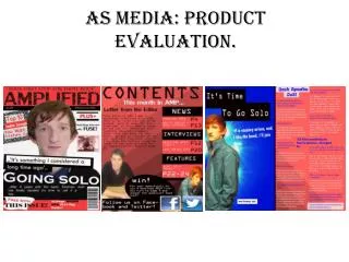
AS MEDIA EVALUATION. SONUS Magazine Robert Gough. Foundation P ortfolio R eview. Front Cover Contents Double Page Spread (DPS). Forms and conventions.

E N D
AS MEDIA EVALUATION SONUS Magazine Robert Gough
Foundation Portfolio Review Front Cover Contents Double Page Spread (DPS)
Forms and conventions • Similar to advance magazine, the main picture has the foreground focus on a person’s face, whereas the background is blurred. This gives more focus on the main feature, in this case a musician. • Classic rock magazine shares the sticker idea, its purpose is to separate features from other bits on the page. This as also used universally on many magazines. • My magazine shares an idea shown in NME and many others, the other articles are stacked down the left hand edge, including quotes. • My masthead takes up the entire width of the magazine, this allows it to be seen easier in a magazine rack. • The title is drawn free hand this symbolises freedom of expression and independence which many young people crave. • We can see in the background a computer with a music editing software loaded, this gives a extra insight to the type of musician and his involvement into his music.
Breaking Forms and Conventions • There is only one area the breaks a convention seldom do you see a thin line title, as many would consider it to hard to read but I think its adds a much needed stylish content. • You also rarely see a profile shot of a artist on a magazine cover, although this is not regularly used I cannot see why it gives a excellent alternate view. • The shot is a close up, it centres around his face and neck the picture is focus off centre. • Using a model within the 16 – 25 target audience, allows the reader to see that the magazine is targeted at them.
Forms and Conventions • The top banner is very similar to Q magazine, I have tried to utilize a post modern cubist feel, which is in line with modern youth schemes. • Another feature similar to Q, are the numbered pictures down the right half of the page, this gives a preview of the magazine content without having to read the list, it is useful for some one quickly looking for a specific main article. • Because the series of black, red and grey lines are overlapping it gives the page depth and a fuller feel. • Because the title ‘Contents’ is the same shade of black as the vertical bar, it looks as if it has been cut of the red banner.
Breaking Forms and Conventions • I have not seen the variant in colour for the main contents text. I have used staple basic colours, one’s that give good contrast to the black background. • Also I have enclosed the page numbers between two grey strips, this adds both a design feature to fill up the area, give the page more definition and give the magazine its own “Trademark Style”. • Unlike many other contents pages the pictures on the right hand side overlap, again give more depth to the contents and allows me to get more details on the page.
Forms and Conventions • My title shares some aspects with the my chemical romance DPS (Bottom left), they both have the title and text printed on top of the main image this creates good cohesion over the DPS, a better flow. • Once again Q magazine provides a source for comparison, concerning using quotes as titles and personal insights showing that it is not just the writers opinion.
Breaking Forms and Conventions • Firstly, I have broken up the text with lines, I feel that they give the piece more structure give the columns a solid break. • Secondly, few magazines put there name and page number in the bottom corner, but although it is unnecessary feature, I think it makes good use of an otherwise empty space. • Thirdly you don’t see the modelsface, for some articles it may not work but I am basing this on a very famous and well know artist thus not requiring and full face shot and allow me to show his emotion.
Double Page Spread Writing Style I have used quite formal language whilst writing this piece so that it acceptable for most people read although it may exclude less educated audience. But I think that this type of music does not generally attract this audience. I have not used many quotes in the piece and just described it in my own words
Representation Because my magazine is aimed at teenagers and young adult that is the age group that have featured in the areas of the music magazine. Again to go with the mainstream feel the people I have used are wearing popular clothes such as jeans, hoodies and body warmer. I have tried to include both genders although the sway is towards male. I did fear that I may alienate ethnic groups because all of the people featured are white British. I have tried to entice a wide audience by difference emotions and settings for instance the picture on the double page spread is quite refined and thoughtful whereas the picture to represent page 81 in the contents is set in a skate park the character looks quite shady and dangerous.
Institution I believe as I have pointed out in many of the slides, Sonus is quite similar to Q magazine. Q is a monthly music magazine, sold to the Bauer media group in 2008 and so I would be looking for my magazine to produced by Bauer media group or similar. I would aim to sell my magazine through the high street, supermarkets and convenience stores, also I would be looking to produce a app based version because it is forecasted that over 75% of the UK will own a smartphone in 2013. producing a free edition would help gain publicity but is not workable from a business prospective and I do not want my magazine to have to many adverts
Target Audience My target audience is a mainstream audience of 16-25 year olds, in established middle class and emergent service workers. I would like to say that it is a unisex magazine but I think it would be more popular with men rather than women due to the type of music. Fairly well educated people would also be drawn to this due to the more formal writing and design.
How To Attract a Audience • Firstly the hand drawn title, although it is not particularly bold its design makes up for it, it is build up of straight lines and cubist letters. • The British pride has grown massively over the last two years with the royal wedding, jubilee and Olympics the Union flagsticker will grab attention and gain interest because of the popularity of British artists. • Thirdly the full length face shot will attract anyone who knows the artist, because they will want to read about them.
Technologies My preliminary sketches were done by hand so I could express my ideas more easily, then we took pictures with a Fujifilm bridge camera similar to the one pictured, the other computer programs I have used are Photoshop to do the front cover, this has been a huge learning curve for me as I entered this course struggling to use the program now I am quite experienced, this the same story for InDesign this is a program that I was unaware of before I started. Surprisingly I have also used Microsoft paint, this was used to join the two pages of the DPS into one Jpeg document. Finally I have also used Wordpressblogging site for the first time which I soon learned how to use.
Looking back: Comparisons and progressions There are some distinct progressions between my two pieces of works, firstly and quite noticeable is the cropping on my sticker image on the ‘Workload magazine it is roughly cut out and on ‘Sonus’ is a even circle. The fonts have much more impact now, they are thicker and more contrasting to the background. And finally the page has much better organisationand have features of a magazine like price date and barcode. Also the colour of the image is much better have better with the contrast being reduced.