Download
1 / 14
140 likes | 326 Vues
Media AS EVALUATION. By Gabrielle Nkansa-Yeboah. In what ways does your media product use, develop or challenge forms and conventions of real media products.

E N D
Media AS EVALUATION By Gabrielle Nkansa-Yeboah
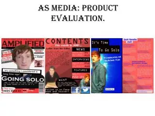
In what ways does your media product use, develop or challenge forms and conventions of real media products The image I chose to use as my front cover challenges conventions as well as ideology as the way the model “Ryan” is looking up away from the audience and is facing towards the light symbolises an angelic image and purity and links to Christian ideology of a “saviour”. Because of this the audience is drawn directly to the models face. This is supported by the response I received from my survey which showed that 65.1% was first attracted to the pose of the model. I also purposely linked the image and the texts “revealing the revolutionary artist together” as the model seems like he is coming out from the darkness and being revealed by the light. Furthermore the framing body posture of the artist connotes a sacrificial meaning. The anchorage of the title and the direct focus from the artist is also effective in working together well as it highlights the importance of both the model and the master head. When analysing the results I received from my evaluation survey, I found that most people said it was different from other rock magazine and that they felt “uncomfortable to look at it as it was quite strange.” and that the image was “dramatic and overpowering”. This shows that the image challenges the norm of an average rock magazine which presents rock artist as cool and laid back people who are dressed in dark wear.
Link to analysing existing magazines: http://gabbystmarys.wordpress.com/2012/11/28/analysing-existing-magazines-2/ Language The language that I used in my media product were, chosen purposely to entertain and engage my audience and was also influenced by other real media products, for example “revealing the revolutionary new artist” this choice of language engages my audience and leads them to want to find out more about the artist. Also In some cases I tried to keep my language simple “Ryan Wilson speaks” as seen in most front cover magazines. Colour scheme I have used this particular colour scheme of red, black and white because they are associated with the theme of rock as presented in real life magazine products. As a result I have decided to keep the colour scheme the same, to associate it with this particular theme. Furthermore I have presented the colour scheme as being the foundation of my media product and one that would symbolises my theme. Font In many magazine covers the conventional type of font used are always simple and bold in order not to distract the audience away from the main image used. As a result for my main texts I purposely chose a simple and bold font to use called “Arial black” and chose a creative master head font called “all ages bold”. I used this particular font as I think its very edgy and hard hitting which reflect and communicates my theme well. Master head Concerning the layout of my magazine cover I have followed conventions. Because I found that when I decided to break conventions and place the master head below the image, my audience responded negatively and I made a decision to put in the conventional position. This shows how the conventional position of magazine master head influences the audiences decision. Therefore I was responding to everyone's opinion and decided to make it more conventional. Draft 2 http://gabbystmarys.wordpress.com/2012/12/03/front-cover-draft-2/ Z lineThe way the audience looks at the magazine is usually followed in a “Z line” which Is conveyed in many magazine covers. This is also visual in my media product in which my audience first identifies the master head then the barcode then the additional information. Furthermore this is done to identify important parts such as the name of the magazines, the publisher and also the artist features on the magazine.
How does your media product represent particular social groups ? The audience I had in mind were young teenagers with an interest in rock. The dominant representation of young people within my target audience are dark, gloomy, loud headed, and seen as outsiders to the rest of the public. Teenagers in general are often depicted negatively by the public and often associated with crime and being a burden to society also as having a rebellious nature. In some accounts my media product does follow this representation, in the fact that I have been rebellious in breaking the conventions of how an average rock artists looks on the front cover and have represented teenagers by using a young teenager for my front cover. However on the other hand my media product challenges this representation of young people as the ideology of the artist almost coming out from the darkness and into the light and being revealed as someone who is “revolutionary” changes the concept of how teenagers are represented in society. Furthermore shows teenagers in a good way. In addition to this looking back at my initial survey that I created when planning my product, the choice of image chosen by my audience, tells me that my audience is rebellious in the fact that they are open to choosing an image which breaks the conventional idea of a rock magazine cover. However are still open to the idea of having an average font an keeping the colour scheme of dark colours such as black and reds to associate with rock.
Comparing Representation The image of the artist Ryan used undermines the stereotypical image of a rock artist. There is a contrast in clothes and appearance which show different connotations and breaks conventions. The contrast in representation is also depicted in the artists body framing posture which is the significance of the mise en scene as it communicates sacrifice, lack of freedom and power. On the other hand the image used also shows particular stereotypical representations in terms of the prop used (the guitar) which show some connatations with rock artist . The reason I have represented my artist this way is to establish a contrast in representation in rock artist and produce an un polished clean version of rock. The representation of the artist “slash” completely reinforces the stereotypical image of a rock artist, the denotation of the artist dark black attire and the prop used (cigarette, sun glasses) shows connatations of coolness, bad attitude and a rebelliousness behaviour. I think the artist slash has been represented In this particular way in order to attract the attention of the audience and again reinforce a polished image of a rock artist. Also the medium close up of slash in the front and the other artist in the back connotes that slash is of extreme importance and represents him as being higher up the hierarchy in rock. Which has an influence on his audience as they are being reminded of his importance which allows the audience to have a level of respect for him as an artist.
What kind of media institution might distribute your media product and why? The publisher that I have researched that might distribute my media product is “future”, this is because we share the same target audience in which most of the magazines they create are aimed at young people. Also they specialise in publishing rock magazine covers such as, Classic Rock and Metal Hammer who are too very known magazine covers. . • Advantages • Greater publicity for my artist. • Allows my magazine cover to grow and expand like other magazines • Publishes magazines that break conventions and are different to existing magazines out there. • Disadvantages • They decide what is going to be featured in my magazine. • I have a limited say on what I want to happen concerning my magazine. • They will control the layout and design of my magazine. Web link - http://www.futureplc.com/what-we-do/portfolios/music/
What kind of media institution might distribute your media product and why? Here I have got a similar magazine cover to mine that was published by future. Here they have also decided to break conventions by having and image that one wouldn’t normally see on a front cover, which supports my idea that future may publish my media product as the type of magazines they publish are different from other magazine front covers. In both magazines the artist is posed with their arms out as a Sacrificial symbol relating to Christian ideology of the crucifixion In both magazines the artist has been set to be the main feature in which the audience is directly drawn to the artist facial expression and body posture of the artist.
Link to analyses of survey : http://gabbystmarys.wordpress.com/2012/11/26/analysing-survey-results/ Who would be the audience for your media product Age The target audience for my media product is teenagers between the age of 16-18. In order to get a deeper insight to what my target audience I created a survey and analysed my results. From looking at my media product I think I have been successful in addressing my target audience in my media product through the type of terminology used and also by having a teenager featured on the front cover of my magazine. Gender My target audience is mainly aimed at young men, however can appeal to females too. When analysing my results I found that 50% of both male and female completed my survey, this allows me to view the opinions of both genders and appeal to them as well. The way I have addressed this audience is by having a male teenager featured on my magazine, also the position of the artist denotes power and authority which is something that appeals to the male audience mostly. Furthermore the colours used also appeal to the male audience as the colours used represent a male magazine. Class According to my survey, the most common answer when asking for a suitable price for a magazine was between £1.00-£2.00. This shows that the type of audience that I would have would be of a lower or middle class background and that it would appeal to my target audience more as they will able to afford to buy the magazine, in which I will be able to gain profit out of.
How I attracted the audience/ addressed the audience When I did my survey I asked people, what image they thought would be suitable for a front cover, whether they would be interested in finding out about a new artist and also the name they thought would be suitable for my magazine cover. This allowed my to address my audience and allow me to relevant feedback in which I could respond to. The main way I attracted my audience was through the use of interesting photography and bold colours, in which I used Photoshop to allow my media products to look interesting and engage my audience. For example in my double page spread the original image used had an interesting body framing posture that I thought would attract audience, however I thought that the image wasn’t effective enough and wouldn’t stand out, therefore may not attract the audience as much. Furthermore I decided that I would make the image darker and show a contrast of light and dark shades in certain areas for effect, for example I purposely made the background lighter to symbolise the fact that as an upcoming artist the spotlight was on him. Furthermore the use of the font choice, layout and colour scheme chosen was also purposely chosen to attract my audience. For example the font used for the master head is bold simple and edgy also the colours used are bright and eye catching which will attract my audience, in addition the layout of my piece was influenced by other double page spread which attracted me the most. Also according to the feedback received from my survey , a majority of people said that the first thing that caught their eye was the pose of the model. The methods I used to address my audience in my double page spread was by using particular language that were humorous and entertaining for example “where the groove at?” also the use of abbreviations “ha-ha”. Also the writing style I was very formal and had a laid back feel to it which supported the laid back conversational interview I had with the artist
What have you learnt about technologies from the process of constructing this product ? The technologies and software I used to construct this product were … Apple Mac computers Nikon camera, lighting machine Photoshop Safari Word Survey Monkey PowerPoint Word press blog Apple Mac computers The most common technology that I used during the process of constructing my media product was the apple Mac computers. In which it allowed me to use a wide range of software to produce my product such as “safari” at a quick speed. As it was my first time using this technology I learnt a lot about the type of activities one could do on the Mac computers such as take pictures and produce videos with effects . This made the process of constructing my product easier for me as it allowed me to use the camera provided in the Mac when ever a camera wasn’t free as I result I learnt that the facilities stored inside the computer allowed me to use my time effectively. Nikon Camera/lighting machine The Nikon camera was extremely clear and came with a lot of memory which allowed me to take professional shots for my preliminary photos and also gave me the opportunity to capture as many images which as a result gave me a wider choice. Furthermore allowed me to make several close ups and editing on the camera before processing it onto my computer. I also learnt how to detect and produce more light when taking a picture which was supported by the lighting machine.
Photo shop This was another important software that I commonly used through out the process of constructing my product, in which I learnt a lot from. And as a result have developed a wide range of skills such as how to edit my images and texts . Furthermore I learned different ways I can construct and develop images by changing its state to fit a particular way, changing the colour and design of my images and also reconstructing an image by adding on and removing element. Blog My blog allowed me to regularly document my work and talk to about the documents I posted onto it. As it was my first time creating a blog I learnt a lot from using it, for example how to change the background themes, how to edit my post as well as add post to my blog and present my work in different formats such as a slide show or a gallery. My blog link http://gabbystmarys.wordpress.com/ Survey Monkey Through out the process of my work I made surveys in order to get customer feedback and help me on my decisions in particular task. From this software I learnt how to transfer the survey onto my blog also I learnt, that the survey allowed me to analyse the customer feedback automatically which as a result made it easier for me when making decisions.
Looking back at your preliminary task what do you feel you have learnt in the progression from it to the full product.
Looking back at your preliminary task what do you feel you have learnt in the progression from it to the full product. Looking back at my preliminary task to my final product I have progressed a lot in terms of my creativity and particular elements that make a magazine. My initial preliminary task allowed me to explore Photoshop as a whole and discover different design elements I could use when making my final media product. The transition from my preliminary task to my final media product allowed me to develop particular skills and gain confidence when working in Photoshop. Furthermore completing regular drafts and documenting them also allowed me to progress in my designs and gain feedback from the audience in order to improve. This also gave me the confidence to take risk and make mistakes along the way which in effect made my work more interesting. For example my front cover breaks conventions in terms of the image used, however allows my work to be different from other rock magazines as well as more personal to me as the editor. In addition to this looking at different existing magazines also influenced the turn out of my magazine as well as helped in my progression, for example I learnt about how different elements can attract the audience such as colour, image and font also about the layout of a magazine such as the “z line” of how the audience looks at a front cover. More over I also came across many media key words such as conventions, mise en scene, representation etc which has helped me when analysing different existing magazine products as well as my own.
Final Products : Two page spread Front cover Contents Page